This is a small journal and mini book about the approach I take when sketching for interface and interaction design.
I'm writing this as I enter what I think may be my 17th year making web sites. The only thing I can say with each passing year is that what I know is still so very little compared to what I have yet to learn. Each time I learn of a new way of working I feel energized and excited about the work I do. This is how I've felt about sketching as part of the design process, and why I decided to capture what I was thinking in this journal.
I started this project to publish the speaking notes from a talk I gave at Asbury Agile in October 2012. The plan is to continue to update it as I learn more, become more experienced with sketching software and web products, and modify my approach. On the surface, it will seem to most like the message is overly simplistic and the points obvious. I'm a simple person, but I have an easy time complicating things. Having a set of guidelines to keep me focussed on what's important keeps me from falling into that trap.
If you're interested in the presentation deck, you can View the Slides on Slideshare. The deck is missing several videos that I used in the presentation, but they're reproduced in the pages found here on Konigi.
Enjoy, and if you have any feedback please contact me.
Mike Angeles
Mill Valley, CA, 10 Oct. 2012
Also given at General Assembly, User Experience Immersive 7/10/13
Starting Over
Sketching and drawing is something I've been passionate about for a long time. This journal is about sketching interfaces and interaction, but I want to start out with a story about sketching that isn't at all related to web sites and software. I think it might help to understand why I wrote this.
A Confession
I have a confession to make. Most of my life I've really thought that I sucked at sketching and drawing. But I've always wanted to do it, and I've always wanted to be better.
Growing up, I was always drawing and making things with my hands all the time. I wanted to be able to accurately and realistically draw what I saw with my eyes, and draw the ideas in my mind. I really wanted my drawings to look like those things. But I've always felt like I sucked at that, and I think that's really blocked me for a long time from being successful at using sketching as one of my design tools.
When desire is greater than ability
I think there's something interesting about having a desire that's much greater than your ability. Something about that equation creates a tension and possibility to grow that can be delicate to handle. It's easy to find yourself unable to meet your passion and give up. If you're lucky, if you have guidance, or something or someone who influences you and pushes you forward, however, it's possible to discover a path to satisfying the desire, unexpected as the path may be.
I'm regularly provided with interesting life lessons seeing the world through my children, and trying to see them through challenges. The unique position of wanting to help, but knowing you need to do so carefully makes me think about responding to those challenges in a way that doesn't discourage, but offers possibilities and paths for consideration. I haven't always approached things this way, but when I do, I find it can be less effort pushing one's self forward. Getting spoon-fed every solution in life only gets you so far.
My son is 11 as I write this. He's a kid like I was who seems to have always loved making things with markers, or photoshop, and that sort of thing. Talking with him about his artwork one day helped me to understand what was blocking me in my own design work.
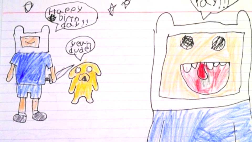
One day when he was about 6 or 7 years old, he was doing his usual thing, drawing pictures and characters. I'm sitting in the same room with him and I hear him say, "I suck at this." Of course my heart breaks a little because I want my kids to feel awesome about themselves. I went over to see what was up.
I saw that he was drawing a character. He was trying to copy a picture of an anime character he likes. He's focussing on the details and trying to make his face and hair look right, and he's really looking closely and working meticulously, trying to make this thing look "right" to him—to match the image he has in his mind.
He's kind of blocked. And all the time leading up to this point, I've never really seen him express frustration over not being able to have the thing in his mind match the thing he created.
I already thought that his drawings were great, but at this point I think I started to talk to him about the idea of maybe taking a break and stepping back. We talked about what it was he wanted to do. He told me that when we made books together, he would get frustrated that the characters didn't look the same from cell to cell, page to page.
At some point during this conversation I told him that I loved how hard he worked on his drawings and asked him, "What if you focussed on the story you want to express, because maybe the thing that's important to you might be getting this idea out without having to make it look exactly like what you're trying to copy." I knew this wasn't the answer he wanted. So I also introduced him to some techniques I had learned to give him something to hang onto while he worked, but I think the first message was the important one.
Empty your cup
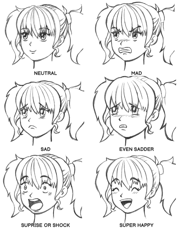
I had taken a class with this guy a few years prior. His name is Kensuke Okabayashi. He's a manga illustrator who taught a class on the Lower East Side of New York for people who wanted to to draw manga. His class helped me to break down the drawing of faces by looking at the basic elements that go into each expression, from happy and surprised, to sad and totally devastated. Until that point, I was never able to see what I needed to do to draw in all the traditional figure drawing classes I had taken. But somehow I started to see differently, and my eyes were breaking down what I saw into forms I could sketch.
By repeatedly practicing drawing the basic set of expressions Kensuke introduced, I had tools to tell a story—the starter kit version anyway. I began to believe that it's not learning how to represent the human form accurately and showing all the details that I should be concerned with, but thinking about what it is I want to tell in my story, and knowing how to do that with a few basic techniques.
I don't know if my son really took all my messages to heart, nor do I think it was my talking to him that changed things directly. But, shortly afterwards he did kind of let go of this idea of having to be perfect. And when I look at some of his drawings, there's a lot of emotion and humor there. It's very rough and loose, but there's nothing wrong with having that character in your drawing and not being "perfect" at it.
In retrospect I think we had similar problems, although I spent much more effort and time trying to be "good," whereas, I think he's moved on much sooner. I also learned eventually to let go when doing my own work and accepted that sketching should be a something that's loose and free. And I embraced sketching over drawing.
I think when you focus on the message and the story you want to tell, when over time you give up this need to be technically correct and just practice doing the basic things to tell your story, that you get progressively better.
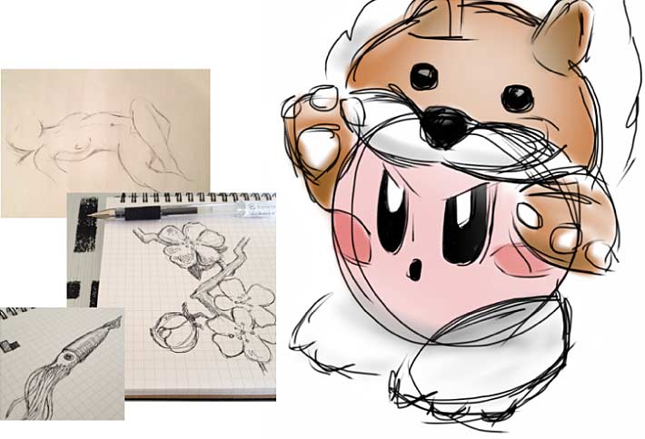
These are some sketches from my sketch book in recent years, post-Kensuke. I think my sketches which used to be really tortured became fun and started to look more like things in my mind. I look at these now and I feel like I've come a long way from really sucking.
I really had to start over. I didn't realize it at the time, but this struggle was happening in my work as a designer as well.
What Is A Sketch?
Starting again as a designer
There is a connection between the story of my son and I and our struggle to sketch, and my own work as a designer. This is relevant to my work because I had this same kind of block for some time, but I wasn't aware of it.
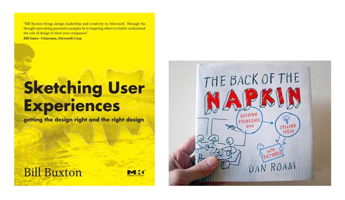
For years, I was doing a lot of sketching in private, but what was missing for me was the bigger picture about how sketching fit into the design process. I kept seeing the mentions of the books and watched the presentations of these 2 guys and they started to influence my thinking. I had picked up both books and they really put me on the path to starting over again with sketching.
Dan Roam's book kind of democratized sketching as a tool that anyone can use to communicate visually. He shows you how effective and simple it can be. Nobody needs to be afraid of sketching because there's a basic language you can learn, and once you do, your power to communicate grows.
The bigger influence for me was Bill Buxton's book on sketching user experience. Buxton talked from both a high level and a detailed point of view about how sketching as a part of design process is valuable as a tool because it's cheap and fast, and it's the right level of fidelity that lets you make bad decisions early, and fail early so you can make those mistakes before you code.
He gives you a way of using sketching successfully by allowing you to maximize this tool at the right time so that you're not making assumptions that are wrong and going down a path that leads you to needing to pivot when you're in code, which is much more costly.
What is a sketch?
All lot of ideas were floating around in my head about starting over on my own personal artistic sketching. And while this is happening I'm thinking about Roam and Buxton. At this point I'm starting to question how I'm using sketching in my own practice as a designer. Am I doing things the right way, the wrong way?
Around this time i had also started seeing people posting pictures of their sketches, and some of them were beautiful works from people I really admire and respect. But then, some of that has the effect of making me feel like, maybe I'm doing it wrong. My work looks like garbage compared to some of these guys.
When I think back at this, what I was seeing were drawings not sketches. They were more like visual designs or pretty wireframes done in pen and pencil, rather than sketches that were being used to demonstrate thinking and problem solving. At least that's what most of these looked like to me. Compared to my sketches, these were polished, clean drawings in all the colors of the rainbow. It reminds me of when I occasionally had to interview people for IA jobs where I would sometimes be presented with beautiful portfolios of work for big brands, but when it came time to show the sketches or describe the problem solving that went into producing the work, there was nothing to show and no explanation of the process.
That's when I started to figure out for myself what I wanted my approach to be, and to decide what's important to me. I stepped back and kept coming back to the ideas I found in Bill Buxton's book and talks.
Sketching != Drawing
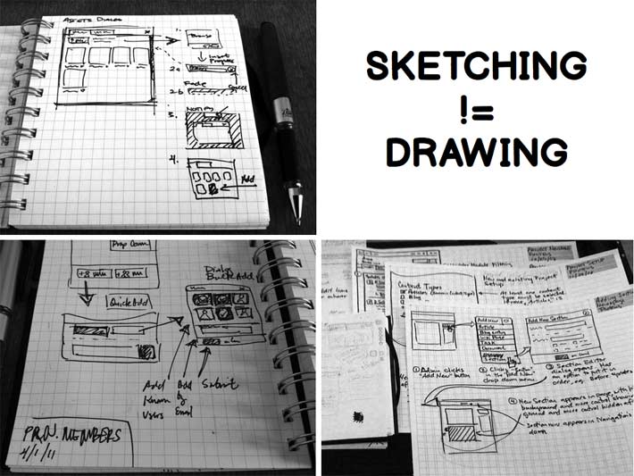
One of the first decisions I made for myself was that I can't look at polished design drawings and let them influence my own thinking about sketching. I need to think about sketching in a different way. I also need to look around more, learn a little more, capture what I was thinking, and then be able to express it so I could make my ideas and approach something I could describe to others and repeat. And the approach had to be super simple, because I'm a simple-minded guy that needs things put plainly if I wish to have any hope of acting on them.
From this came my first, rather obvious statement. Sketching is not drawing. It's a completely different action that is rough and loose and meant to be fast and disposable. The artifacts are meant to show the process involved in arriving at the sketch as much as it is meant to demonstrate the final concept. It's great when used in teams, but can be used individually if you're thinking about them as part of the design process that Buxton describes.
To act on the decision to approach sketching with a newfound purpose in mind, I had to think back to that idea I wrote about with my son. I needed to step back and think about why I should be sketching at all.
Why We Sketch
I started to think a lot about why we sketch. I began asking, "how am I making sure that the ideas I'm reading about and agreeing with are informing the way I work."
I looked at what other creative people are doing, and I picked this handful of things that are important to me.
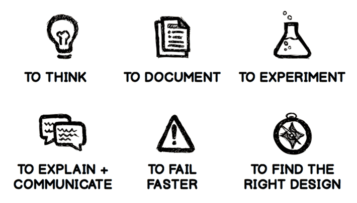
I'm using sketching:
- to think about problems
- to document the solutions and the intention of the design
- to experiment with things that are maybe unfamiliar or unconventional in terms of my own knowledge
- to communicate and explain the solutions and decisions I'm proposing
And these last 2 are most specific to product design. I'm using sketching:
- to fail faster
- to find the right solution and design
Here are some examples I was finding from other fields that demonstrate why we sketch as part of the creative process.
We sketch to think
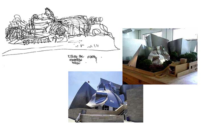
This is Frank Gehry's sketch. They're squiggles showing how he's exploring the concept for the Disney Concert Hall in Los Angeles. It's just rough lines that represent all these undulating and curving forms that are going to make up the facade of this building in metal. He's also figuring out the relationship of the curvy metal building to the smaller rectilinear forms, and the proportion and scale with the landscape and trees.
You can also see in the prototype or model that the elements in the sketch are carried through to the final building. What we're seeing here is sketching as a tool to begin to think about the design problem of sculpting a metal architectural skin over a box until they've arrive at this main concept.
Source: Arcspace
We sketch to document
Documentation is probably a common reason for all of us to put something down on paper, if just to capture the idea for other people to use.
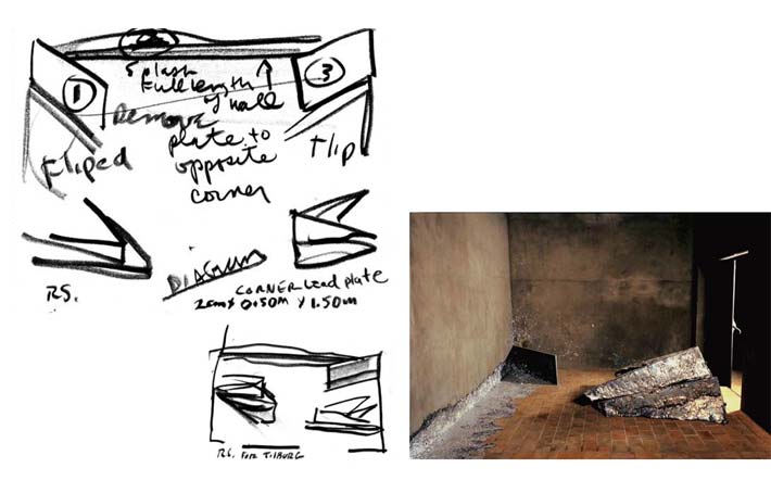
This is sculptor Richard Serra, who is using this sketch as a way to document how he wants this installation to be laid out, indicating with sketches and notes how he wants each piece to be positioned in this room.
Sources: Depont and zigzagblues
We sketch to document
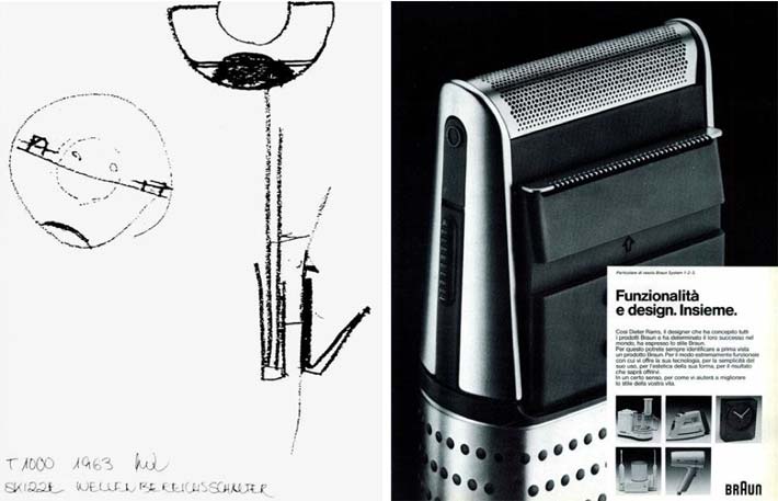
This is Dieter Rams documenting the cutting element of the Braun razor. The sketchs shows the detail of the blades insidde the razor that clip the facial hair and capture the stubble in the rounded metal of the cutting end.
Sources: Less and More: The Design Ethos of Dieter Rams and "Alessandro Mendini interviews Dieter Rams" on Domus
We sketch to experiment
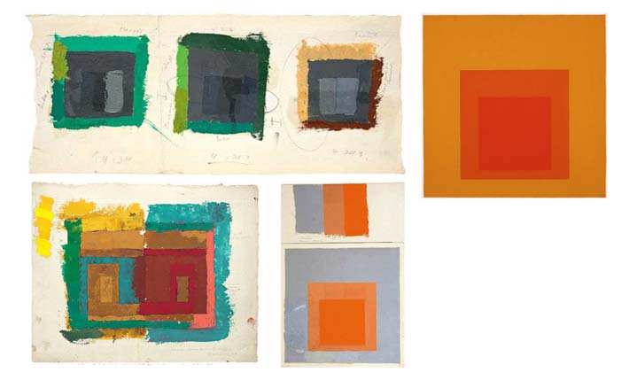
This is painter Josef Albers who is known mostly for these minimalist paintings of color fields in his "Homage to the Square." work. He doesn't start from painting these clean lines, he starts with testing these colors, and how they work together and against each other with these rough sketches in paint and color.
Source: Albers Foundation
We sketch to communicate & explain
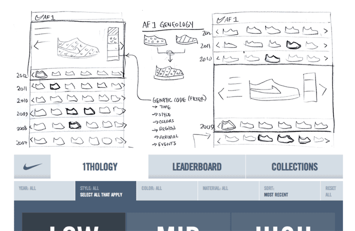
And the things most of us are familiar with, which is the use of sketching as a tool to come to an understanding about how a product is going to function. This is the kind of sketching I do most, which is a sketch that communicates the behaviors of an interface.
This is Gene Lu's sketches of the filtering interface, for the Nike Air Force 1 Facebook app. And you see him exploring the filtering mechanism in the middle, and how he's showing how the different characteristics of a shoe can be selected to refine search results.
Source: Portfolio of Gene Lu
Sidebar: The Design Process
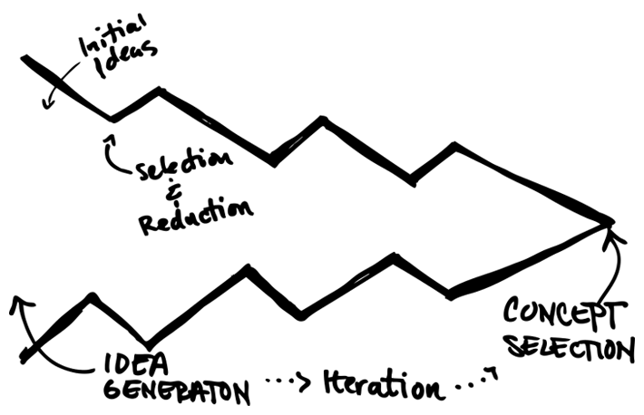
The real turning point for me had to do with where sketching fits in with product design. And this is where we come back to Buxton in this diagram talking about design process.
This expanding and narrowing chart shows the growth of ideas you generate at the beginning of a project at the left. What you're trying to do is come up with as many ideas as possible.
And then there's a narrowing of the flow, where ideas are being selected. And when decisions are made, you expand a little bit to explore more of the ideas in each iteration and refine them. And you keep doing this iteratively until you arrive at the final concept.
And the sketches are looser and lower fidelity at the beginning and have higher fidelity at the right end.
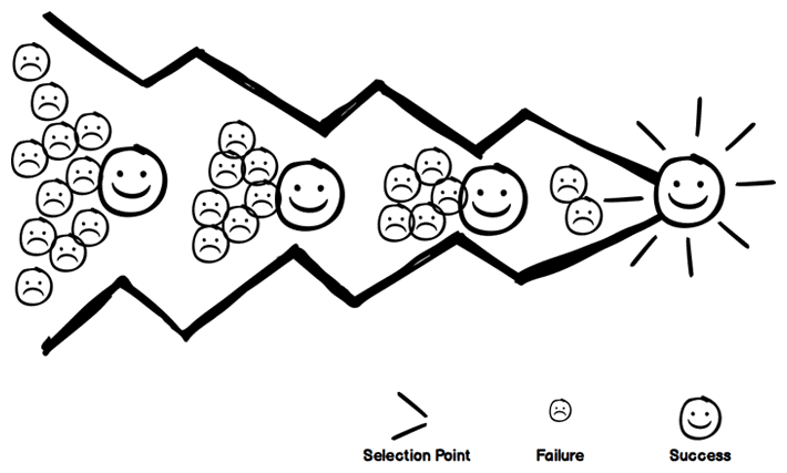
We sketch to fail faster
Failing is the point. This process has a lot to do with mitigating risk. You make all the mistakes now in paper, where it's quick and cheap, and when you can do it with a much lower risk factor than when you're working in code. Making changes on paper costs you only time, and in the end saves you time if you've discover problems along a line of thinking before you've coded it. Pivoting once you're dealing with working code is much more expensive.
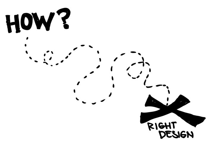
We sketch to find the right design
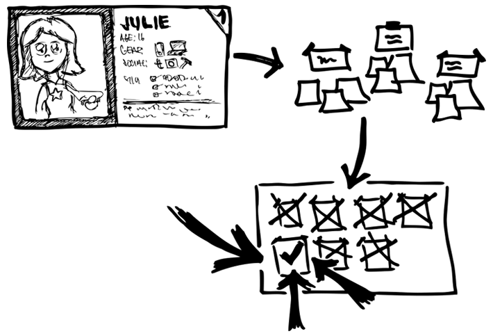
The final point to investing in this activity up front is this. You are expressing a lot of ideas so you can eliminate the ones that don't work, and select that ones that are right, and solve the problem you're supposed to be solving—the optimal solution. This final, "right" concept declares the intent of the product you will build.
How Do We Do It?
All the "whys" are what I focussed on when I was starting over. It may seem like a lot of torture to think about all these things when on the surface, sketching seems like something you should just do without much thought. But, I had to understand why I was feeling like I wasn't using sketching with intent. I wanted to know how I could use sketching in a way that is helpful in creating successful products.
So I really started to think about how to do this in a repeatable way every day. I needed to put it on paper, and be able to describe what I was doing to others I worked with. I needed to be able to test the idea with others as I tested the practice on projects.
I ended up with a small set of guidelines that were easy enough for me to follow, and it may come off as being obvious, and perhaps stated simplistically, but I'm a simple guy, and I need a clear and easy approach if I'm to have any hope of sticking to it. It's much harder to do these things every day in practice. Believe me, it's easy to get seduced by tools and the details rather than see the bigger picture.
First, I want to talk about the pre-requisites to my guidelines, starting with the basics. What follows afterward is the approach I've laid out for myself that I have been practicing.
Anyone Can Sketch
If video above doesn't load, you can view it here.
I started with this basic idea that anyone should be able to do this, and how can we simplify sketching using a basic set of elements and language that anyone can use.
These are some ideas that I found from Dan Roam, John Landay, and Dave Gray. The idea being that once you have these basic elements, a few forms, and some arrows and lines for flow, then you have the tools you need to express any idea.
This is all you need to learn to start to communicate visually with a sketch.
Work Fast
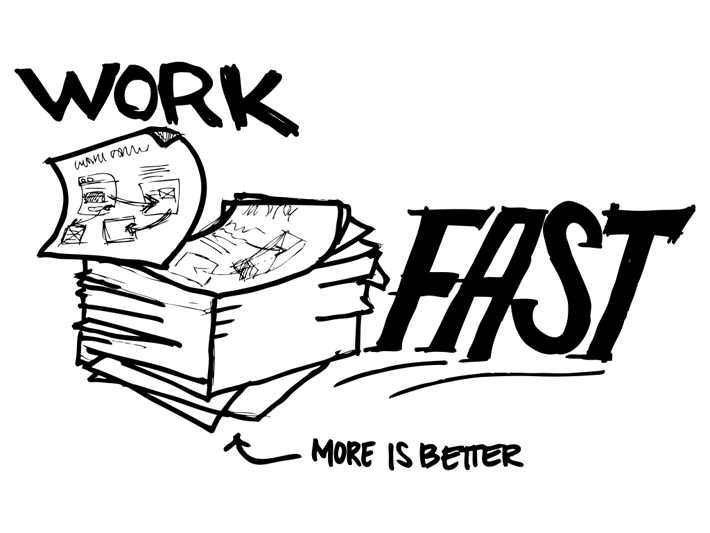
This was the first guideline that I created for myself to follow, and the one I work hardest at. So the idea is to sketch faster, produce more, and to not stop and think too much about what I was doing when I was starting a design, but to get the ideas out, make them flow, and produce more.
I wanted to start to try to come up with as many ideas as possible for any one problem that I'm trying to solve, because more is really better at this stage than diving deep into details.
Working fast and generating more is fantastic if you're working in a design studio or any size team. Anyone can participate from designers and developers to business analysts and stakeholders. There are several great techniques that work well for eliciting more ideas that you can look to for inspiration. The idea with these techniques is that you gather around a group of people to work on one idea, with each person sketching a number of solutions for a problem.
I like the team-based design concept that I've heard Tod Zaki Warfel discuss. His "6-8-5" exercise works something like this. If each person in a group of 5 people got together and were given 5 minutes to to sketch 6-8 ideas for an interface, at the end of that 5 minutes, you'd have a pool of 30-40 ideas you can review. It's a fantastic idea for rapidly exploring concepts in a team. See the links below for resources to help you incorporate these exercises into your process.
- Leah Buley's sketchboard technique is discussed in her "UX Team of One" talk. Leah's 6up templates are also available for download on her site.
- Tod Zaki Warfel's 6-8-5 is discussed in his Rapid Design Techniques talk. He summarized approach in this Quora discussion. See also his Prototyping book.
- On Konigi, you can also download a free 8-Up Sketch Template to use in rapid design sketching exercises.
Capture The Essence
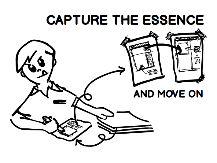
The act of capturing the essence is something I remember and love from figure drawing classes. In a figure drawing class, the 1 minute and 3 minute pose are warm up exercises you do at the beginning of a session, where the purpose is to get you to loosen up and freely and loosely capture the figure, usually on newsprint, and usually as a way to get you ready to begin the real work. With speed and brevity in mind, one tends to look more at the whole form and the bigger picture and capture the character, gesture, and energy efficiently in as few lines as possible. In 1-3 minutes there's no time to focus on details.
The figure drawing sketch epitomizes for me what the quick thumbnail sketch is about. Capturing the essence when I'm exploring ideas for the first time and then forcing myself to move on is a point that I try to remind myself of every time I approach a sketch book. When you're working fast you need to do only what's necessary to express the idea and keep moving on to the next idea.
In the beginning of each iteration of idea generation we're concerned with volume. We're concerned with trying to get as many ideas out as possible. We'll come back to refine when we select the ideas with merit, and to refine further in the next round of iterations.
Ugly Is The Point
The next idea I had for myself was to stop fussing over the details because at this point of the process, the important thing isn't representing the reality of how a button is going to be visually rendered and designed. But right now, I need to focus on representing the function and intention of the design before I actually work on the details.
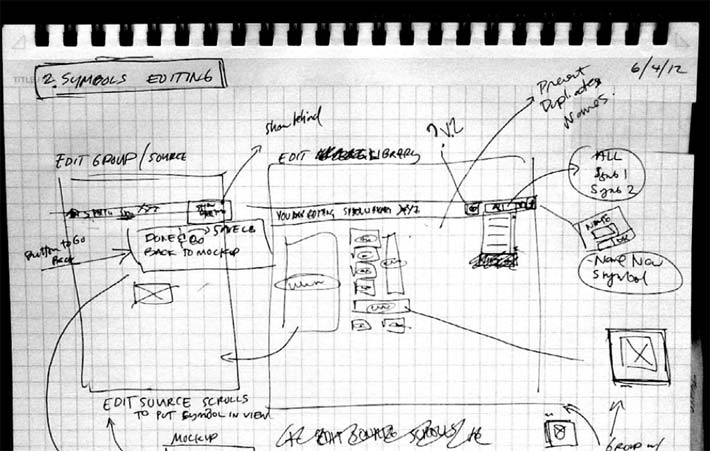
This is a sketch that we worked on in Balsamiq during a kitchen table discussion. We were discussing how we wanted to evolve the Spartan interface of an advanced feature that a small percentage of our users used regularly, to make it friendlier. To look at this mess of crossed out words, squiggles, and messy lines, you'd think nothing of it. What a mess, right? But this is what happens when you're working out a solution to a problem. There will be mistakes. There will be adjustments in direction, and there will be exploration.
Ugly is the point when you're sketching. When we're capturing ideas at the speed of thought, the ideas will come faster than our hands can sketch them. So the messiness of though—the uncertainty of the evolving idea—is reflected in the sketch. However, while this sketch is not pretty, it does reflect the problem solving process. Although it may be difficult for those outside the conversation to see, the arrows and words represent the behaviors we want to trigger, and the controls that will be used in the interface.
Embrace Constraints
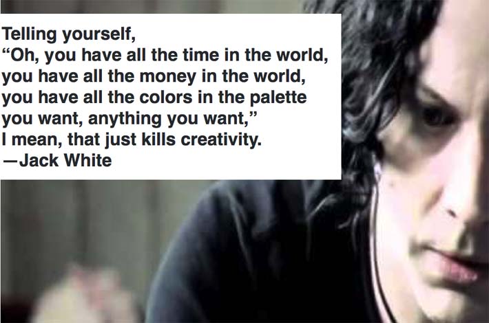
Source: Under Great White Northern Lights and "Jack White on Creativity" in Makin Ads.
The idea of using constraints to your advantage is important to me because it forces me to not care about how something looks, but force myself to focus on how something functions. I also like to call this the less is better rule.
This is Jack White talking about the power of constraints and using them to your advantage. What he's talking about is that all the tools and money in the world can actually prevent you from being creative if you end up thinking about tools more than coming up with the ideas.
The idea also reminds me of an interview I once read. I think it was either an interview with fashion designer Michael Koors or with Tim Gunn. Sadly I can't recall where I read it. But the gist was that fashion guru in question was asked why he wears nothing but black suits. He said something like wearing simple and black means I don’t have to bother with making decisions about what I wear every day, so I can focus on the harder decisions about what other people are going to wear. I love this idea. Barry Schwartz's Paradox of Choice also talks about this idea of removing choices might be one way to help focus on the important problems.
There are lots of ways you can put this guideline to work in how you sketch, or in anything you do as you make products. To put it in simpler terms, I've thought of this as "Less is Better" when it comes to reducing tools and devices in the periphery.
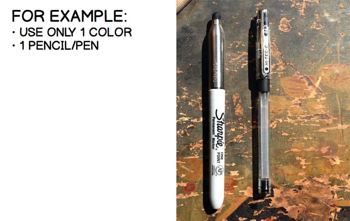
Here is an example of one expression of the idea.
I picked this constraint. To capture ideas:
- pick one tool
- pick one color
Forget about the rest, because you're just trying to get the idea from here down to paper.
For you it could be something else. Take the example of Twitter. It's amazing that something as overlooked as imposing a constraint on the number of characters in a message can be so powerful, but the constraint leads to a very different form of communicating and a different way of framing ideas compared to longer, and often less edited messages. The constraint can come from anywhere, but for the technique of sketching, I focussed on the pen I use.
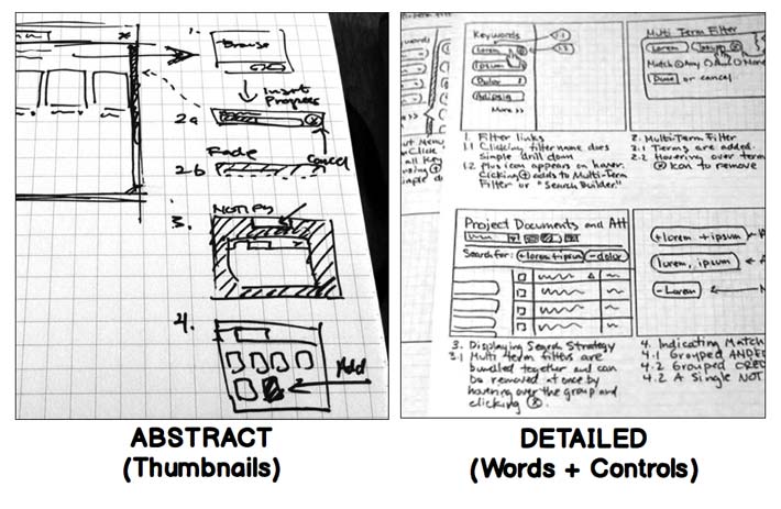
1-2 Levels Of Fidelity
When I talk about fidelity, I'm talk about I'm just talking about starting at a really abstract point, because when you're working really fast in thumbnails, you're just throwing down squares and squiggles.
From there once you need to add more information, that's when you get to making the boxes bigger, adding controls and words. And then you're also adding a lot of description to fill in the picture.
Ideas Come At Any Time
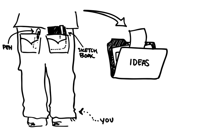
This is more of a tip than a guideline, but a lot of ideas will come when you don't expect them, because once you start working on a problem, your brain can be working on the solution and then you might passively come up with the idea somewhere when you you're doing something else and are not ready for it.
For me that happens a lot in the shower. I do a lot of foggy glass sketches in the shower while my mind is focussed on shampooing for some reason. When I used to drive to work, it used to happen in the car. Or in New York it happened in the subway.
This is something that is common for a lot of designers and artists. Austin Kleon's book Steal Like an Artist talks about the artist David Hockney, who had suits and pants tailored to have pockets to hold sketchbooks so he was always ready when an idea came.
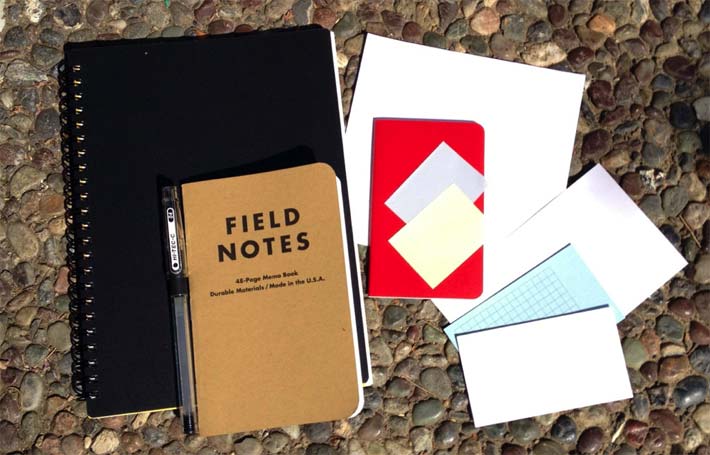
I carry paper in all sizes from sketchbooks to the little Field Notes books and the pocket Moleskine notebooks, and Levenger business card-sized cards that I keep in my wallet.
I also work on real and imagined projects to practice. While I’m on the subway, out at a cafe, anywhere, I practice my shapes and lettering, and take lots of notes to myself. I also take lots of screenshots and keep a swap file of things to steal.
Doodles are also important. I think of the doodling I do as my bonsai. It’s something I do repeatedly in my sketchbook with no real purpose, but sometimes the random doodles lead to real ideas.
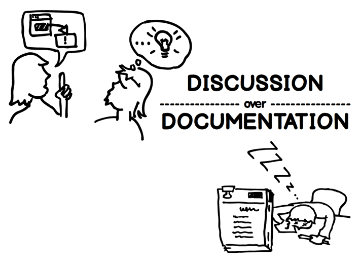
Discussion Over Documentation
This is really in the same spirit of the Agile Manifesto principle, “Individuals and interactions over processes and tools” and “Working software over comprehensive documentation.“
We hate documentation when it’s done in isolation, when it’s costly, when it means less discussion between team members. This is a point I make a lot when I speak to people about design. The goal should be to discuss ideas, make decisions based on discussion, and to favor discussion over huge decks of documentation.
A lot of people don't want to work with specs. I like to work with people to solve a problem, and in an iterative design, the point is to use sketching to figure out the design you're going to work on.
In a perfect world, we’d all have extra sensory perception and communicate telepathically what we imagine. But we don’t have that, so we rely on talking to each other, and explaining with pictures and models, doing what's necessary to find the idea that works—focus on talking to each other and getting to some consensus fast.
Explain Or Ideas Will Die
When you work fast and loose, one thing that's easy to neglect is the explanation. I find that I have to remember to describe everything with text. I have these sketches sometimes where I'll just make a few boxes that point to each other, and I'll come back and think, what I was thinking? I'll have no idea.
A sketch is useless to you unless you can come back and recall the details of your idea. It's even more useless when it's time to come back and pass that idea to someone else. Sometimes a high level of abstraction can only go so far in helping to sell your idea without detail, because most likely your idea needs to be picked up, understood, and acted on by someone else. Words are important.
When I look at messy sketches with words all over them and arrows criss-crossing between boxes, I'm reminded of the algebra teacher that repeatedly said "SHOW YOUR WORK." Showing your work in math is important to showing that you understand and can trace back how you arrive at a solution. Using annotation and markup is as important in sketching. It explains what's going on, and helps you visualize a path of interaction, and go back and retrace the steps when you reach dead ends. I'll take ugly sketches that show your thinking over pretty sketches that do little more than put lipstick on the pig.
Know When To Stop
I know this is easier to say to some people than others. If working on an agile team, you have no problem with this.
There does come a point where you can stop and leave the sketches behind. Maybe you can use them as a reference to remind yourself what you were thinking. But you don't necessarily need to rework or update them—and the same with wireframes—the purpose of them is to help you think, make decisions, and pick the solution you're going to design. Then you build.
The problem I have selling this idea is that for a lot of people, especially in in the agency scenario, the document is the deliverable they're selling. In an agile team you would have no problem with this since many product teams start their working code.
This goes along with the discussion over documentation argument. If the situation allows, you build when the expression of the interface is good enough that everyone understand what to build. Then that expression gets validated or disproved with a working product.
If you’ve done you’re work of picking the right design, and solving the right problem, then the risk has already been mitigated in a huge way, so you hopefully need only to make smaller changes rather than disruptive pivots.
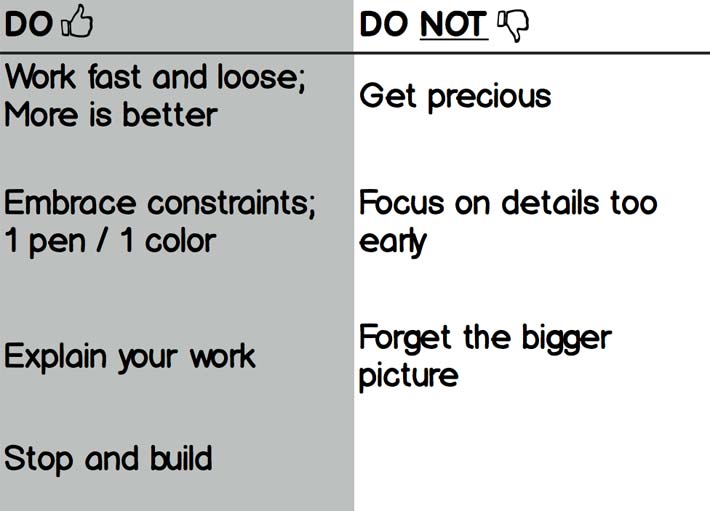
Do's & Don'ts
To recap... I guess the purpose of me getting in front of people to talk about this seems silly, but it's really easy to get into this cycle of thinking about your tools and documents rather than thinking about your product.
The reminders I have at the end of this are to really not worry about focussing on the details and getting precious about your work at this stage—the early idea generation stage. Keep stepping back and keep putting the bigger picture in mind as you go.
A Final Word
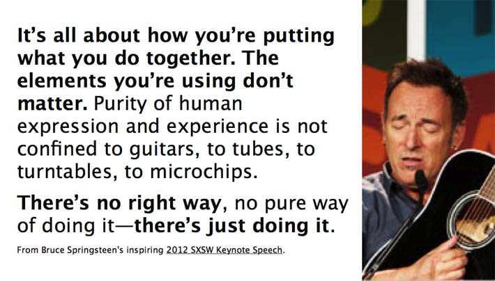
I thought a great way to end this message is to let someone much larger than myself make this point.
Creativity is never really about the tools or what you're using to get your idea. As Bruce says here, "there's no right way, no pure way of doing it—there's just doing it."
The act of thinking and solving problems is what's important, and I just happen to believe that sketching is one really powerful tool to do it.
I really believe there's a way to do it that should feel easier, and you shouldn't have to struggle with the feeling that you suck at it, because this is one case where sucking is not a bad thing, if you're doing it with the right intent of solving the problem in mind.
Thanks. Make Great Stuff.
Can't get enough? Here are a few more great resources not mentioned, if you want dig deeper into Sketching user interfaces and interaction.
- "Why We Sketch," by Jared Spool. User Interface Engineering.
- "Sketch Sketch Sketch," by Joshua Brewer. 52 Weeks of UX
- "Forms, Fields and Flows," by Dave Gray
- Brain Doodles, Visual Thinking Tutorials.
- "Think You Can't Draw? Here Are 6 Artists Whose Work Will Help!" by David Barnes.
- Konigi articles on Sketching.
