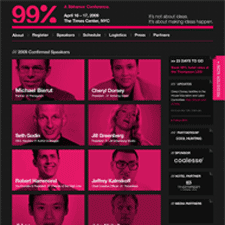
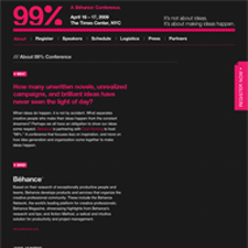
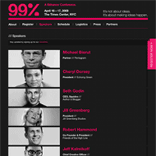
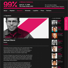
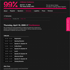
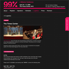
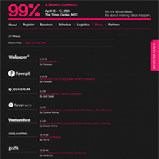
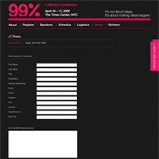
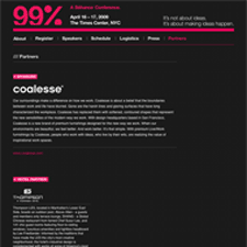
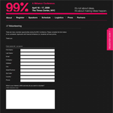
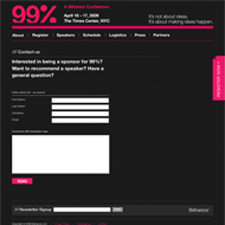
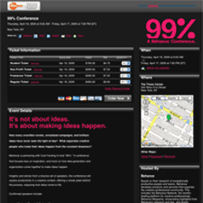
Behance's 99 Percent Conference bills itself as one "...that focuses less on inspiration, and more on how idea generation and organization come together to make ideas happen." Not suprisingly, they have one of the best looking conference sites to set the stage, showcasing the speakers and event. The treatment of the slash motif morphing into the trapezoids repeated throughout the site in the photography is cool. I like the dark bold color treatment and the clean hierarchy in tables, forms, and text.
Published on Monday, Mar 23, 2009 in designs
