I'm a big fan of zoomable user interfaces. When they're done simply and elegantly, the experience of navigating through a ZUI site is sheer pleasure. You never lose a sense of where you are, and the whole of the site is near by. On small, manageable sites where the number of sections is not very wide or deep, the zooming paradigm works very well.
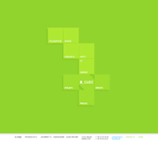
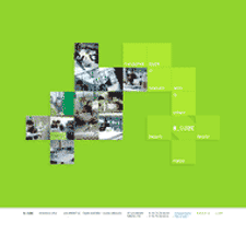
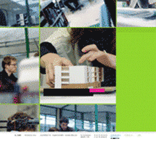
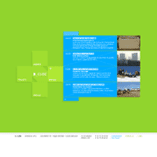
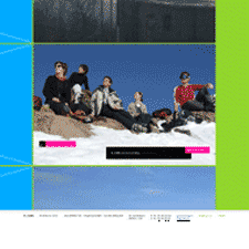
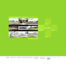
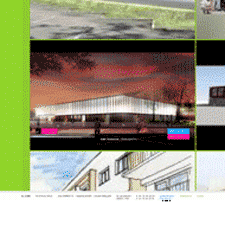
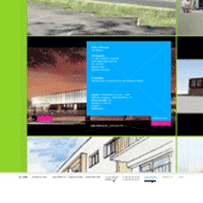
Danka Studio, which creates sophisticated, interactive navigation on its Flash sites has achieved that with the site created for French architecture firm B-CUBE. The mosaic of screenshots here shows the branches I navigated to on every side of the cube. The user enters an unfolded cube, that continues to fold away like an deconstructed origami box as each panel is explored. Zooming into a single square can be like dropping into another world, where photos, illustrations, and articles come into view. Moving through the pagination of a single square provides even further detail into this view. Superb.

