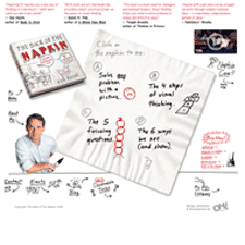
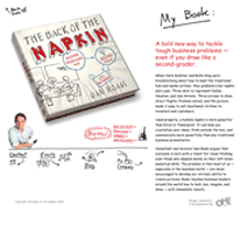
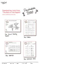
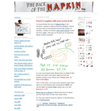
I can't think of a more appropriate site for a cute hand drawn interface than for The Back of the Napkin book site. This is a great book for anyone who wants to expand their tools for business thinking. Dan Roam provides a friendly approach and simple formula to using drawing to collect, analyze, and communicate problems and ideas, and you don't need to be good at drawing to do it. This is turning into more of a book review than a site review.
I'll just say that the art direction for the flash on the napkin is appropriately fun, casual, and makes an effective pitch. The rest of the site could be pulled together to feel more cohesive to me. I could do with some consistent color treatment and navigation on all the pages and the blog. That blog could look more like the main site.
