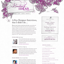
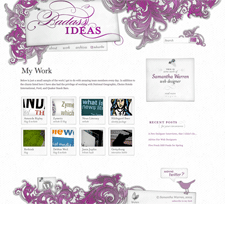
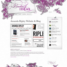
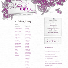
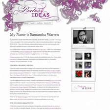
Samantha Warren's blog and portfolio is features some great layered graphics in the trompe l'oeil header and footer and some lovely type. I like the paper textures, the subtle shadows and little 3D effects, the nice treatment of the search box, and the general feeling of dynamism created by the asymmetry of the header/footer and layering, balanced by the strong alignment in the body. Nice stuff.
Published on Wednesday, Jun 3, 2009 in designs

