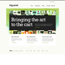
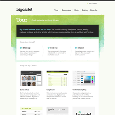
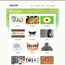
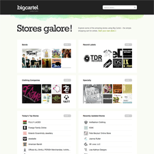
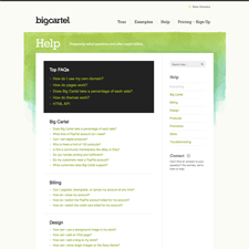
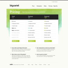
Shopping cart provider Big Cartel hosts simple, customizable ecommerce sites for independent creatives, e.g. artists and musicians. The company site sells the product by describing the service in terms of value, and by providing examples of other artist sites, and the design experience. I think the soft textured watercolor background in the header gives it a hand-crafted feel that's appropriate to this audience. I think emphasizing the sign up link slightly might be a good idea.
Published on Thursday, Jul 2, 2009 in designs
