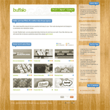
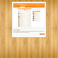
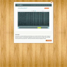
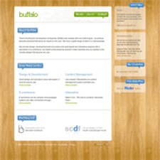
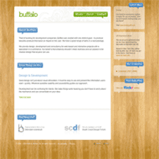
Buffalo's site is simple on the surface, with very few pages. What I like most are the transitions when you click to view their work. AJAX is used to display work in-page, similar to the functionality of a lightbox, but doing away with transitions typically indicated by graying out the background. This version displays the portfolio panel with a close icon. They also use AJAX to toggle visibility, e.g. in their About page.
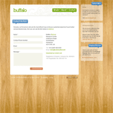
I also liked that visually the site is both ornamental and clean. The colors of the wood panel background provide warmth and the subtle ornamental flourish in the header makes everything feel stylish and quirky. The cool colors of the text contrast enough with the wood to make the page visually easy to scan. The comment bubble headlines and buttons with handwritten text provide a human feel.
