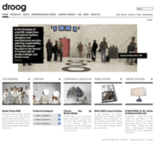
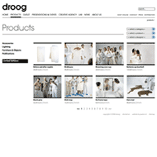
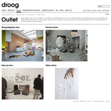
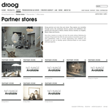
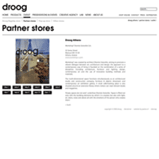
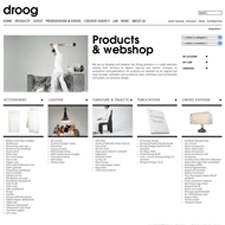
droog is a Dutch company, led by Gijs Bakker and Renny Ramakers, that art directs and sells products collaboratively created with designers worldwide. The site showcases the droog collection, whose products are categorized as accessories, lighting, furniture and objects, publications, and limited editions.
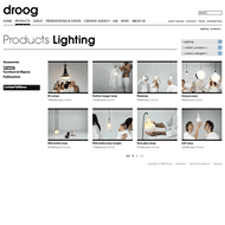
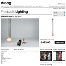
The design aesthetic is modern and minimalist, and conveys a sense of wit which mostly comes across in the product photos. There are unexpected twists, like a right aligned breadcrumb, and simple touches like the category/product/designer drop down menus.
The only minor nits I have are with the treatment of navigation and information architecture. I thought the product categories could be treated as part of the global nav, to be consistent with the Outlet and About Us sections. I also didn't see the need for the separate paths for a single piece of content, e.g. Products > Lighting > Milk Bottle Lamp, and Store > Lighting > Milk Bottle Lamp, but there may be a good reason.
