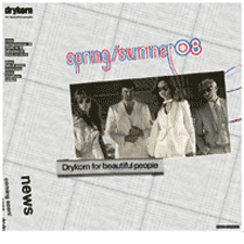
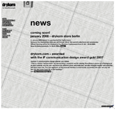
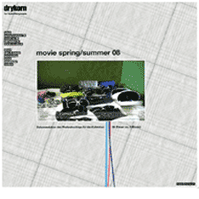
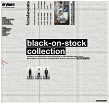
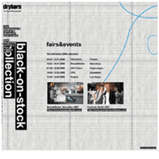
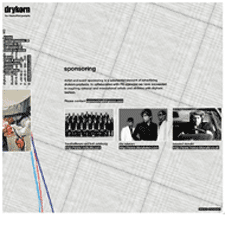
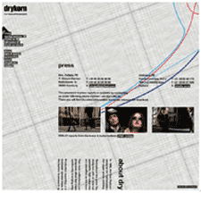
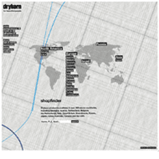
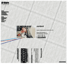
With a tagline like "for beautiful people," your web site better beautiful too. Drykorn totally delivers on that promise. There are very few sites I gush over, but every time I come back to this site I want to just wrap myself up in it. Each season the design takes on a new texture, in line with the colors and fabrics of their garments. The design showcased here is for Spring/Summer '08, and its appropriately light, but summery fabric background is still as rich and textured as the dark woolen background they sported in the Winter look.
The site is rich with photos and interaction with the panning, zooming, and rotating ui might feel a bit heavy on a slower connection, but it seems appropriate to the brand. It's sophisticated and fun. To top things off, urls are formatted for search engine optimization.
