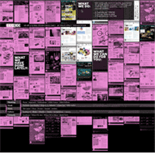
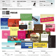
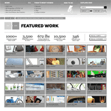
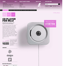
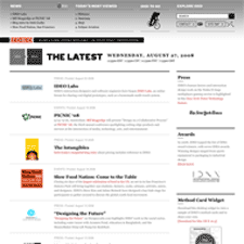
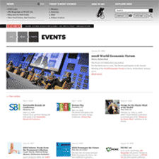
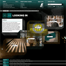
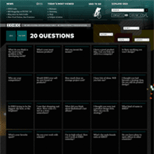
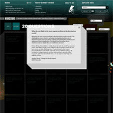
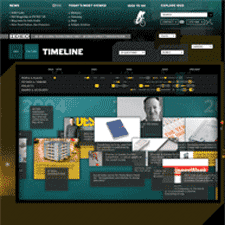
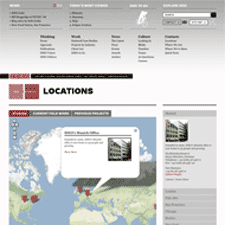
The redesigned IDEO site has been sitting in a browser tab for a few weeks now because it just felt like one of those things I needed to mull over before writing about. It's one of the few sites this year that just took me by surprise. In short, the deep treasure trove of content unleashed in this redesign is a huge departure from the tightly constrained and minimalist prior design. The old design featured a buttoned up business face, showcasing and marketing what they do and have done. The new design pulls down the curtains and shows more of who IDEO are and how they do what they do from many perspectives. This quote from IDEO designer Valerie Casey describes this new desire for transparency.
"For me, the greatest achievement of the new IDEO.com is that it really manifests IDEO's culture--transparent, messy, highly creative. We are a family of observers and collaborators, builders and storytellers." (From Core77)
I was initially overwhelmed when trying to make sense of the site. The loose and deep architecture and the flipped upside down navigation seemed the antithesis of the tidy IDEO sites of the past. But after that initial realization that there would be so much more to explore in this site, one digs in, and all of the references and currency of the exposed business begin to make sense. They're telling a different and more intimate story here, and its one that lets you almost feel like a fly on the studio wall. What you buy into here is the value of this culture, and the beliefs they're communicating. It's really the way marketing should be done.
