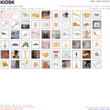
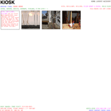
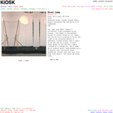
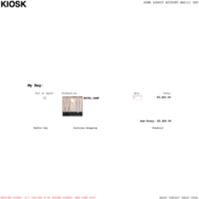
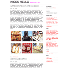
You probably know that I like minimalist design. I like it not only for its aesthetic appeal, but because of its utility in helping to bring clarity or focus to an idea. The site for the KIOSK shop utilizes a minimalist aesthetic. I can't say I love it, but I love the story, which can describe this better than I can.
"We offer a curated range of products from all over the world. Everything is sourced during our travels; we build the collection while we are traveling and then feature it in the shop for 4 - 6 months. ... We opened the store to offer an antidote to over-design. We consider the objects we stock to be humble, straightforward and beautiful for their simplicity and directness. Often they are traditional goods that have developed over generations or anonymous design found in general stores, DIYs and kiosks, products created by not one personality but things that are the result of local aesthetics and needs. Their beauty is sometimes hard to see in today’s market; our motivation to start Kiosk was to shed some light on these anonymous objects."
