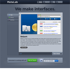
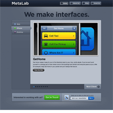
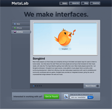
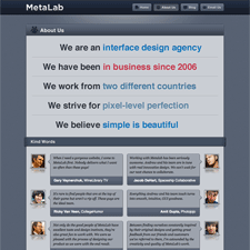
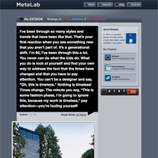
Metalab's aesthetic evokes the crisp, metalic edges and rounded stylistic elements that I've come to associate with Apple. You can see it in the details of their gradients, shadows and lighting effects. The visual style is clean, but what I found most enjoyable was the combined use of vertical tabs and carousels on the home page—essentially their portfolio. The message is really simple and bold too. "We make interfaces, we strive for pixel perfection."
Published on Monday, Jun 22, 2009 in designs
