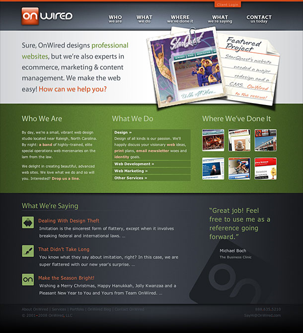
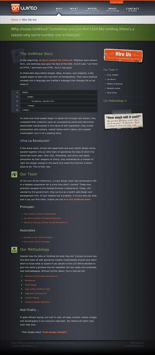
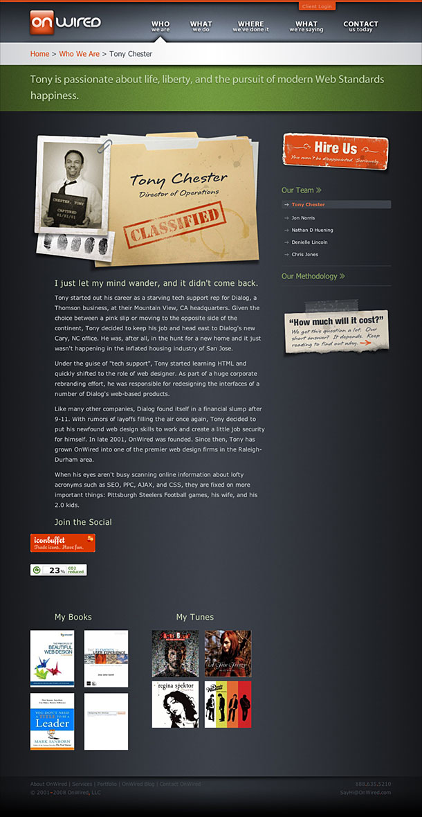
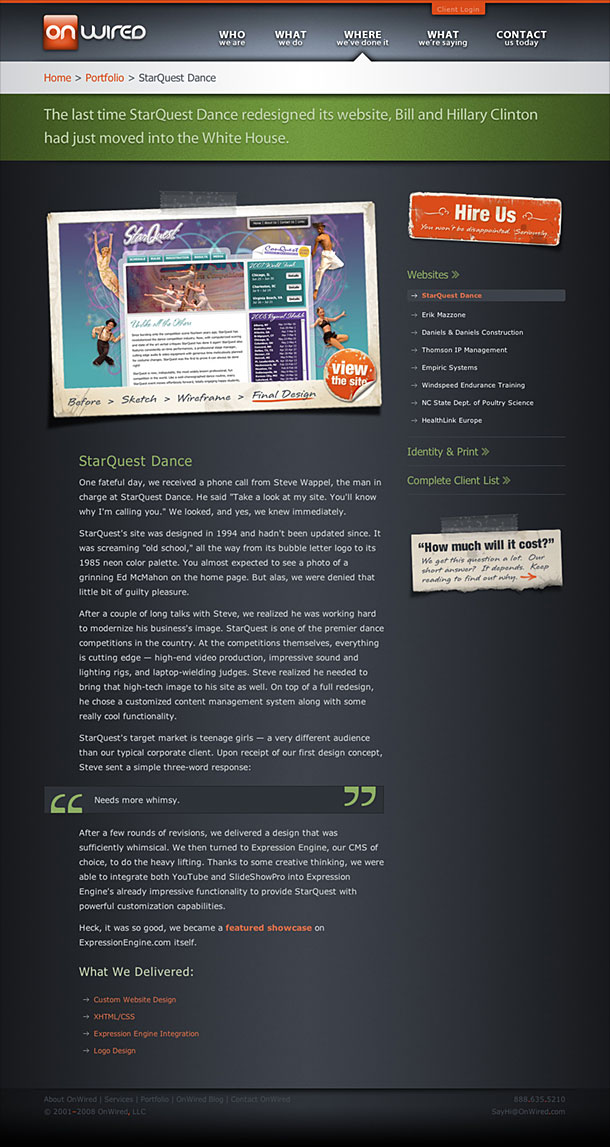
One of the things I like most about this web design shop's site is the conversational tone of the site. The navigation, for instance describes the site under Who, What, Where type categories. The copy is clear and assuring. The layout and typography also chunks up the hierarchy of page content well and the layered effect provided by taped on bits of photos and paper is nice tool for directing the eye and connecting segments of copy. One small thing I might question is the use of shadows and the protruding paper effect in each separation. I like the dimensionality and use of lighting effects and shadows in some places, but find that the technique is a little distracting in the header of the lower level pages where the shadows occur so close to one another.