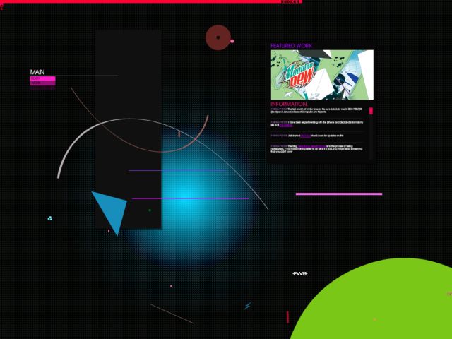
Still on the run
Daniel Brown's
Faust
if istanbul 2008
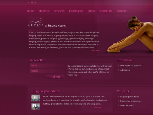
Artis3
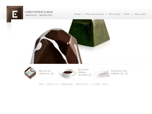
Christopher Elbow Chocolates
Design Can Change
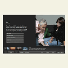
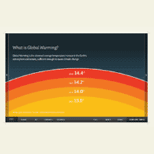
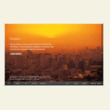
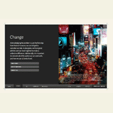
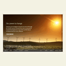
Design Can Change is a site created by designers at smashLab to provoke the community to start thinking and acting towards sustainable practices. The message of the site is delivered simply and elegantly. Succinct lead copy is accompanied by appropriate infographics, illustration, and stunning photography. Most importantly, the campaign effectively uses storytelling to communicate the issue emphatically and create connection with the audience so they may make the same pledge.
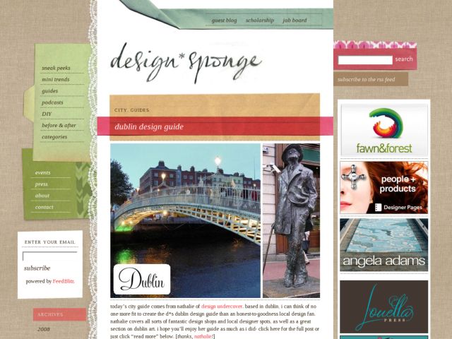
Design*Sponge
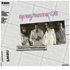
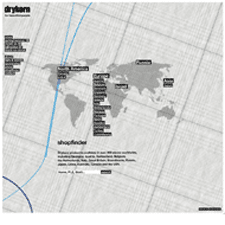
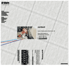
Drykorn
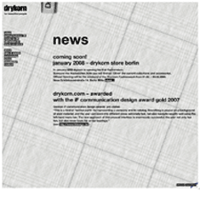
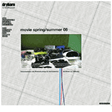
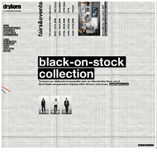
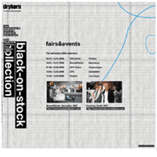
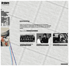
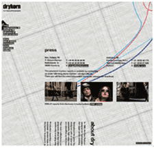
With a tagline like "for beautiful people," your web site better beautiful too. Drykorn totally delivers on that promise. There are very few sites I gush over, but every time I come back to this site I want to just wrap myself up in it. Each season the design takes on a new texture, in line with the colors and fabrics of their garments. The design showcased here is for Spring/Summer '08, and its appropriately light, but summery fabric background is still as rich and textured as the dark woolen background they sported in the Winter look.
The site is rich with photos and interaction with the panning, zooming, and rotating ui might feel a bit heavy on a slower connection, but it seems appropriate to the brand. It's sophisticated and fun. To top things off, urls are formatted for search engine optimization.
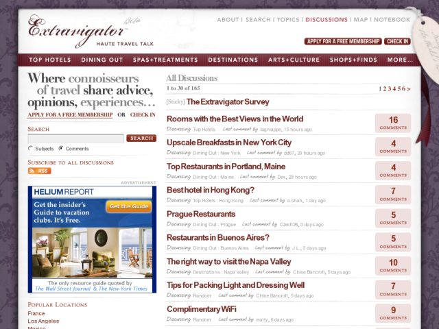
Extravigator
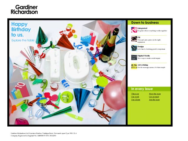
Gardiner Richardson
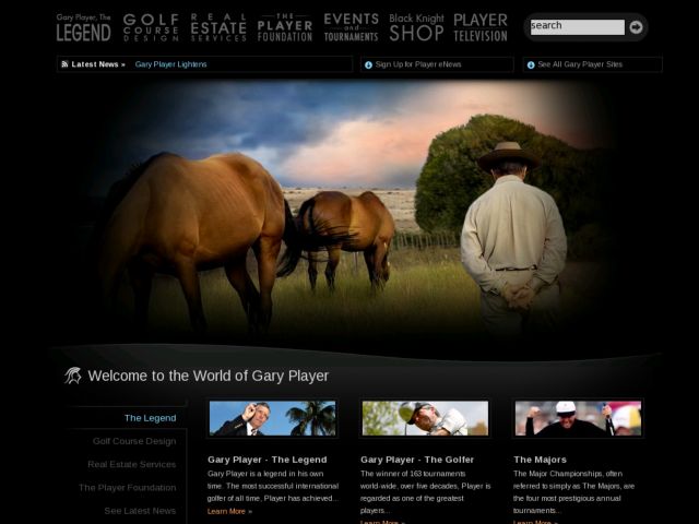
Gary Player
Grapefruit Graphics
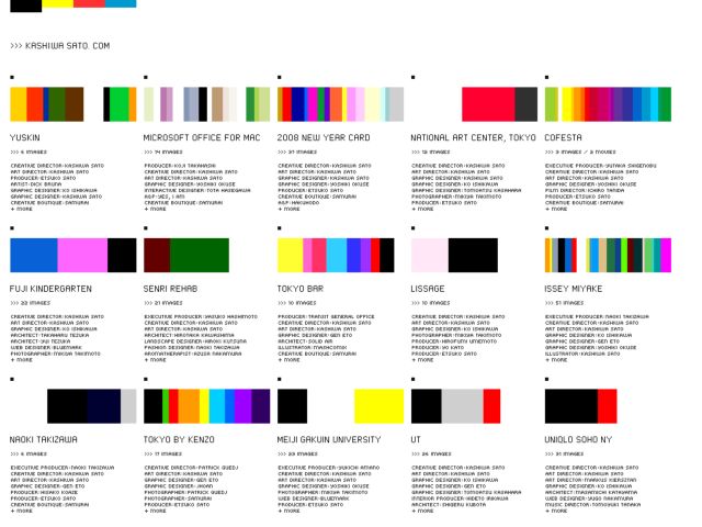
KASHIWA SATO
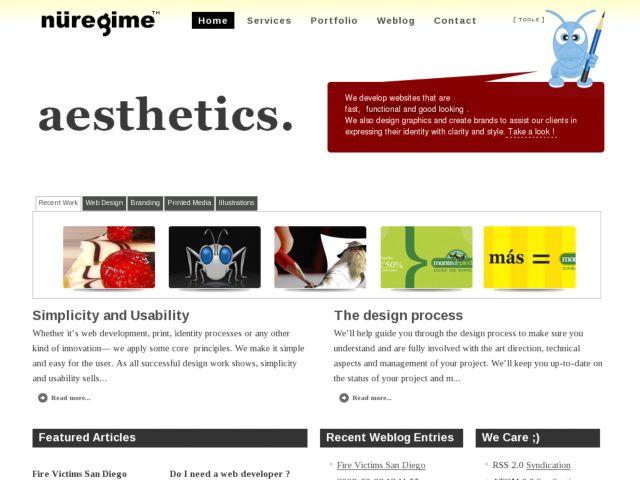
Nü Regime Graphics
NOFRKS.design
OnWired Services
One of the things I like most about this web design shop's site is the conversational tone of the site. The navigation, for instance describes the site under Who, What, Where type categories. The copy is clear and assuring. The layout and typography also chunks up the hierarchy of page content well and the layered effect provided by taped on bits of photos and paper is nice tool for directing the eye and connecting segments of copy. One small thing I might question is the use of shadows and the protruding paper effect in each separation. I like the dimensionality and use of lighting effects and shadows in some places, but find that the technique is a little distracting in the header of the lower level pages where the shadows occur so close to one another.
