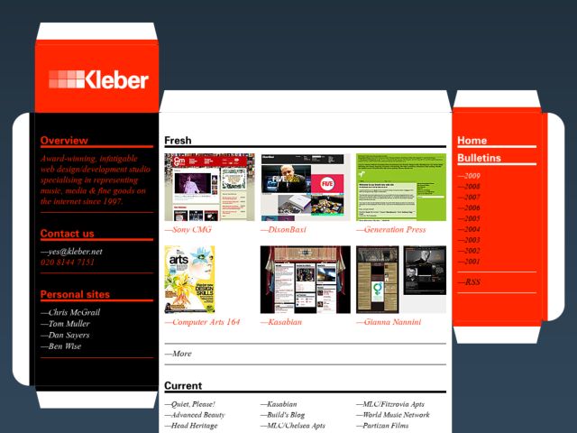
I like the clever idea to use a flatpack package to frame this UK studio's portfolio.
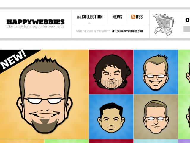
Happy Webbies
Desktops and shirts for web designers. The messages hold the world of lesser designers and developers in contempt, but the illustration is great.
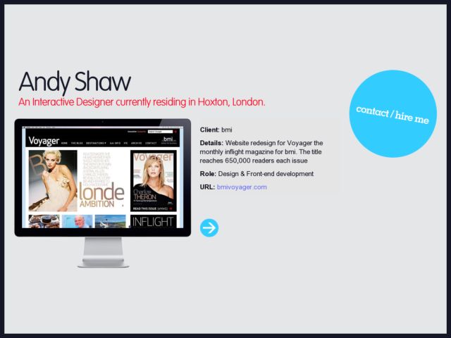
Andy Shaw
Taking a portfolio site to the bare essentials. Links to the latest work & contact options.
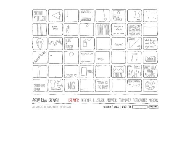
Joe
The whimsical sketched interface of Joe Davis' design portfolio.
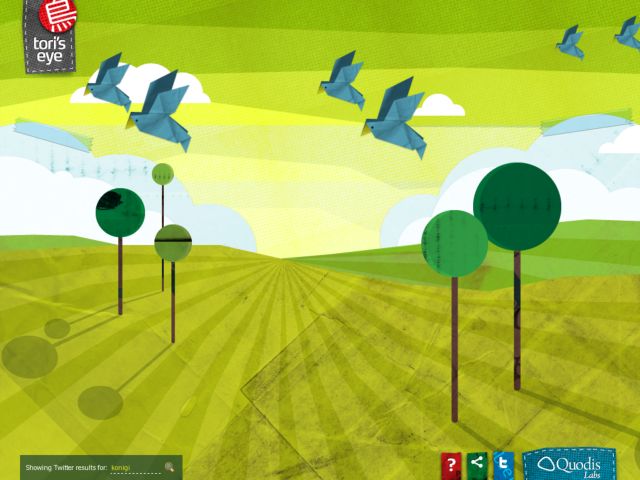
Tori's Eye
This is pretty cool. Origami birds carrying tweets while the sun rises on papercraft scenery. All done with jquery.
Orange Label Design Studio
Very nice single-page portfolio from this web design studio. Reload the page a few times to change the large header graphic. The rip-off tabs for the downloadable questionnaires and company profile are a nice touch, as are the individually laid out work samples. Would be nice to see some jump navigation between categories of the beautiful work here.
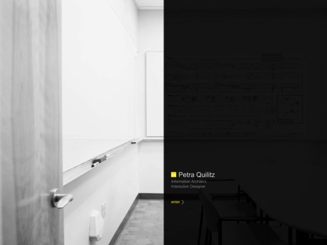
Petra Quilitz
This is one perhaps one of the most attractive portfolios I've seen for an Info. Arch./Interaction Designer. Love the use of photography to highlight the nice large deliverables tacked on the walls. Great stuff.
FatCow
Love the nutritional information panel on the right of this promo landing page. It's ashame they don't use a fun graphic like this on the regular home page.
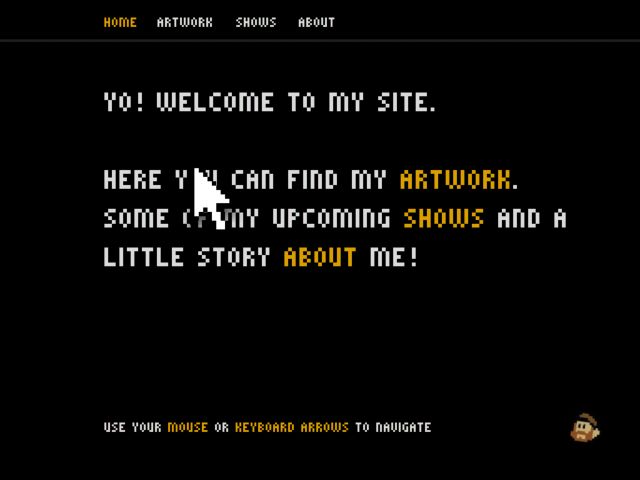
teoskaffa.com
Teo Skaffa's fun portfolio is like a tribute to 8 bit game consoles. Huge pixelated text and pointers, dinging mouseovers that make you half expect coins to pop out of links, and a keyboard navigation make this site a pleasure for NES nostalgists.
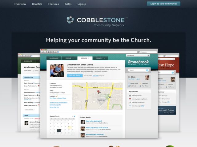
Cobblestone Community Network
Excellent use of subtle shadows and gradients in the header navigation. The faint radial gradient for the lighting effect on the centered logo is perfect, perhaps making reference to the light from a church apse shining down on an alter, which of course has symbolic meaning. It's a very subtle thing, and I'm not sure it's intended, but it has a powerful effect and adds a subtext to the design.
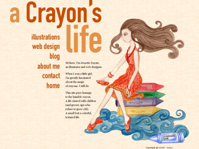
Crayons Life
The portfolio of illustrator and web designer Jessette Dayate, which pays homage to the crayon.
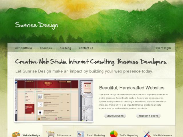
Sunrise Design
Web Studio in Baltimore, Maryland.
Carsonified
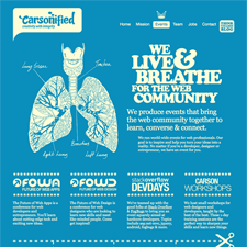
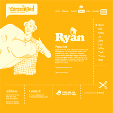
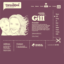
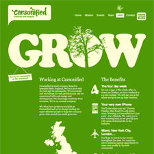
Carsonified redesigns with bold monochromatic pages with a retro look that feels insired by poster art. Sweet.
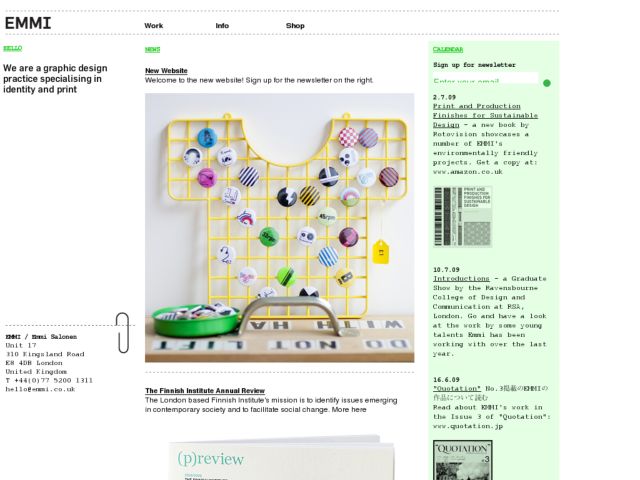
emmi
A minimalist portfolio with low-fi graphics, fixed-position navigation.
LITAGO KU-KUNST
Cute use of sticker effects and vinyl toy illustration in this promotional site for a Norwegian milk product. Love the background and navigation menu on the bottom.
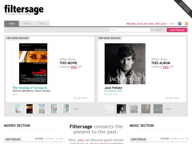
Filtersage
Filtersage connects the present to the past. You can discover great movies and music or share your knowledge by making new connections.
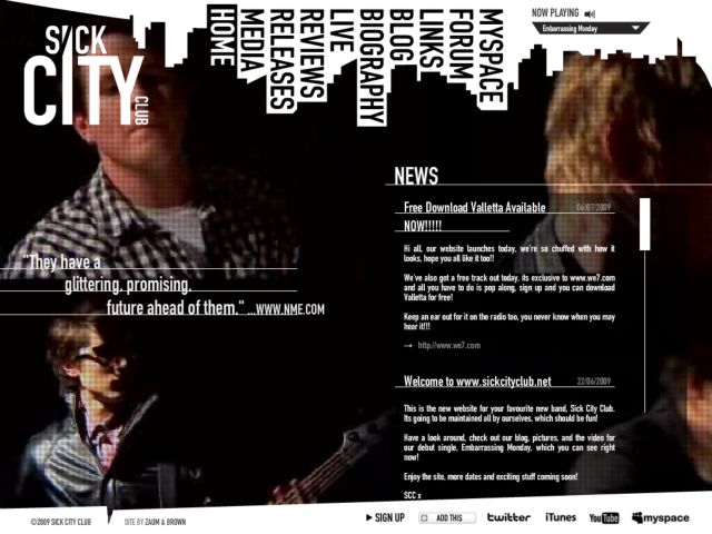
Sick City Club
Sick City Club are a new band hotly tipped for 2009 by UK's Radio One. The new site was designed and built by Zaum & Brown. It's a full flash build powered by an xml cms. The design was inspired by traveling around a city, always being on the go. The sites most prominent feature is the bands new video playing as the background.
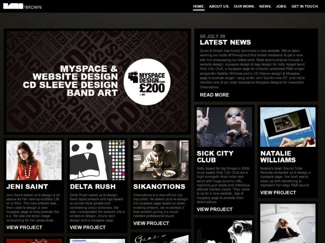
Zaum & Brown
Zaum & Brown is the business moniker for freelance designer Richard Brown - offering creative solutions including myspace & cd sleeve design to bands and artists of all shapes and sizes.
keepa
The gang is based in Lviv, Ukraine and consists of two designers and illustrators. Collaborate with web and software developers in the area of interface and design solutions. Works with advertisement agencies and magazines, draw illustrations.
Big Cartel
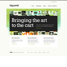
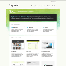
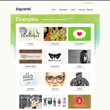
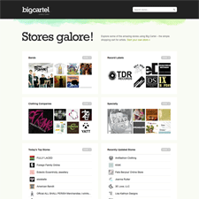
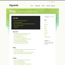
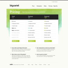
Shopping cart provider Big Cartel hosts simple, customizable ecommerce sites for independent creatives, e.g. artists and musicians. The company site sells the product by describing the service in terms of value, and by providing examples of other artist sites, and the design experience. I think the soft textured watercolor background in the header gives it a hand-crafted feel that's appropriate to this audience. I think emphasizing the sign up link slightly might be a good idea.
whnwlnd
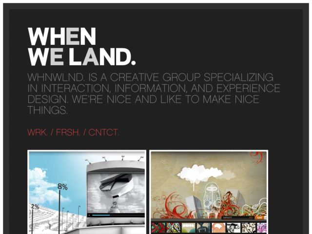
Bold type (fantastic use of Cufon) and a great looking portfolio of UX work from this Los Angeles studio.
Atomic Floyd - The New State of Sound
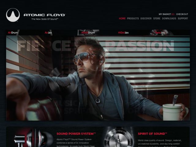
Online presence and shop for high end head phone manufactorer Atomic Floyd. Special attention was put into the html focus defocus of the navigation. By Story Worldwide.
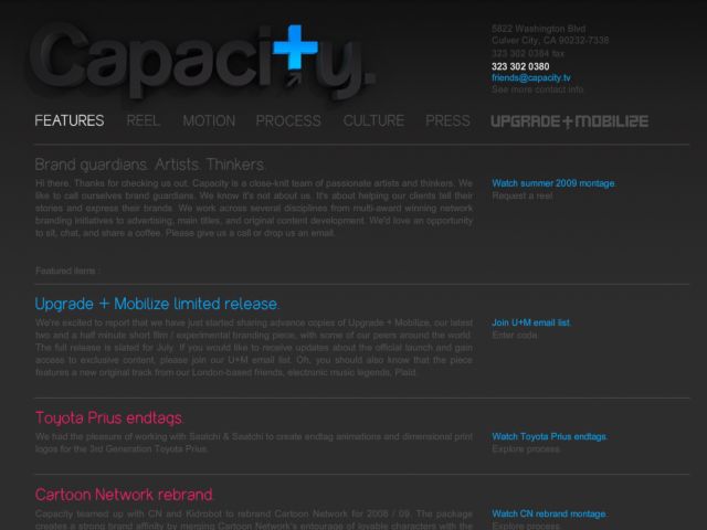
Capacity
Love the animated effect when mousing over the 3d logo. Simple grid and nice use of expand/collapse transitions in places.
Duchy Originals
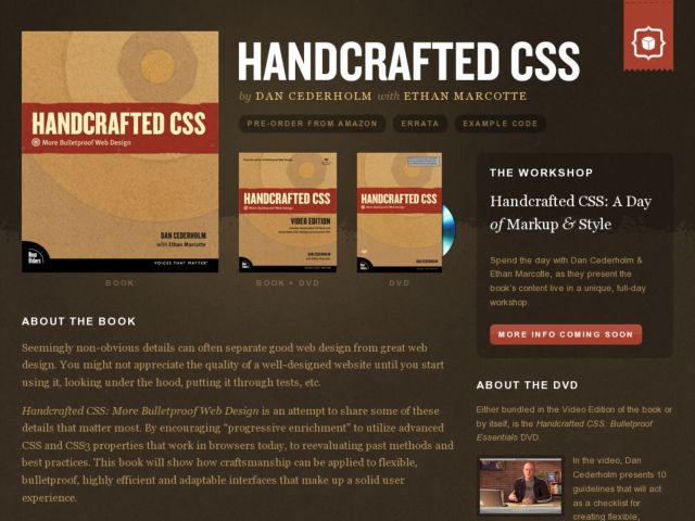
HANDCRAFTED CSS
This is the simple single-page site book site for by Dan Cederholm with Ethan Marcotte's "HANDCRAFTED CSS."
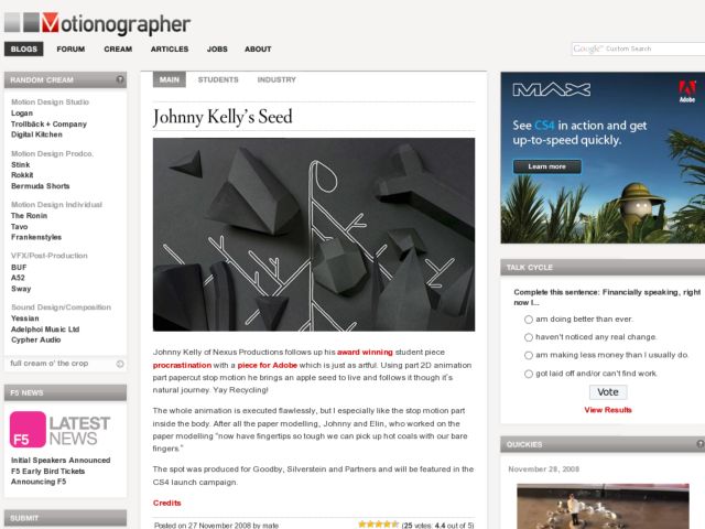
Motionographer
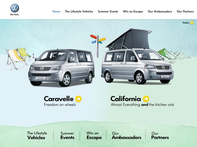
Volkswagen Lifestyle Vehicles (UK)
Love the soft texture of the water color background and the animated illustration that appears when you hover over the vehicles.
Gambolio.com - Take Control of Your Casual Gaming
London-based software developer Webalon is planning to take on the big online casual gaming portals with the public beta launch of an innovative Ajax-powered casual gaming web app. Described by Webalon founder Alex Kearns as "iTunes for online games", Gambolio allows users to create and play their own library of online games in the same way as iTunes helps people oversee their music collecion. "We want to give users the same sense of ownership of the games that people have with the songs in their iTunes library," said Kearns.
Users can choose from a catalogue of more than 8,000 free games to add to their library. Games can be filed in different categories, shared with friends and family, rated, commented on - all within a beautiful Ajax interface designed from the ground up to greatly improve the user experience of playing online games.
"While most gaming portals bombard you with flashing icons and animated ads, force you to play the games at a fraction of the size of your browser window and make searching through their catalogues a painfully slow experience, Gambolio has taken a completely different approach," said Kearns.
The application's rich, desktop-style interface and interactivity allows users to browse and search through thousands of games in a matter of seconds, play games in a unique full-window mode bereft of the in-your-face adds ubiquitous on most portals and load your friends' game libraries simply by clicking a button.
Gambolio.com's Ajax technology allows users to smoothly switch between playing games, managing their library, commenting on games... without the need for a single page reload. "It is really like a desktop application - with all the fun interactivity and responsiveness - but working in your browser. We believe gambolio.com could change the way people play online games for the better," said Kearns.
Design Hotels
Love the bold use of white text reversed on black everywhere on this site, including the forms.
Gatorade
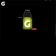
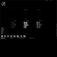
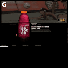
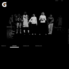
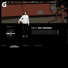
The Gatorade site redesign accompanies the drink maker's rebranding and the bold type of the product names on every bottle. Every drink name is an active message about excelling in sports and the video loop that runs in the background of product and athlete pages suffuses the site with the imagery of athletes kicking ass. A product filter allows users to view by product name or nutritient.
