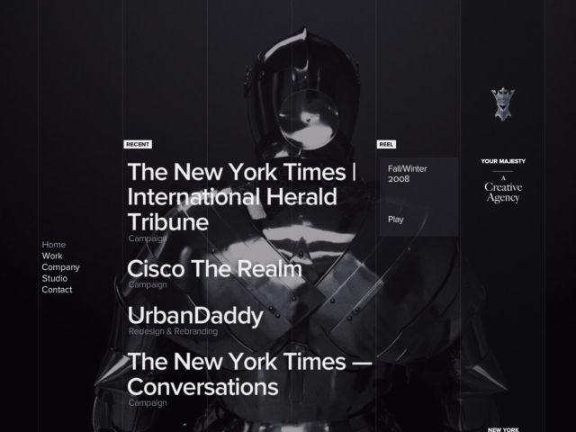
Your Majesty releases their portfolio.
Your Majesty releases their portfolio.
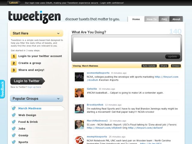
Tweetizen is a simple web-based tool designed to help you filter the daily influx of tweets, and easily embed twitter groups to your own website.
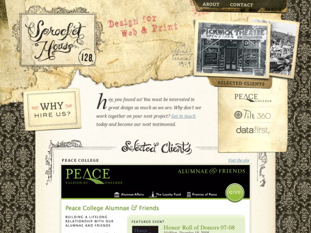
Design for Web & Print
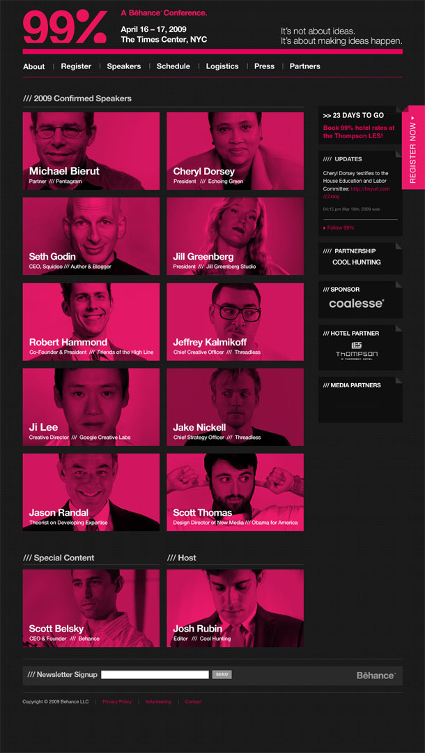
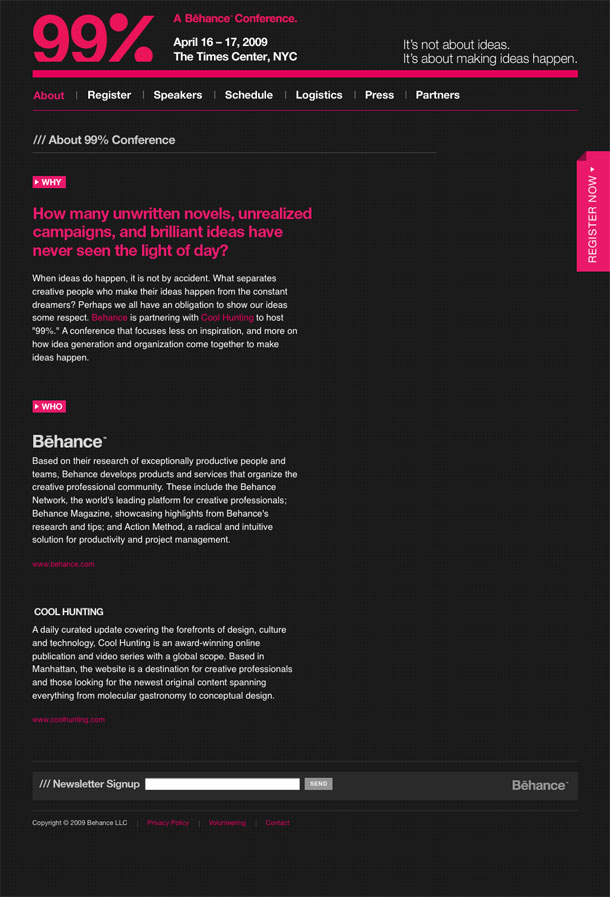
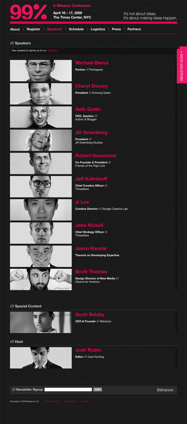
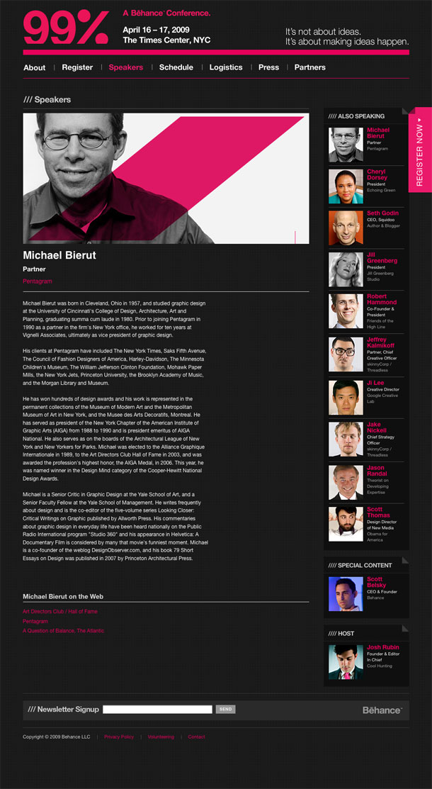
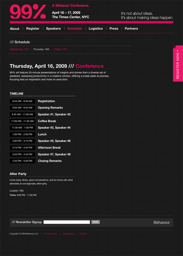
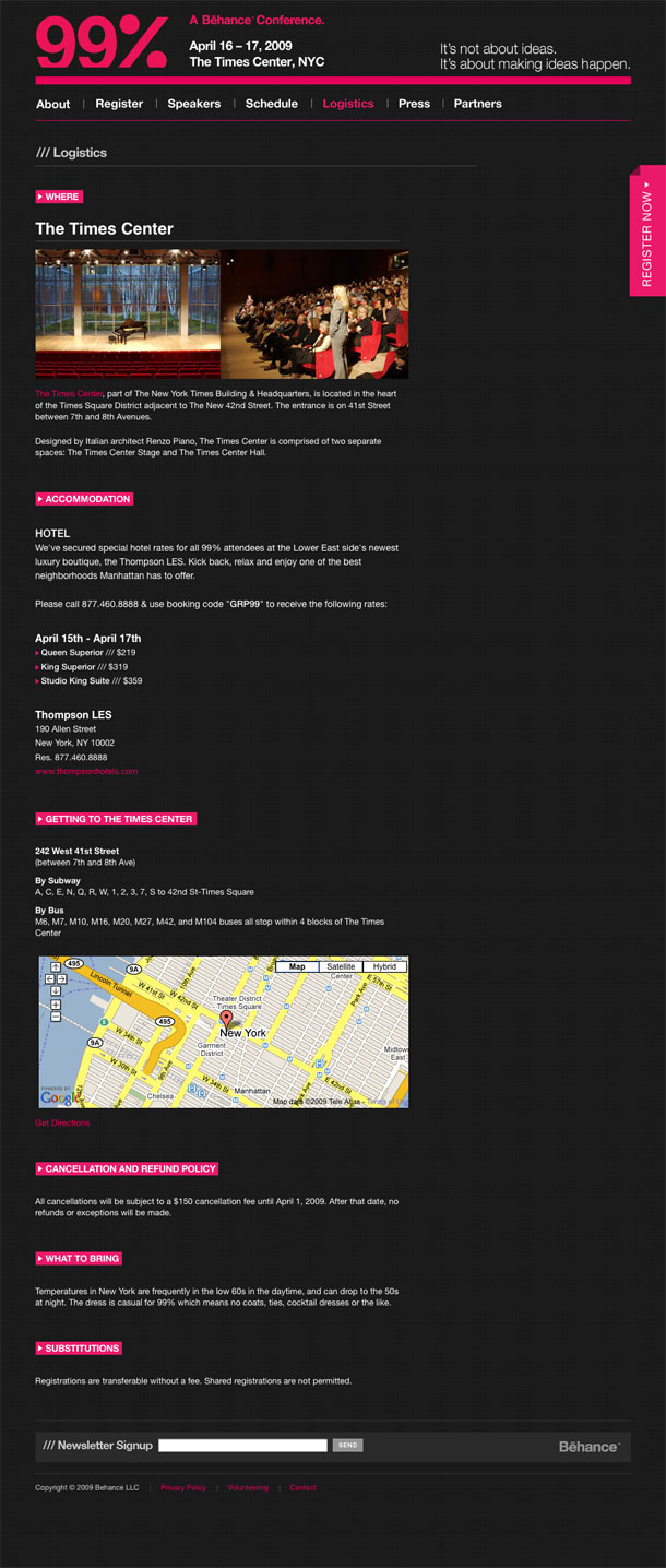
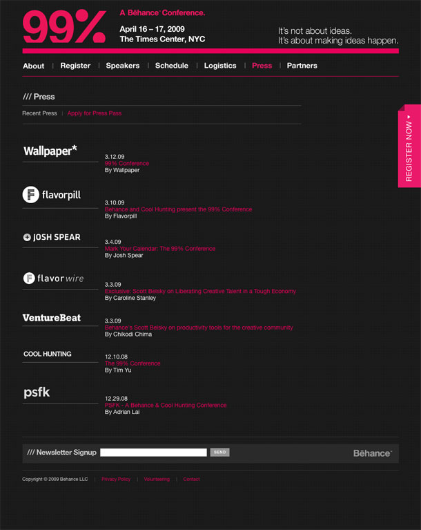
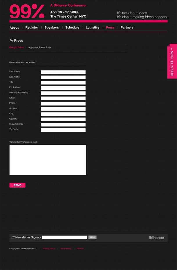
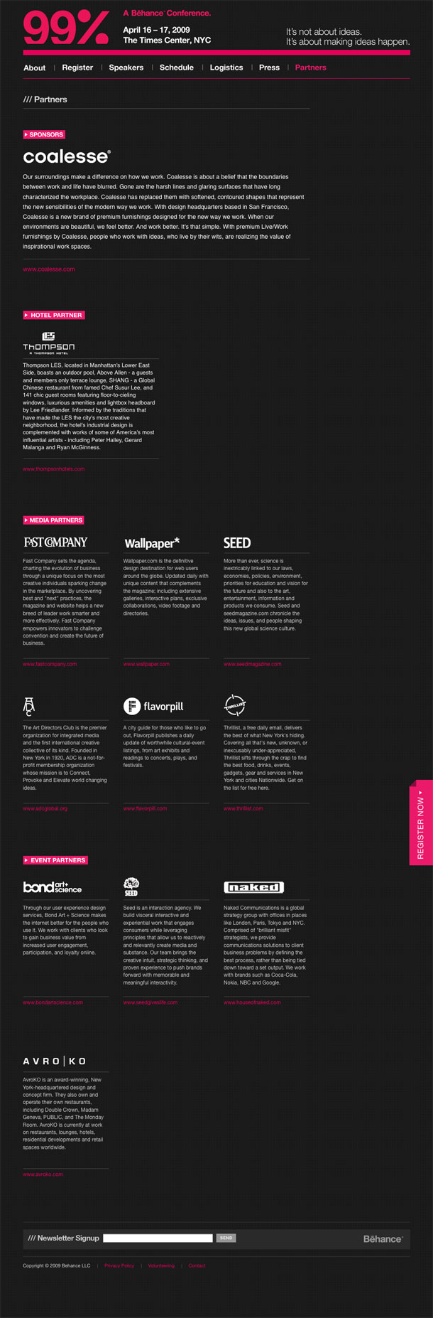
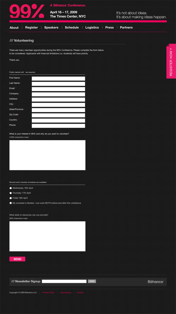
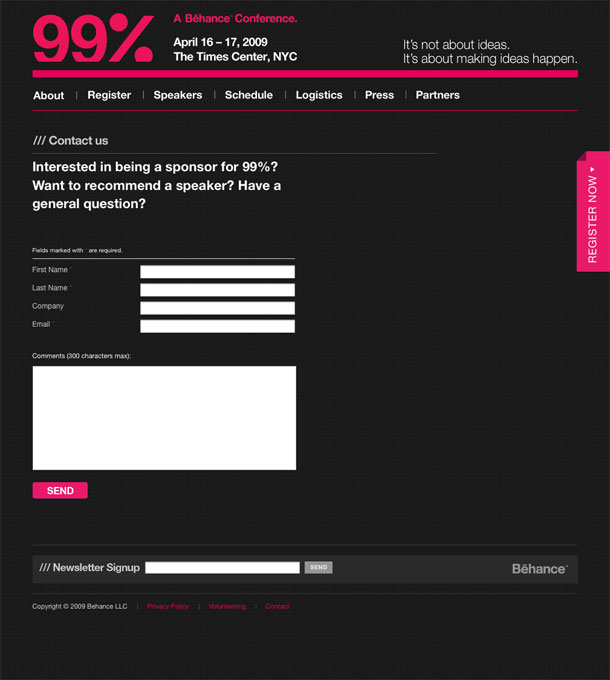
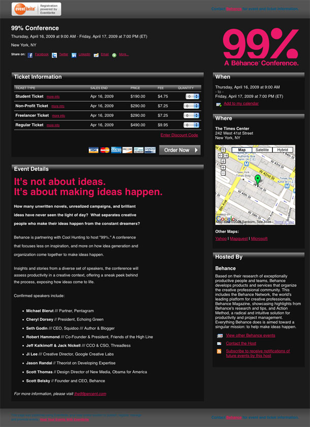
Behance's 99 Percent Conference bills itself as one "...that focuses less on inspiration, and more on how idea generation and organization come together to make ideas happen." Not suprisingly, they have one of the best looking conference sites to set the stage, showcasing the speakers and event. The treatment of the slash motif morphing into the trapezoids repeated throughout the site in the photography is cool. I like the dark bold color treatment and the clean hierarchy in tables, forms, and text.
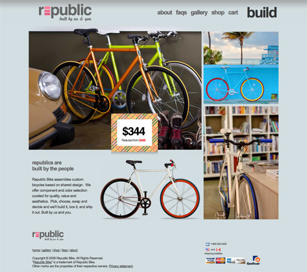
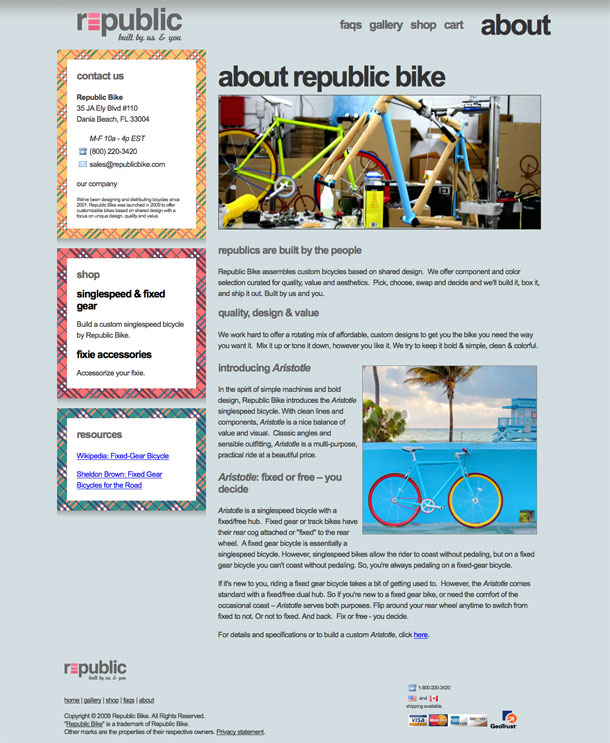
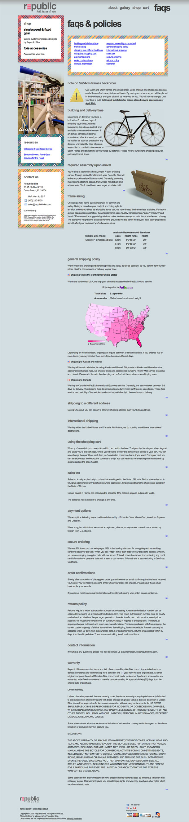
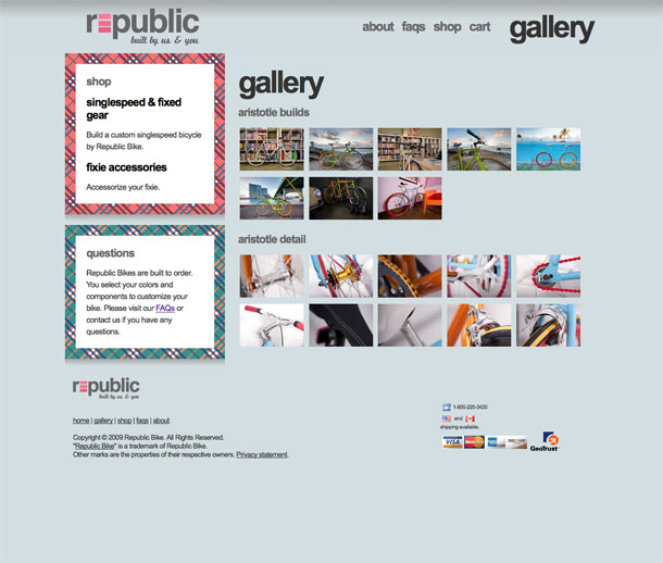
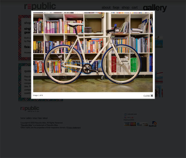
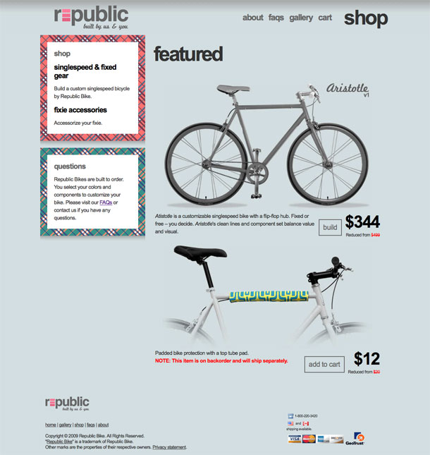
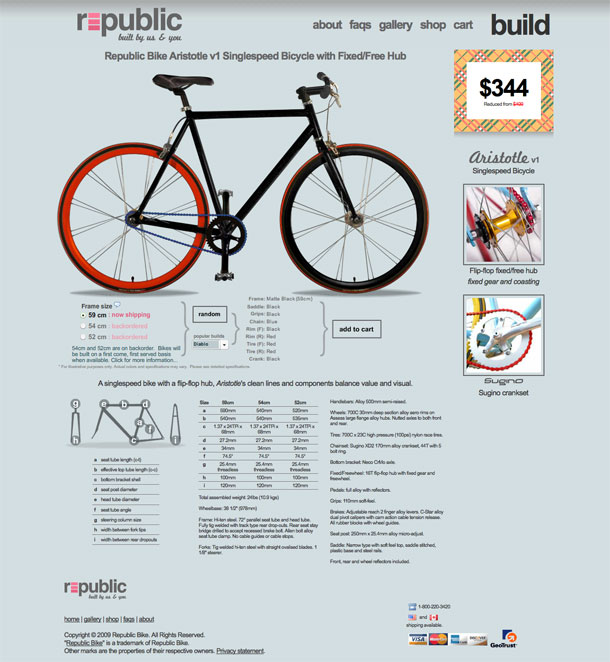
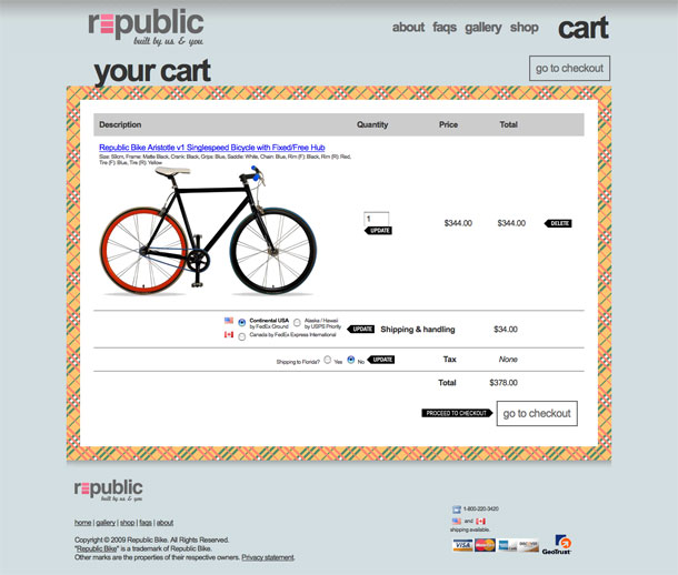
Republic Bike assembles custom bicycles based on shared design. The build feature on the bike configurator lets you choose among a few "curated" color combinations for components. I like the big heading type and the illustration and table of the bike product page.
Via @edfladung
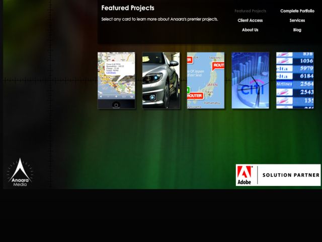
The website of RIA company Anaara Media LLC has an interesting flash interface which makes use of expanding cards to present its content.
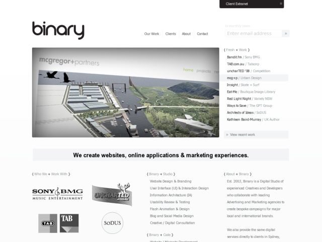
Nice minimalist portfolio showcasing Aussie design studio's work.
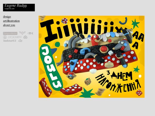
Nice simple portfolio of Eugene Rudyy, Ukrainian designer and illustrator.
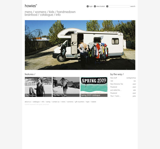
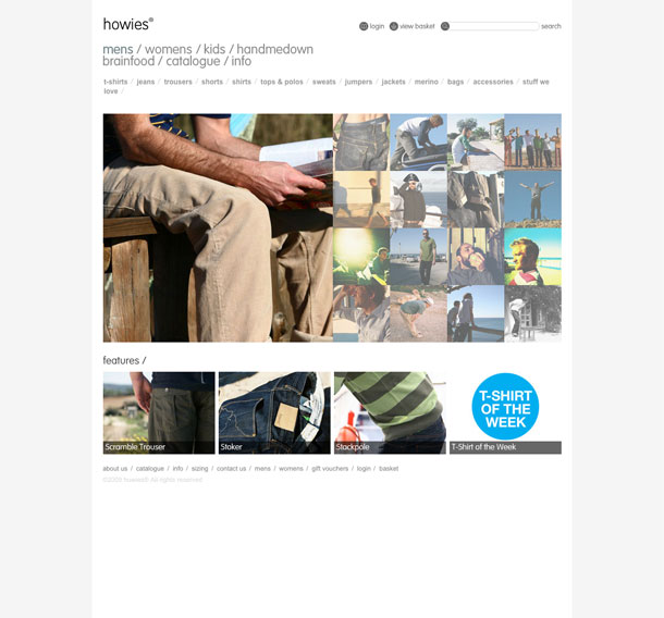
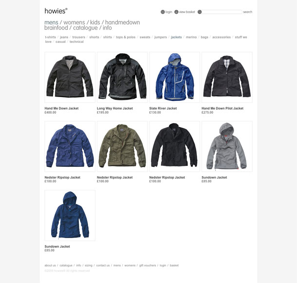
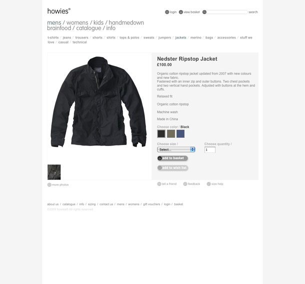
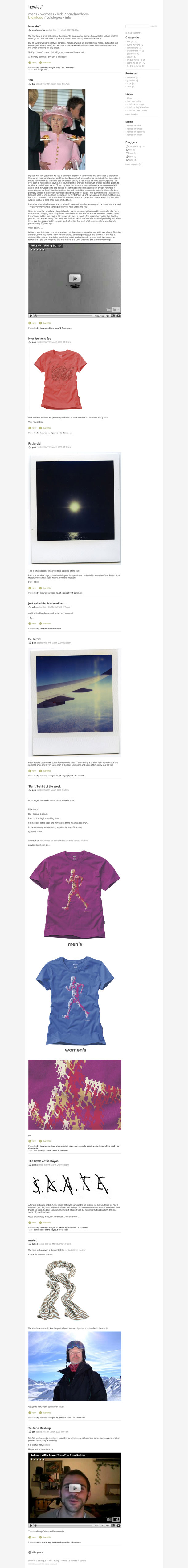
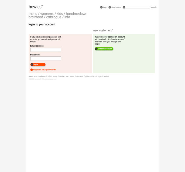
My friend Carl told me about howies a while ago, but I only recently had a look back. They're a clothing and accessories company that aims at providing products with materials and construction that are meant to last and can be handed down to others for reuse. What I like most is how they use storytelling to provide a picture about materials in their products and their handmedown idea, which is communicated in its own mini site.
The main site is a no-nonsense minimal showroom and store with friendly, approachable type and spare, straightforward product pages. Nice little details like the little animated pixel icons in the header and the smiley face favicon (hat tip to k10k?). There's something about the idea of buying quality products that are made to last that should make you feel happy, and I think they communicate that well.
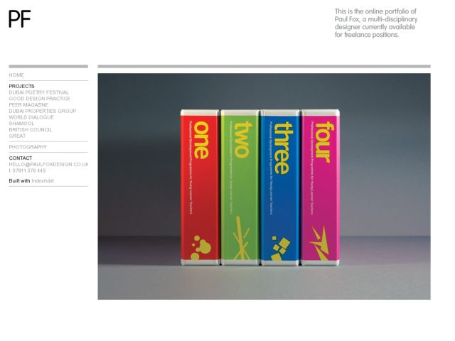
Paul Fox's portfolio takes the indexexhibit application to put a nice skin on the barebones app to showcase his excellent graphic design work.
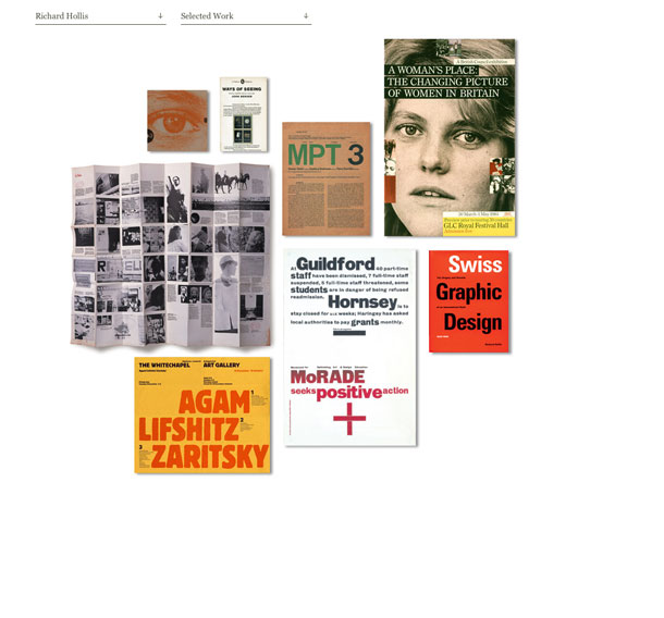
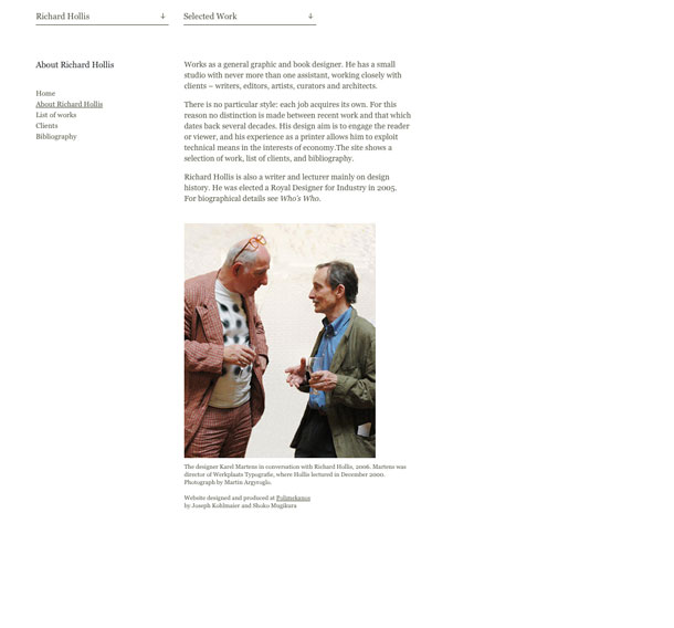
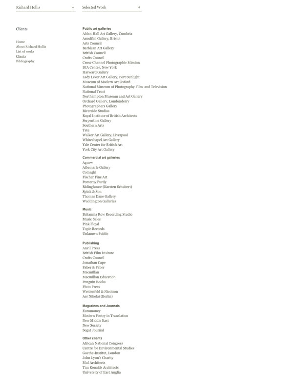
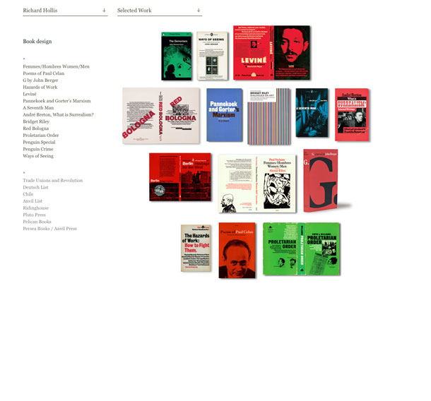
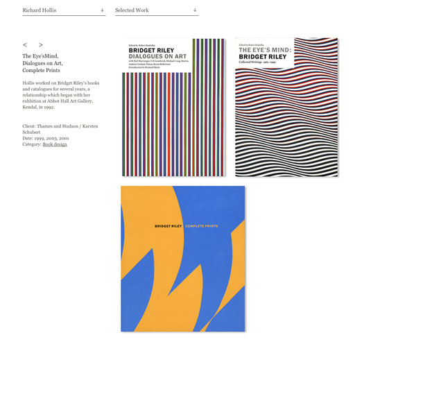
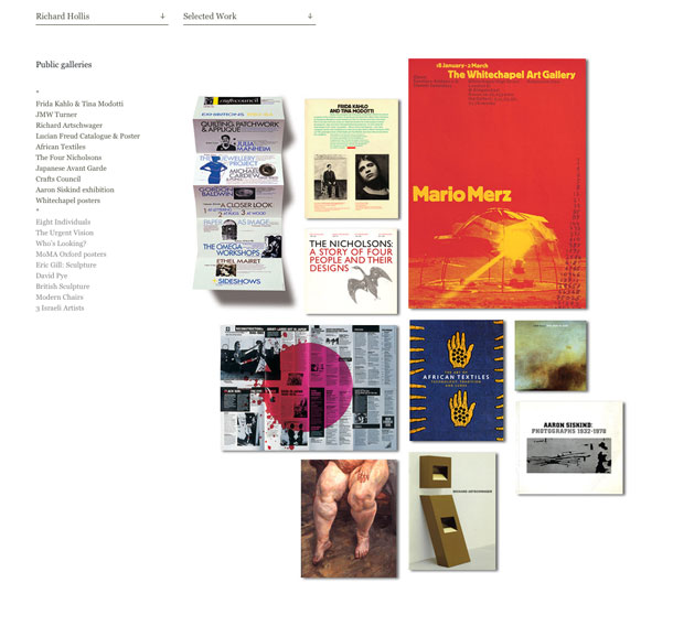
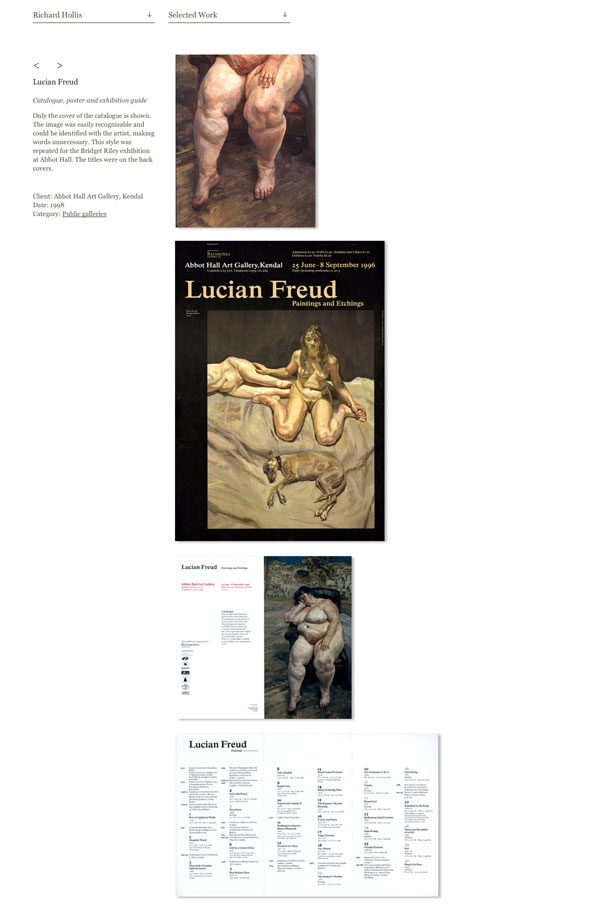
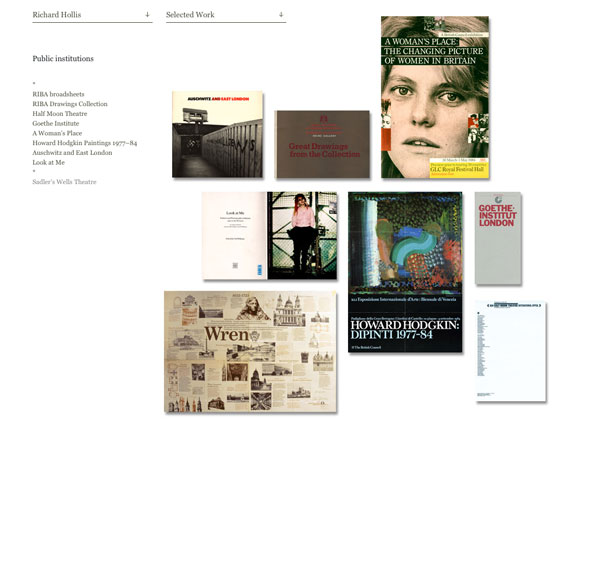
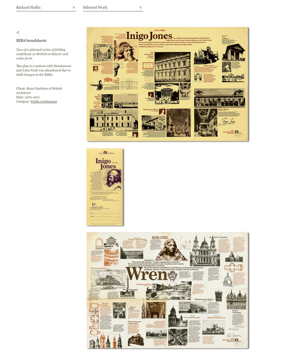
I like the simplicity of the portfolio pages on graphic and book designer Richard Hollis' site. The layout of the thumbnails of the design work as if posted on presentation board is nice. Clever shadows on the folded pieces are a nice touch as well. The enlarged images in the product details put the work front and center, with no need for explanation.
Via siteInspire
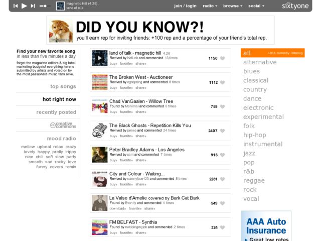
Hard to believe that independent music sites continue to find ways to create social experiences around listening to music in the wake of huge, established communities like last.fm scrobbling and one to one experiences like muxtape playlist sharing. thesixtyone brings band and listener contribution together by letting musicians upload music, while listeners surface the tracks that deserve attention.
It's a nice minimal design that focuses on the experience of playing the new and popular music people are listening to and favoriting. A simple filtering mechanism at the left lets you sort by most active, popular, and recently uploaded while the links at the right allows you to limit by genre. The filters work together, so that your activity and genre selection sticks as you modify either one. Very nicely done.
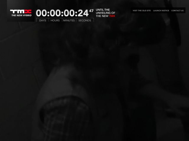
This clever, comical page for interactive agency, TMX Interactive, features video of a team led by some McGruber-like dude defusing a bomb while a clock ticks down to zero. The old site with info about the company, including their portfolio is actually a lovely minimal site as well.
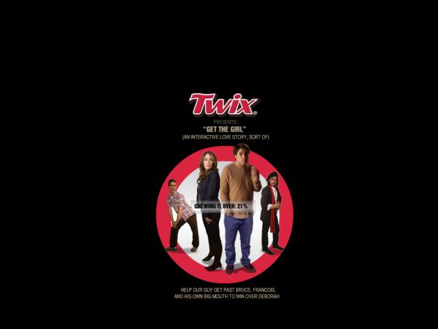
Man, the candy advertising biz sure spends a lot on creative work. While not as unexpected as the Skittles site, the interactive storytelling on Twix.com takes you through a scenario where you get to play a guy trying and lying to pick up a girl at a party by helping him make strategic decisions at each Twix moment. Guess 18-30-ish guys are their target demographic. Clever use of interactive video and a humorous story to keep you engaged on the site for more than a few seconds.
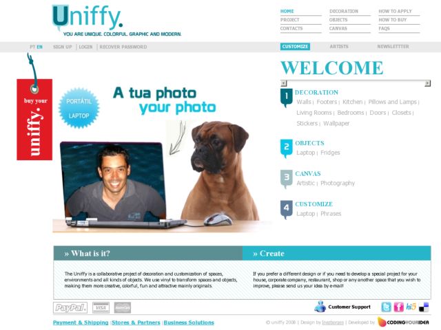
The Uniffy is a collaborative project of decoration and customization of spaces, environments and all kinds of objects, which are opportunities to express ideas and ways of harmonizing the house and give personality, elegance and distinction. With Uniffy, you can change the look of any environment, because the combinations and possibilities are endless, and best of all, is that the adhesives are easy and quick to apply. They were specially created for people who like to customize and are in constant search for new forms of self-expression ..... The applications are diverse, from walls, floors, windows, mirrors, tables, furniture, or any other surface.
We take things personally and we always pay attention to details because this is our style, this simply represents our way of living and our understanding of life.
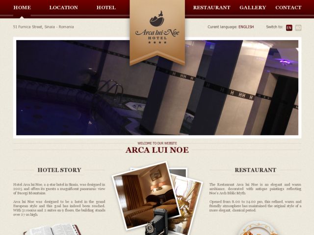
Hotel Arca lui Noe, a 4-star hotel in Sinaia, was designed in 2005 and offers its guests a magnificent panoramic view of Bucegi Mountains.
Arca lui Noe was designed to be a hotel in the grand European style and this goal has indeed been reached. With 31 rooms and 2 suites on 9 floors, the building stands over 27 m high.
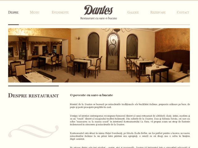
Meniul de la Dantes se bazează pe mâncărurile tradiționale ale bucătăriei italiene, preparate culinare pe baza de peşte şi paste proaspete pregătite în casă.
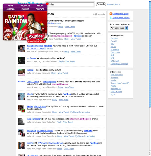
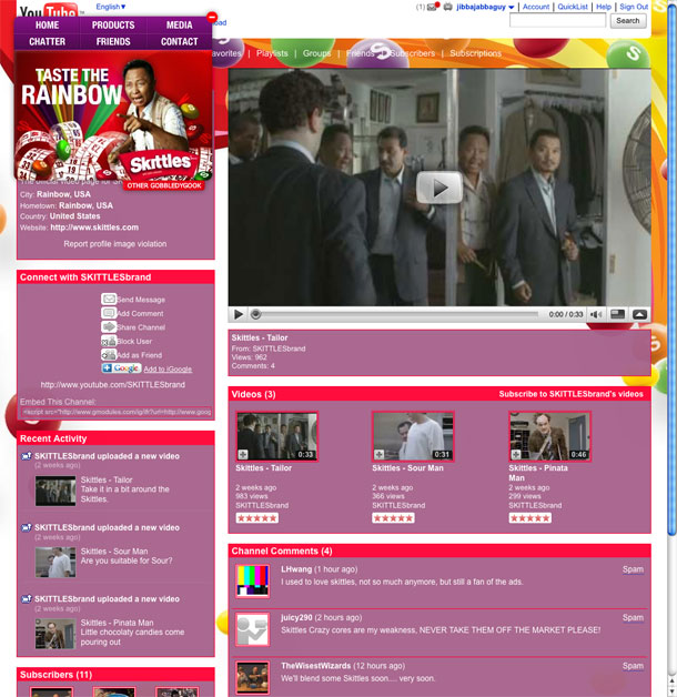
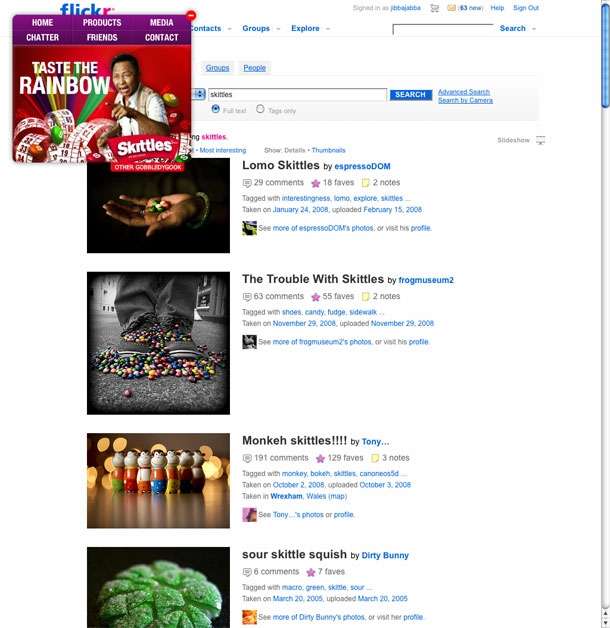
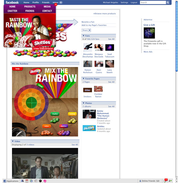
Stealing a page out of Modernista's book, Skittles launches a site that uses social networking and media sites as its backdrop. Like the Modernista site, the effect is unexpected and attention getting. Choosing Twitter for this experiment was pretty gutsy. Whereas they could have more control over what goes on their YouTube and Facebook pages, the sentiment on Twitter isn't all too positive. You can check the live feed of Skittles tweets at Newstrendz, a new social trends site. But a more troubling issue with this design is its similarity to Modernista's and calls to question the issue of plagiarism.
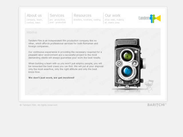
Tandem Film is an independent film production company like no other, which affords professional services for both Romanian and foreign companies.
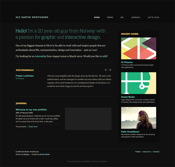
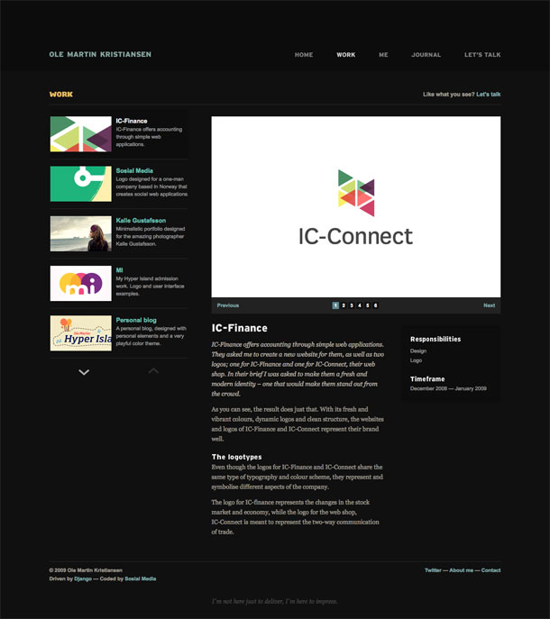
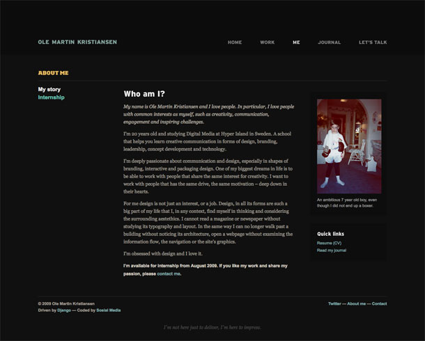
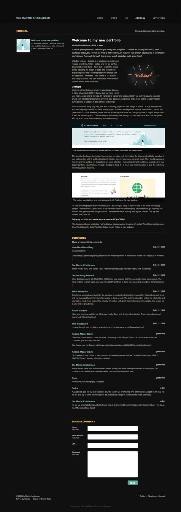
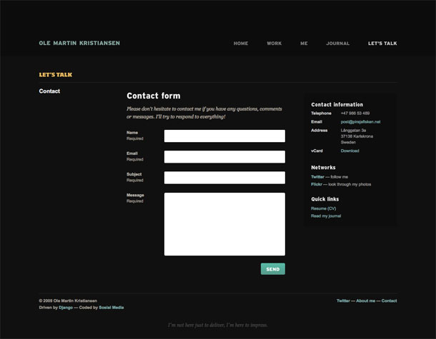
The portfolio of Norwegian interactive & graphic designer, Ole Martin Kristiansen is a dark, clean, minimalist design. Very nicely done.
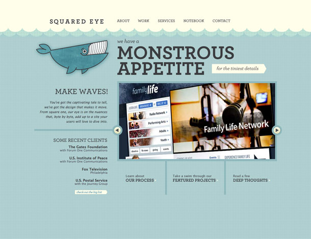
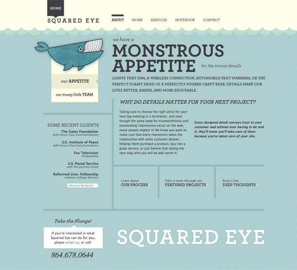
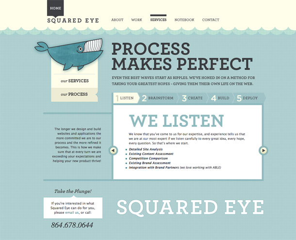
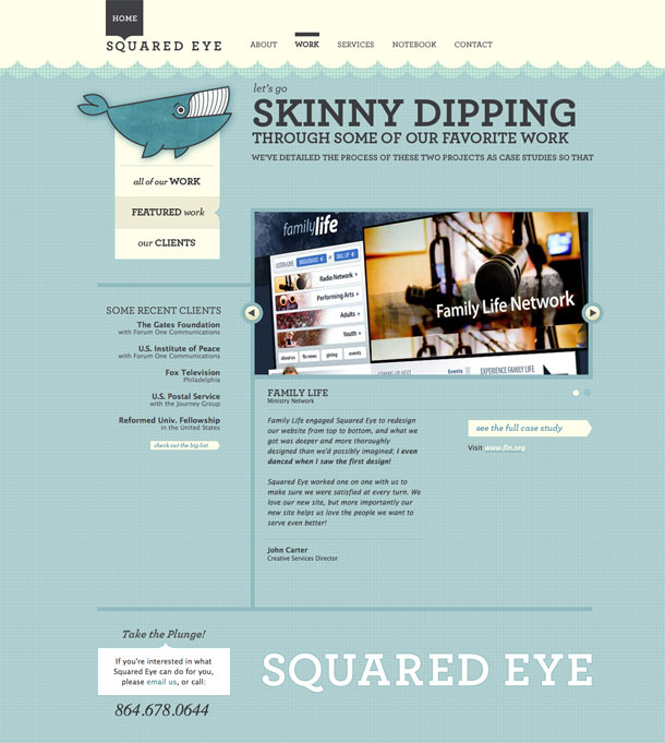
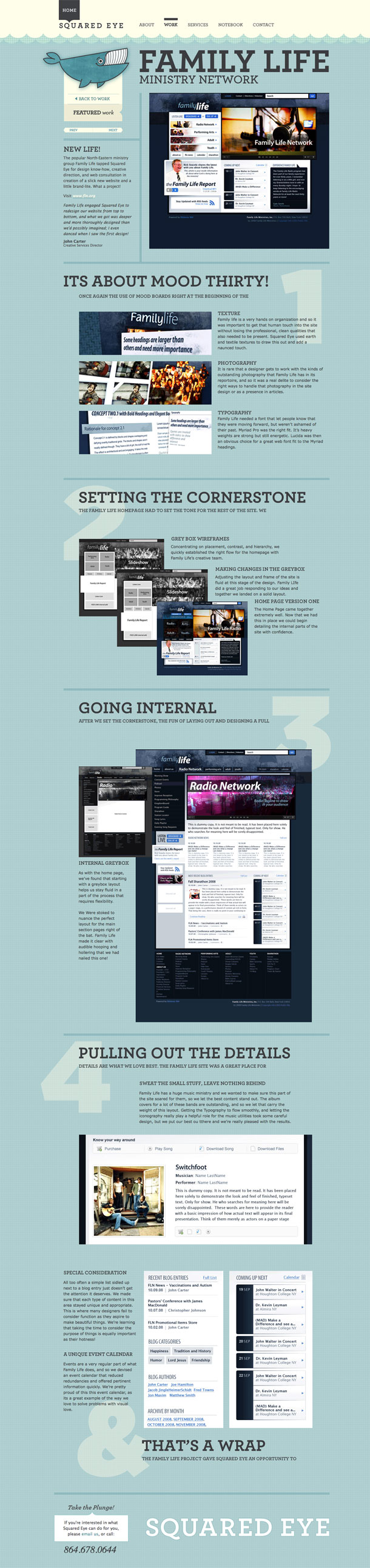
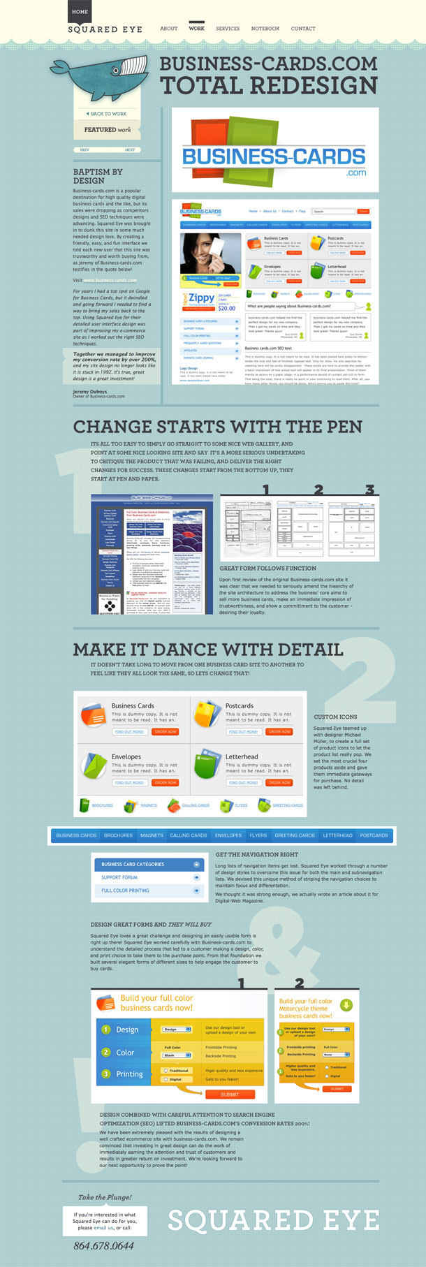
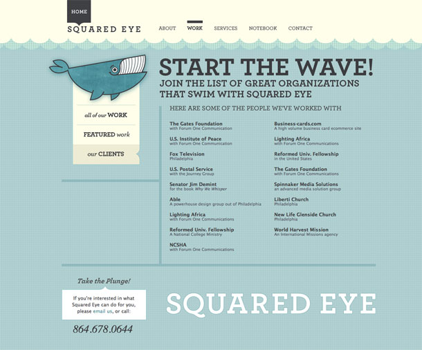
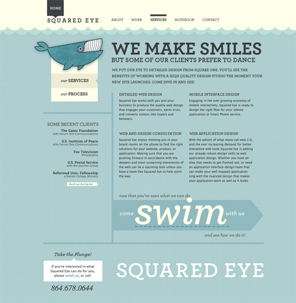
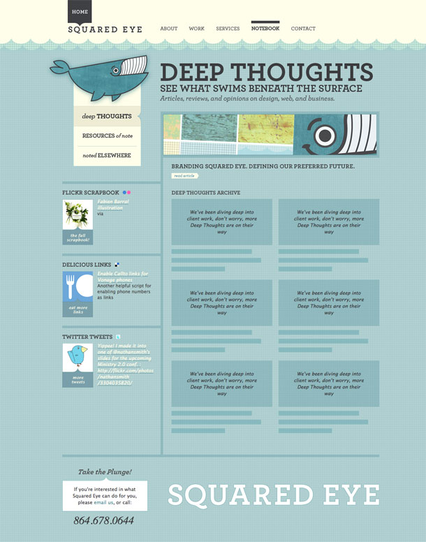
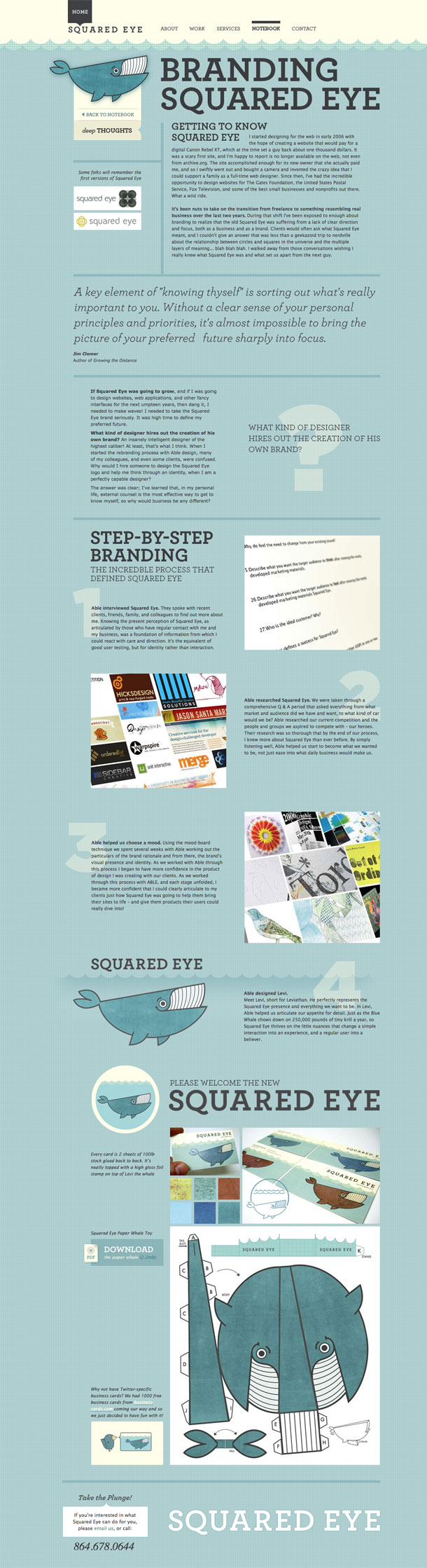
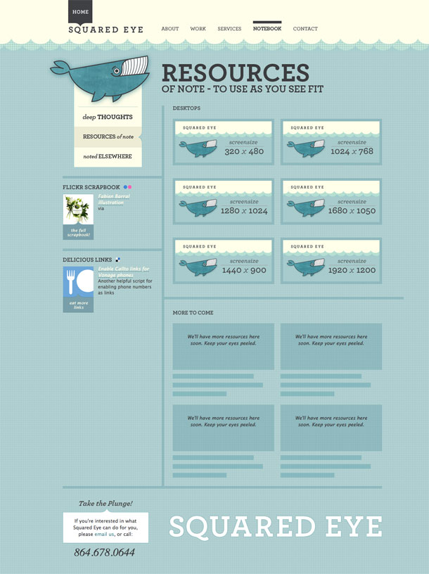
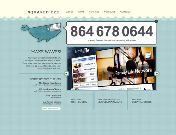
Squared Eye's newly relaunched site goes down in my short list of favorite redesigns. I love the fun art direction and editorial copy throughout the site, starting with the excellent whale logo, the crafty feel of the cutout graphpaper waves in those beiges and workingman blues that remind me of ledger paper, to the excellent copy in the headlines making reference to the water theme, and the attention to detail in every link and mouseover. Wonderful stuff.
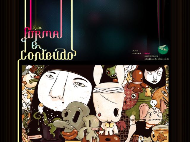
Brazilian illustration and design studio Estúdio Alice is a single page portfolio with absolutely gorgeous illustration.
Via @innstudios
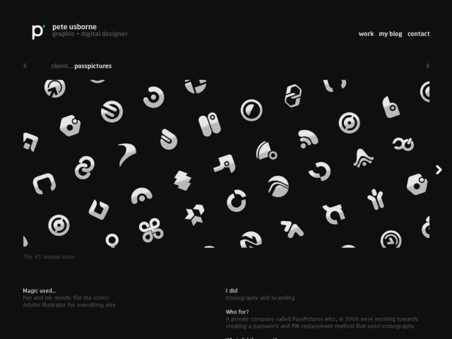
I love the dark minimalist style of designer Pete Usborne's portfolio. Simple linear navigation arrows above the screenshots to switch project, and to the sides of the project screens to shuffle through the slideshow. Below is a brief describing the project.
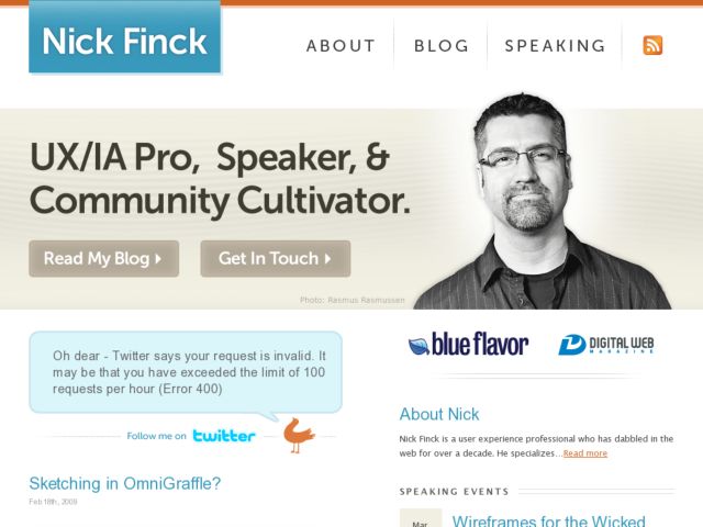
Redesign of Nick Finck.com, the personal site of Blue Flavor UX/IA partner, speaker, and Digital Web publisher. Designed by Matt Brown. Friendly, big type and a simplified navigation make it a keeper.
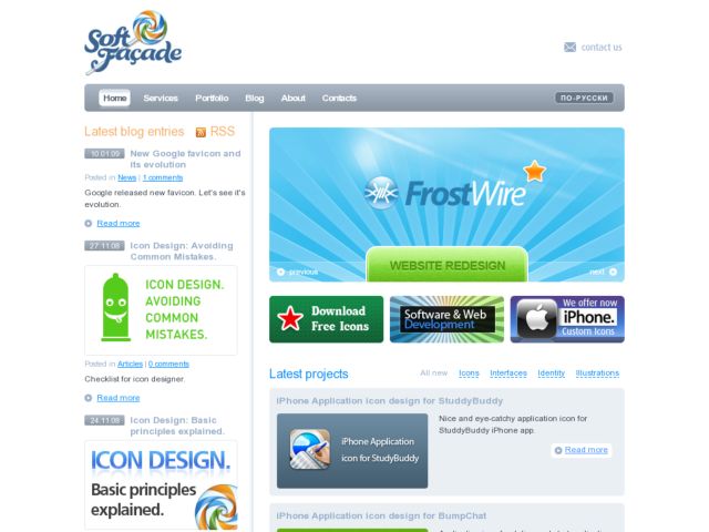
Softfacade do icon design, visual interface design, and logo design. Clean site that does a very nice job of emphasizes new projects from their large portfolio of icon work as well as surfacing their blog entries in a sidebar.
New site for New York lighting company Greg Yale Illumination. Designed and developed by Knowawall.
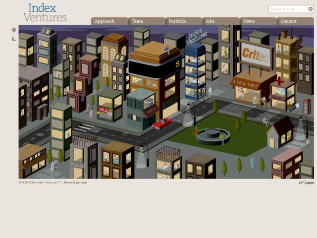
I love the isometric illustration for this little cityscape on this venture capital firm's splash page, which feels light and loaded quickly. I wish they found a way to fit a little bit more about what the company does into the design, e.g. in that scrolling ticker.
Via Andrew