Unstoppable Robot Ninja

This is a bad-ass looking weblog with a very cool header. Big type and ample white space sets up a very clear visual hierarchy and makes it easy to read, and a strong center alignment of header/footer elements directs the eye. I love the big illustrated robot head in the header (kind of expecting it to wink at me) and the character photos in the footer. I also like the way the global navigation shifts so that the center link is whatever section you're viewing, which makes that centered look and directs your eyes downwards.

http://unstoppablerobotninja.com/

13 Creative

I like the trompe l'oeil look of this paper product designer's portfolio, designed by Deluge Studios. It's like sneaking in and taking a snapshot of the sumptuous printed goodies on her desk while she's not looking. The multi-column text blocks on the notepad are nice (click the About page to see that), the colors are rich and elegant, and the decorative flourishes are lovely.

http://www.13creative.com/

Work at Play

Work at Play Social Media Labs is a creative agency in Vancouver, BC that works on social media projects. The behaviors make the site feel like it's rendered in Flash, but the nice card flipping case studies on the home page, and the sliding page transitions are all done with Javascript.

http://www.workatplay.com/

White House

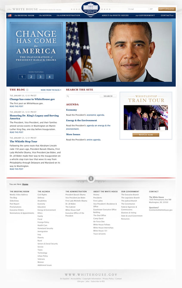
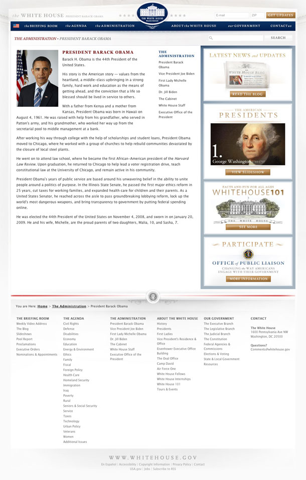
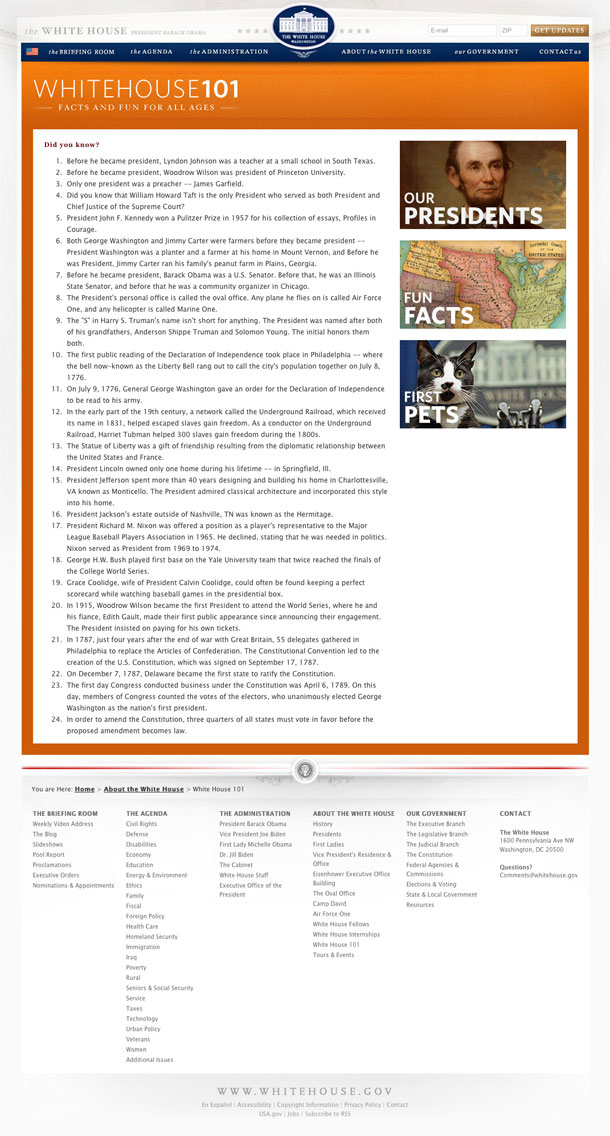
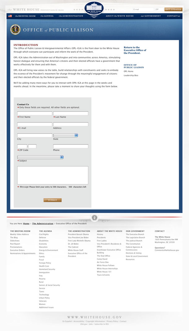
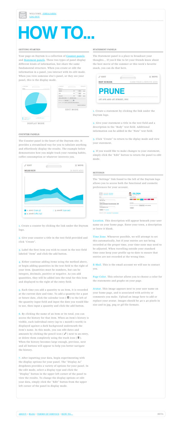
The redesigned WhiteHouse.gov site exudes a staid and elegant presence, that establishes a suitable look and feel for the new administration. Compared to the vibrant, youthful, and energentic feel of the Obama electoral campaign with it's bolder and more saturated blues and reds, and dimensional and atmospheric graphics, this site is restrained and has an appropriate seriousness that reflects the job ahead. But it is also elegant and fresh, and has the feeling of being modern, yet stately.

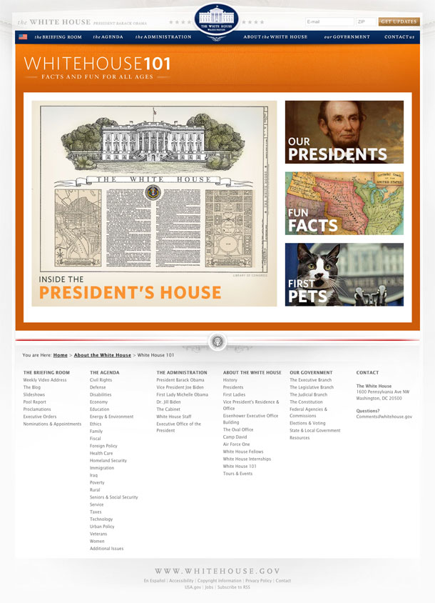
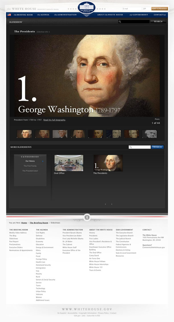
Subtle details make the design. Notice the pyramidal shape of the header, echoing the triangular pediment of the building shown in the White House seal, the faded image of the Oval Office's molding in the background, the horizontal break between the body and the footer made by the seal of the president and the strong red line, and the understated shadows complete the sense of dignity. This says, "solid" and "stable" to me, and firmly points to government's philosophical roots in things classical. Notice also the special treatment of the slideshows in the "About the White House" section, which are gorgeous. But what will make this site most successful is it's use in providing access to information from the White House, and the presence of the blog and video sections gives the sense that the site is ready for the task.

http://www.whitehouse.gov/

Westerdals

Westerdals is a communication design school in Norway for film, tv, and graphic design. The site's home page presents a mosaic of videos of teachers, previous teachers and current students who talk about what makes the school unique. Each of the rectangles in the grid is either a video or text block, which expands into adjacent squares on the grid when clicked in order to load a video player or text.

I always like monologue type videos or testimonials. The personal commentary is a nice, and provides a sincere touch for recruiting students. The format of this single page delivers the message very effectively from each of the different personas that represent the school.

http://www.westerdals.no/opptak/

YCN

Nice minimalist design from this London, UK creative organization that is equal parts industry publisher, awards host, events coordinator, and agency, serving up design and communication needs through the members of its collective. This is a multi-faceted org, and starting with the homepage and looking around through the pages, you get the impression that there's a lot of content on this site, and a lot of people involved.

The challenge upon arriving there for the first time is to understand what they're about. The title/tagline seems to convey enough maybe, but the about page reveals the most info. I always find it challenging as a designer to distill what something is about and find the right way to message that essence for different types of users.

http://ycnonline.com/home

TypeNeu

TypeNeue is a typography blog that uses Suprb's Grid A Liciouis theme for WordPress to give it that dense multi-column layout. Entries are ordered reverse chronologically, but unlike typical columnar layouts, the entries are read from left to right first, then top to bottom, so the lines of demarcation are staggered. This creates a unexpectedness and less ordered feeling to the layout, but gives the design the ability to put more content into the screen above the fold.

http://typeneu.com/

The Darling Tree

Joanna Klima is a freelance designer and craftsperson. I love the decorative fluorishes behind the body, the textured backgrounds, and the overall tone of the copy. There's a very handmade feel to the site, which goes along with the idea of providing more personal service, and the aesthetic that Klima is known for.

http://www.thedarlingtree.com/index

Versions

Versions is a Mac Subversion Client (SVN). The home page groups the layout into 3 sections, providing the product overview and value statement, a diagram of how it works, and the full feature and functionality list. It does this all in one page, without the fuss of transitions to view them--just scroll. There are only 2 other pages of significance here. A support page that provides search and a listing of recent support issues via Google Groups, and the shopping cart page.

http://www.versionsapp.com/

Realmac Software

Realmac Software is the maker of LittleSnapper and RapidWeaver apps for the Macintosh. Their site sports the kind of clean rounded corners and beveled edges we come to associate with Apple, but brings in a more colorful and rich palette with excellent illustrations and product icons throughout. Glassy reflective marquees melt into the 2 column product info below, and big icons and buttons make clear targets for calls to action. One of the nicest looking product sites I've seen in a while.

http://www.realmacsoftware.com/

GOOD

GOOD is a collaborative project that produces a print magazine, website, videos, and events that focus on the greater good and moving the world forward, e.g. towards social and environmental improvement. They donate 100% of contributions for the magazine to one of the non profit orgs they support.

The site is utterly readable and clean, and utilizes a blog format with excellent filtering abilities. I like the layout of the entries on the main pages, which look sort of like index cards laid out across a desk. Excellent iconography and badge system for the social features, e.g. the use of the good marks badge on the top, and the paper plane share icon are really nice. It's all remarkably clean

Functionally, the site is great. The site architecture is very clear and represented well in the navigation. Incredibly good stuff, and it all appears to be done in WordPress.

http://www.good.is/

unblab

unblab a service that hopes to fix your broken inbox by giving you tools that watch your inbox to self-organize based on use, to give you different ways of focusing on messages, and provide access to support staff when applicable.

The site presently sports a single page-type design, with information for the beta. As users step through the demo slides or sign up for the beta, the marquee swaps information out while the rest of the layout and design stays in tact.

http://unblab.com/overview

AIGA CMS Administration

The redesign of the AIGA content management system by Happy Cog and Naz Hamid is easily one of the nicest looking CMS admin experiences I've ever seen screen shots of. Neutral background colors are easy on the eyes. There's great attention being paid to the details. Icons are well designed and clear, forms are laid out well, everything is perfectly aligned, and page elements direct the user through every facet of administration.

http://www.weightshift.com/work/aiga_cms/

LittleBigPlanet

The art direction on the LittleBigPlanet site is fabulous and fun as hell. The rich flash experience takes the idea of the DIY game building experience and literally brings that to life.

There are corrugated box platforms held up by rope strung on on eyelets, hand drawn video controls, skateboards rolling to and fro as the platforms oscillate, and the little animated rag boy character flopping around as you navigate the space. And you know I love the folded graph paper backgrounds on the blueprint tool and sticker. Now I'm gushing. Love it. Can't wait to get it for my son this Christmas (don't tell).

http://www.littlebigworkshop.com/en-us/

Wilson Miner

Designer/developer Wilson Miner's portfolio and weblog is ultra-clean and very easy to read. The large type and great use of white space presents a clear hierarchy of page elements, and attention to details like the simple use of prev/next arrows for carousels and pagination make perusing this site a pleasure.

http://www.wilsonminer.com/

Obama Election in the News (International Sources)

This is just a small sampling of news coverage of the US Presidential Election from non-U.S. sources that included substantial news pieces on their front pages.

Sources:
1. http://bbc.co.uk
2. http://www.guardian.co.uk/
3. http://www.worldnews.com/
4. http://english.aljazeera.net/
5. http://www.abc.net.au/news/
6. http://www.cbc.ca/news/
7. http://www.chinadaily.com.cn/
8. http://www.mg.co.za/
9. http://www.telegraph.co.uk/
10. http://www.spiegel.de/
11. http://www.smh.com.au/
12. http://www.iht.com/
13. http://www.lemonde.fr/
14. http://www.timesonline.co.uk/tol/news/
15. http://metimes.com/
16. http://www.nation.com.pk/
17. http://english.pravda.ru/
18. http://www.thestar.com/

See also:
Front pages from US Sources

Obama Election in the News (U.S. Sources)

Newspaper and online news headlines and front page screens on the day after the 2008 US Presidential Election.

Sources:
1. http://nytimes.com
2. http://washingtonpost.com
3. http://chicagotribune.com
4. http://usatoday.com
5. http://wsj.com
6. http://latimes.com
7. http://dailynews.com
8. http://nypost.com
9. http://inquirer.com
10. http://cnn.com
11. http://cbsnews.com
12. http://abcnews.com
13. http://msnbc.com
14. http://foxnews.com
15. http://news.aol.com
16. http://news.yahoo.com
17. http://npr.org
18. http://reuters.com

See also:
Front pages from International Sources

daelan.com

Daelan Wood's portfolio is a spare, minimalist site with a simple slideshow banner of recent work at the top, and a description of his whereabouts at the bottom. Direct and to the point.

http://daelan.com/

Back of the Napkin

I can't think of a more appropriate site for a cute hand drawn interface than for The Back of the Napkin book site. This is a great book for anyone who wants to expand their tools for business thinking. Dan Roam provides a friendly approach and simple formula to using drawing to collect, analyze, and communicate problems and ideas, and you don't need to be good at drawing to do it. This is turning into more of a book review than a site review.

I'll just say that the art direction for the flash on the napkin is appropriately fun, casual, and makes an effective pitch. The rest of the site could be pulled together to feel more cohesive to me. I could do with some consistent color treatment and navigation on all the pages and the blog. That blog could look more like the main site.

http://www.thebackofthenapkin.com/

DAYTUM

Daytum comes to us from the data obsessed minds of visual designers, Nick Felton and Ryan Case. Felton is the creator of the Feltron personal annual report that we Tufte/stats junkies love and Case is the creative director working on the social media experience at Sling Media. DAYTUM is a wonderful evolution of the personal annual report, bringing obsessive loggers a place to count whatever comes to mind and visualize that data beautifully in the personal and community space. The the UI and visual design are clean and simple and let the data tell the story in sparklines, pie charts, bar lines, line graphs, and big bold numbers. Love it. Hope to be able to generate my annual report after a year of logging.

http://daytum.com/

Wario Land: Shake It!

The promo site for the new Wario Land Wii game takes you into the world of the big garlicky brute as he stomps through the screen, shaking the interface up, much as he did with the YouTube promo. The big gimmick with this site is that you have to shake objects in the interface to navigate from section to section. The rest of the site makes use of a hunt for objects to keep you engaged as you explore the story and game play features.

http://www.wariolandshakeit.com/

Bond Art + Science

The new site for Bond Art + Science mimics an instant messaging window session where Bond are talking to you directly as a potential client. Messages scroll up from the bottom in a canned discussion, almost as if viewing someone's previous IM session. The device would have been very clever if it was actually functioning as a chat bot.

This site manages to do one thing very well—it gets your attention because the presentation is unexpected. There's a danger, of course, in being gimmicky and making findability suffer, but if the interest is in commanding attention and sticking in the memory, this has done the job. The site ranks among a few other agency sites this year that have accomplished this sort of memorability using unexpected interfaces, e.g. Modernista and IDEO.

http://bondartscience.com/

Fancast

The slight redesign of the surface on Fancast is a lovely updating that comes along with the site's latest release and new inventory of video content. The presentation layer is sporting the clean and glossy look of white boxes with pale drop shadows that I'm fond of, as well as using soft white bevels with enough restraint to look good without going over the top. The overall look is softer, and might slightly reference the minimalist Hulu, but clearly outsexes that site.

http://www.fancast.com/home