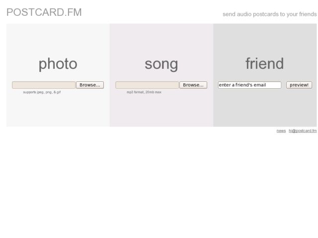
Simple new postcard site. Interface consists of 3 boxes with inputs: 1) browse to find a photo, 2) browse to find an MP3, 3) enter an email address. The resulting postcard is a simple photo page with a Flash MP3 player. Love it.
Simple new postcard site. Interface consists of 3 boxes with inputs: 1) browse to find a photo, 2) browse to find an MP3, 3) enter an email address. The resulting postcard is a simple photo page with a Flash MP3 player. Love it.
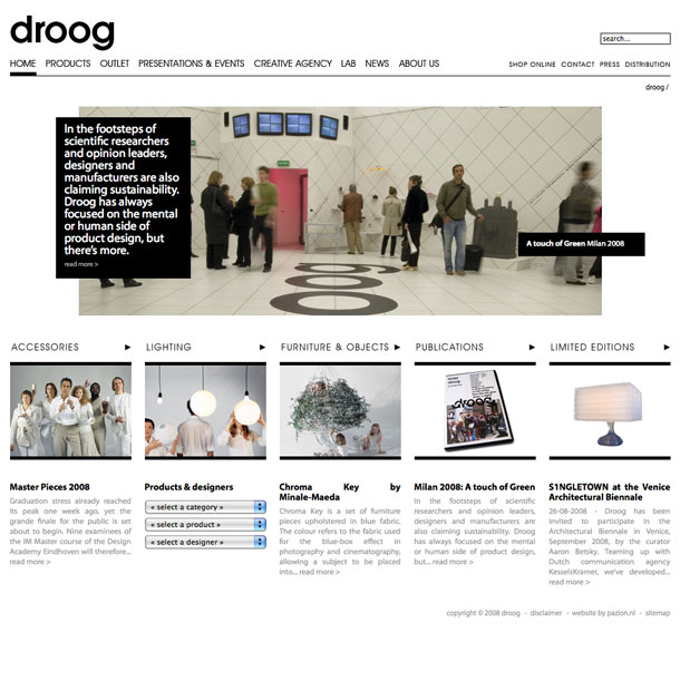
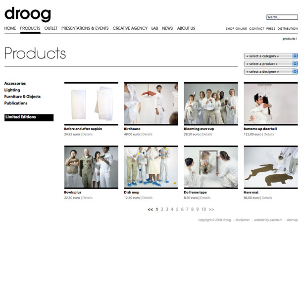
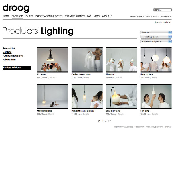

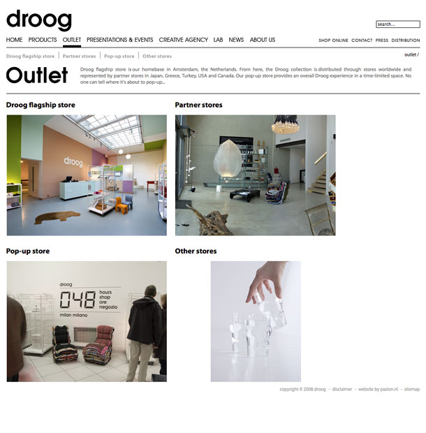

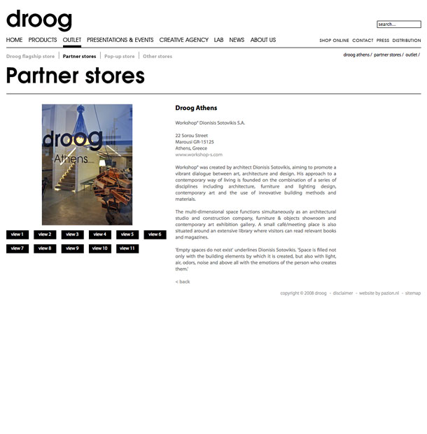

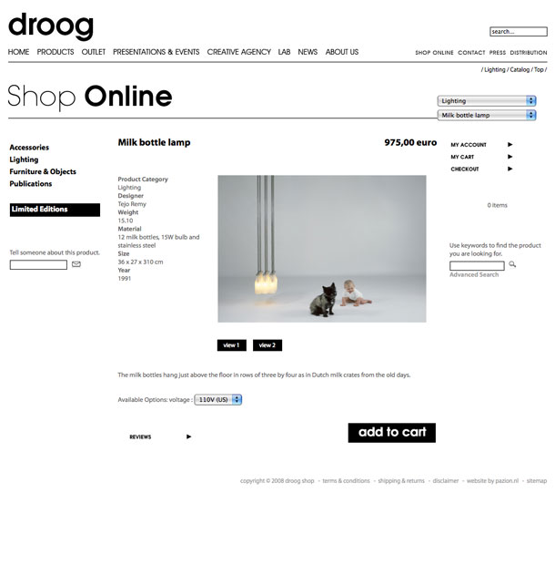
droog is a Dutch company, led by Gijs Bakker and Renny Ramakers, that art directs and sells products collaboratively created with designers worldwide. The site showcases the droog collection, whose products are categorized as accessories, lighting, furniture and objects, publications, and limited editions.
The design aesthetic is modern and minimalist, and conveys a sense of wit which mostly comes across in the product photos. There are unexpected twists, like a right aligned breadcrumb, and simple touches like the category/product/designer drop down menus.
The only minor nits I have are with the treatment of navigation and information architecture. I thought the product categories could be treated as part of the global nav, to be consistent with the Outlet and About Us sections. I also didn't see the need for the separate paths for a single piece of content, e.g. Products > Lighting > Milk Bottle Lamp, and Store > Lighting > Milk Bottle Lamp, but there may be a good reason.
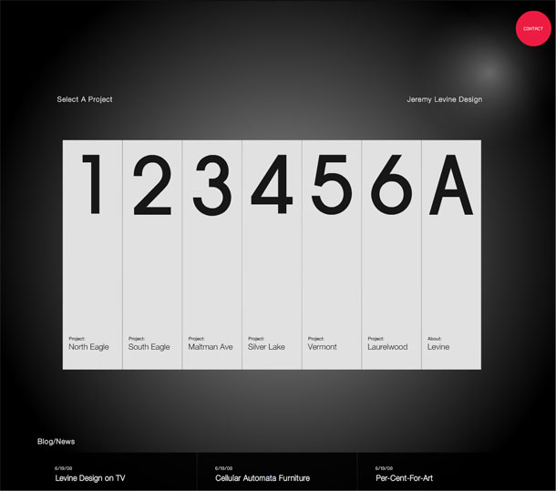
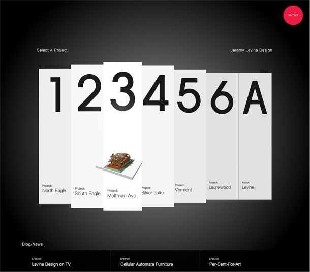
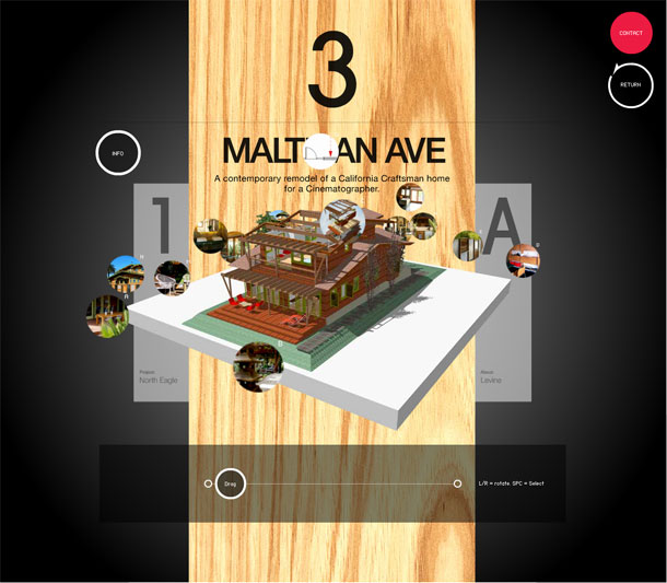
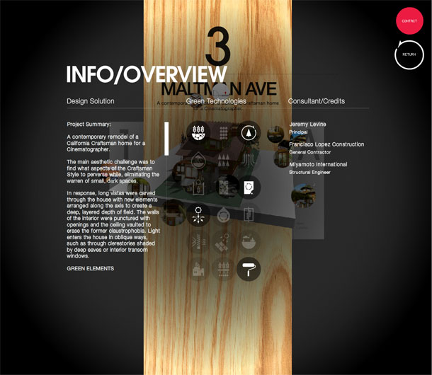
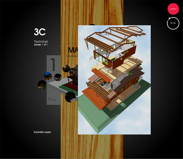
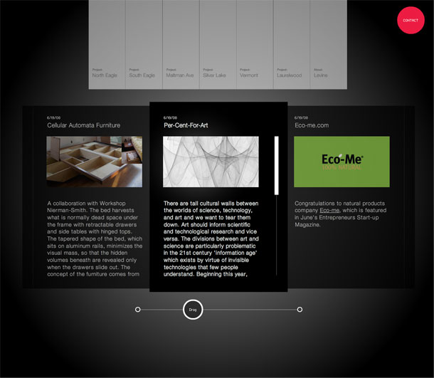
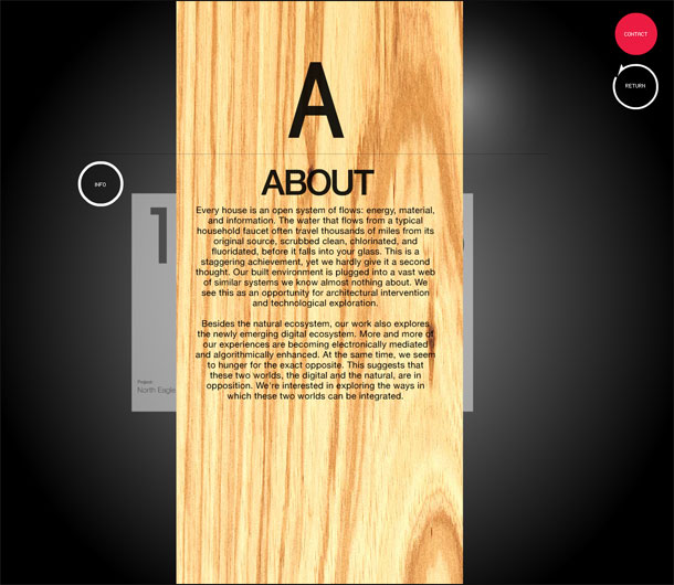
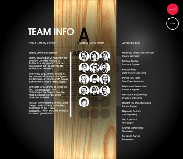
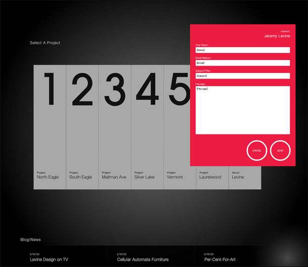
The portfolio site of the Jeremy Levine Design does an excellent job highlighting the work of an architecture studio with interests in both the natural and digital environment. The site unfolds, spins, explodes, and collapses on itself to immerse the user in the projects, exploring each environment from multiple facets. The studio worked with Section Seven to realize a site that borrows some of the techniques used in that studio's own portfolio, but contextualizes the experience for exploring 3 dimensional architectural spaces.


Theme is a magazine about contemporary Asian culture, targeted at a creative audience. Each issue focuses on a single theme or topic. The Summer '08 redesigned site sports a clean, minimalist aesthetic with and clear, simple grid reflects a design that is focused on delivering feature content, and now provides users the ability to comment on all content.
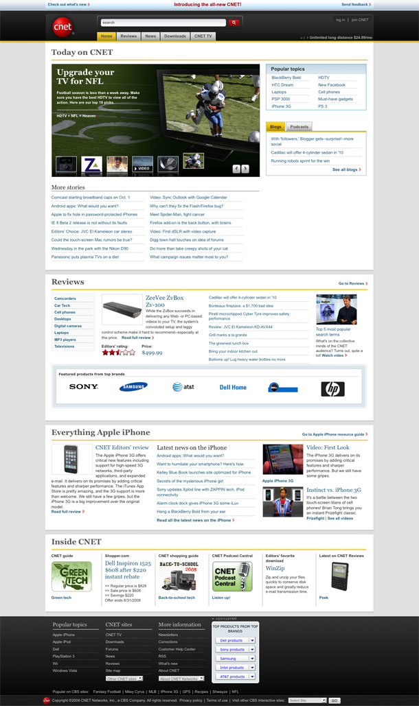
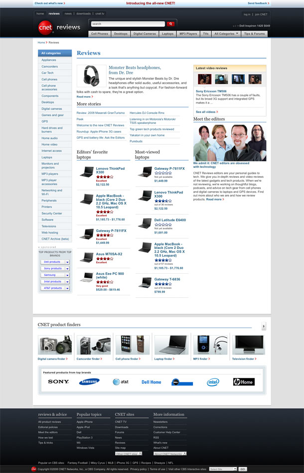
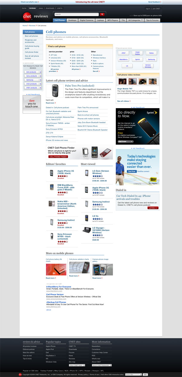
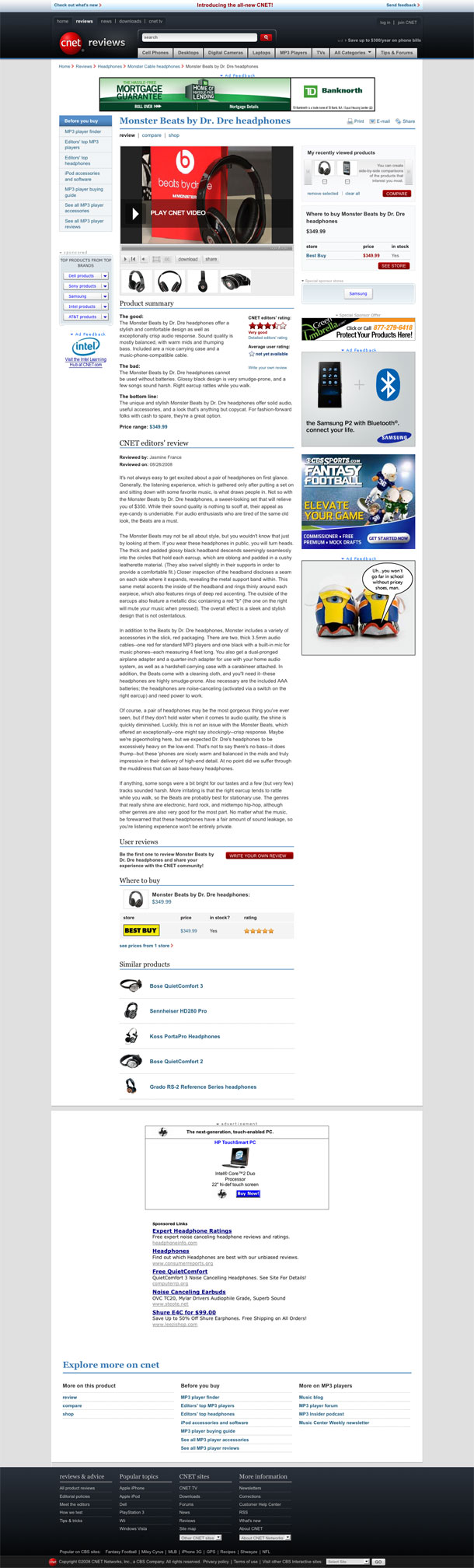
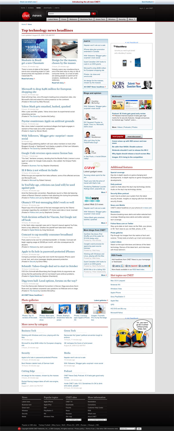
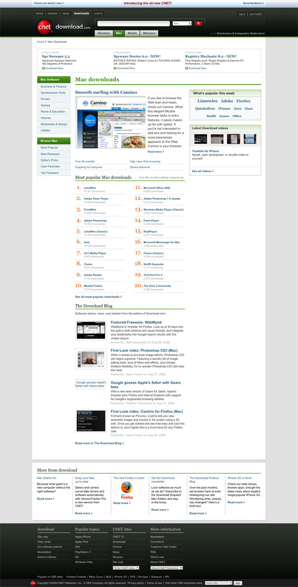
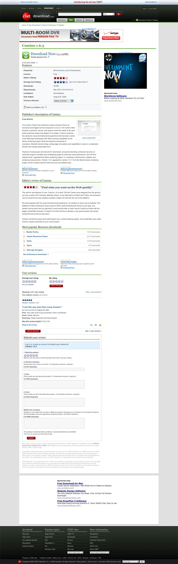
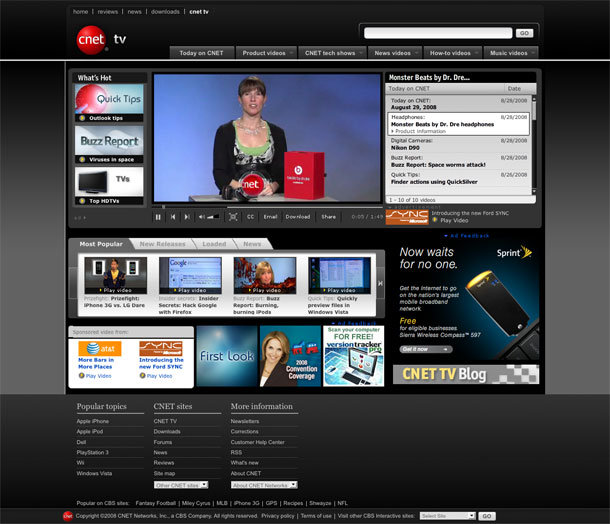
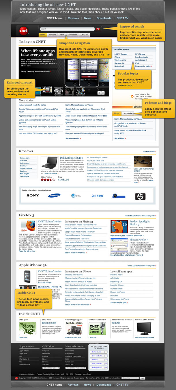
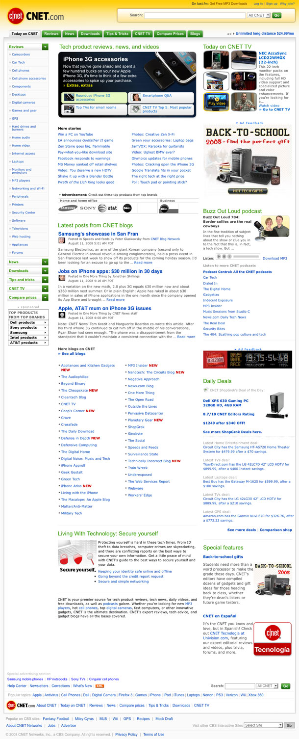

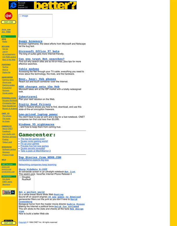
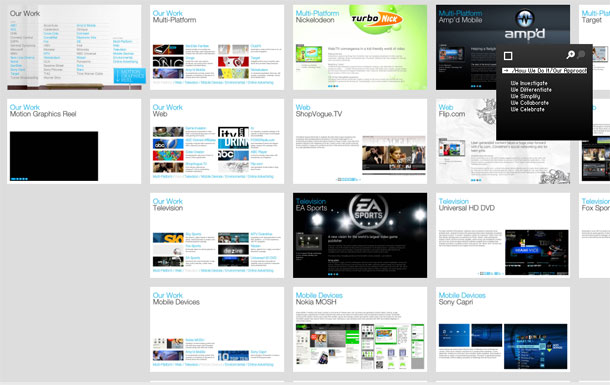
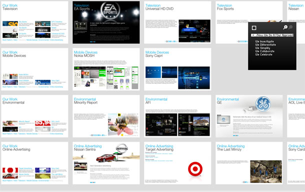
CNET redesigns its identity and with it, all of its sites now sport a cleaner, more modern aesthetic. Some claim that the original c|Net, with the block of yellow navigation on the left hand side was responsible for the proliferation of that layout type in the 90's. Today there is only a hint of yellow, and that left sidebar that held most of the site navigation is now relegated to a simpler, singular category or local navigation purpose within a section. A big improvement. The global navigation at the top serves to keep the user situated in the larger scheme of things.
CNET is a huge site, and because of that, it is probably difficult to keep the home page simple, while addressing the needs of their divisions. They've been evolving their design over the years (as you can see from the last 3 screenshots) and the current and past designs have moved towards a cleaner look, and simplified navigation. If you compare this home page with the prior design, they appear to have made stronger, more selective decision for keeping the home page less cluttered and easier to skim.
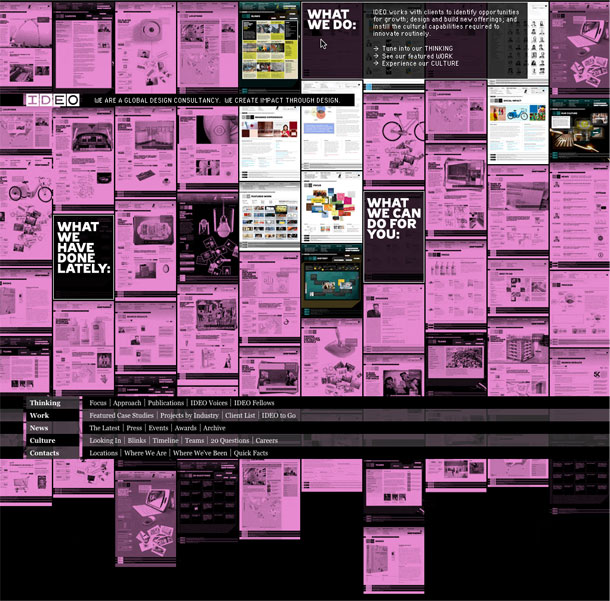
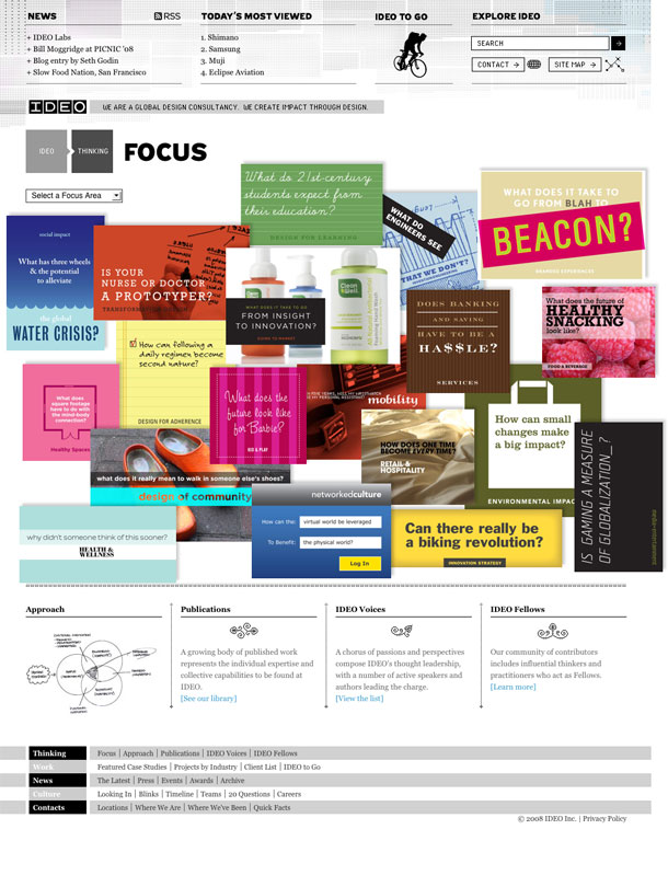
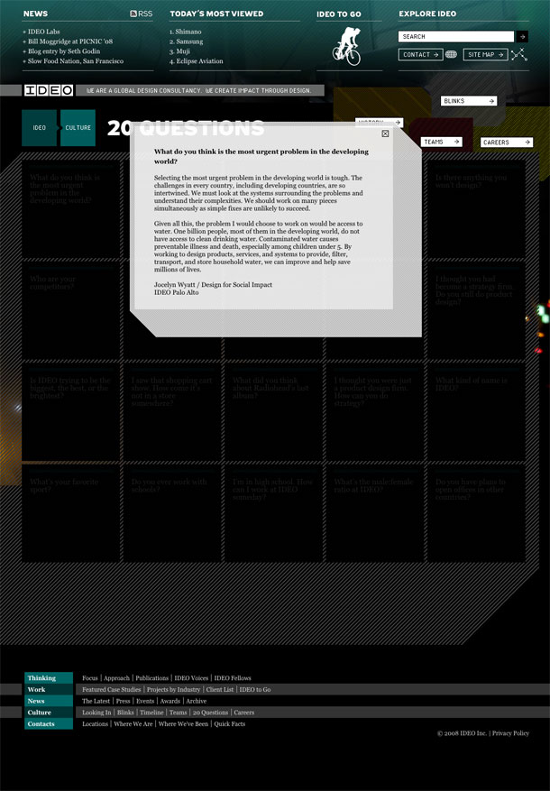
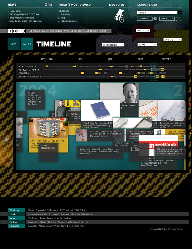
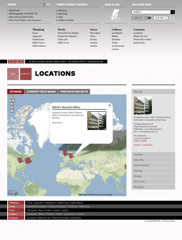
The redesigned IDEO site has been sitting in a browser tab for a few weeks now because it just felt like one of those things I needed to mull over before writing about. It's one of the few sites this year that just took me by surprise. In short, the deep treasure trove of content unleashed in this redesign is a huge departure from the tightly constrained and minimalist prior design. The old design featured a buttoned up business face, showcasing and marketing what they do and have done. The new design pulls down the curtains and shows more of who IDEO are and how they do what they do from many perspectives. This quote from IDEO designer Valerie Casey describes this new desire for transparency.
"For me, the greatest achievement of the new IDEO.com is that it really manifests IDEO's culture--transparent, messy, highly creative. We are a family of observers and collaborators, builders and storytellers." (From Core77)
I was initially overwhelmed when trying to make sense of the site. The loose and deep architecture and the flipped upside down navigation seemed the antithesis of the tidy IDEO sites of the past. But after that initial realization that there would be so much more to explore in this site, one digs in, and all of the references and currency of the exposed business begin to make sense. They're telling a different and more intimate story here, and its one that lets you almost feel like a fly on the studio wall. What you buy into here is the value of this culture, and the beliefs they're communicating. It's really the way marketing should be done.
"Created In Powerpoint" they say. This very simple, witty flash site for the agency Love Creative deserves to be here for its witty, big buttoned, black and white interface alone.
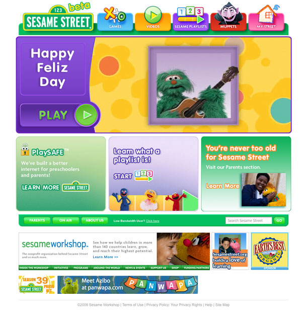
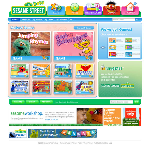
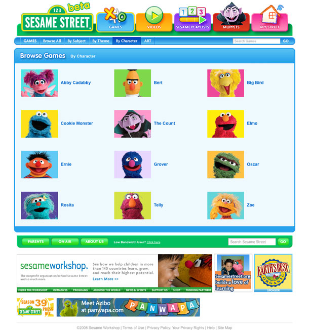
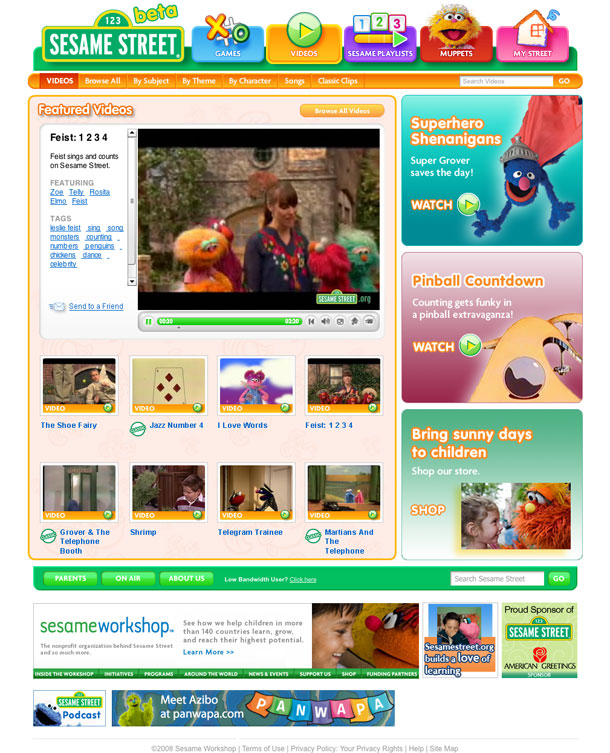
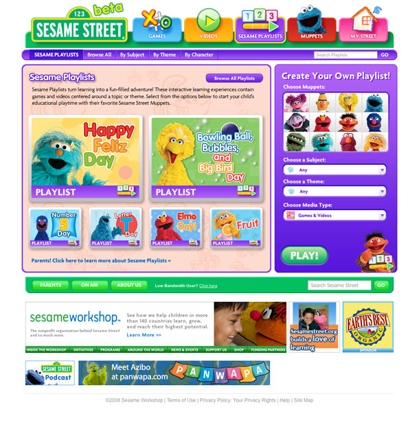
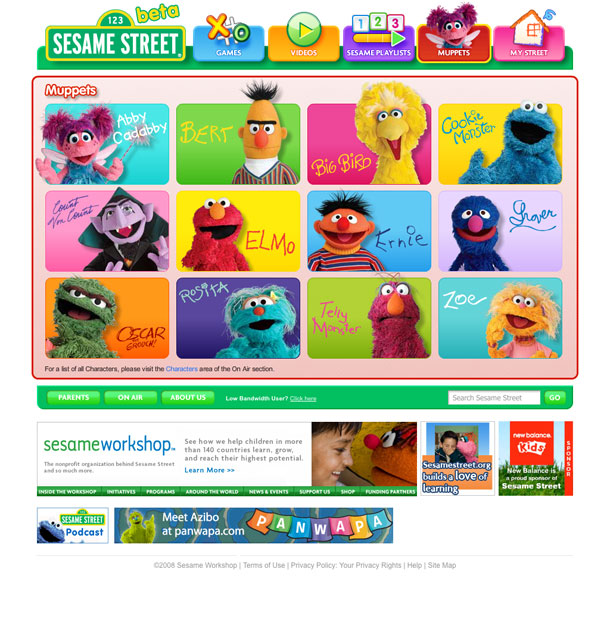
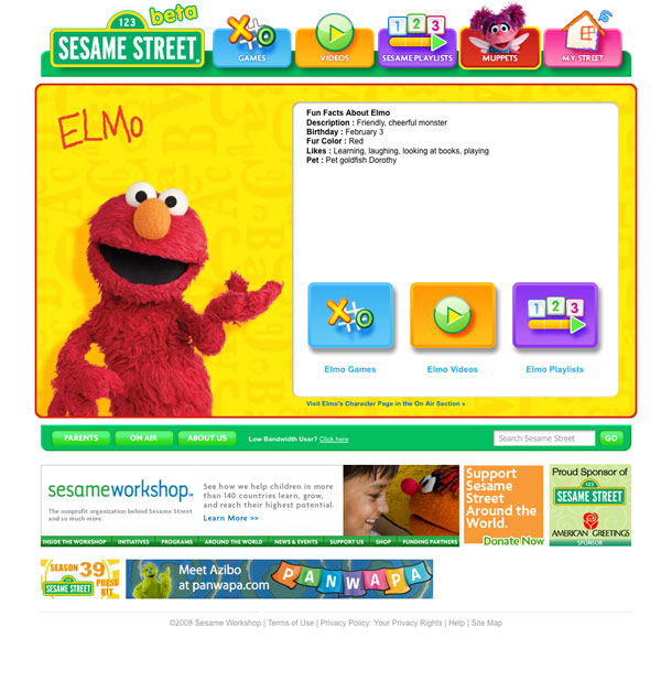
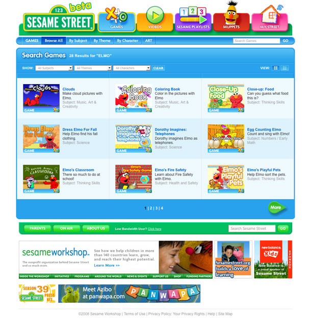
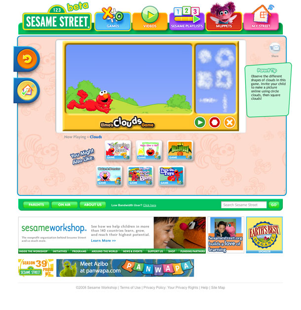
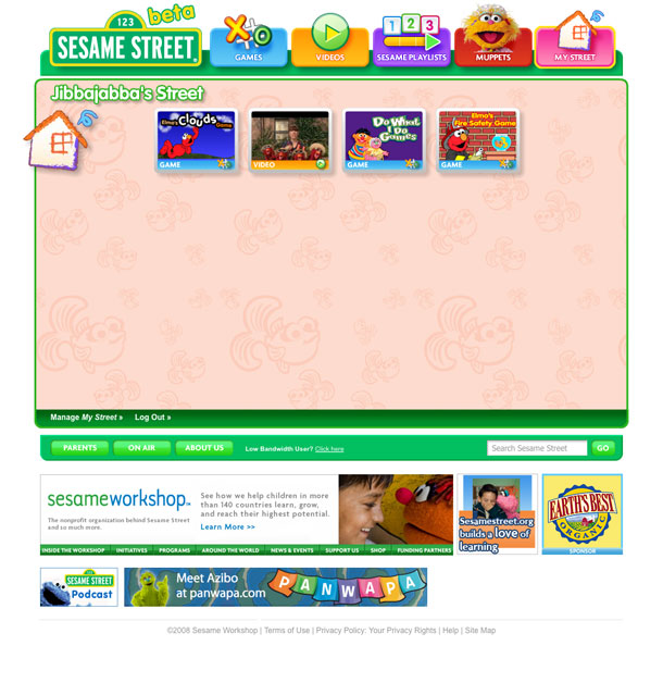
The Sesame Workshop and PBS produce excellent Flash sites for kids. Among my favorites are the Sesame Street and Arthur sites. The recent redesign of the Sesame Street site adds new navigation options, a more YouTube-like video section, and most notably, user profiles. The best of the new features is the ability to add favorites to "Your Street," a user profile page that uses your favorites to display a start page. The refresh keeps Sesame Street among the most usable web sites for kids.
One of the things that I really liked in the prior design was the Muppet navigation bar that ran along the bottom of the interface. When my child was pre-literate, this let him explore the site easily, while the voice-over of each link label reinforced the spelling of the names. They do a lot of that still here, but the Muppets are now a level down. Once you're within each section, however, the site utilizes a lot of narrative for help, illustrations, and pictograms for buttons.
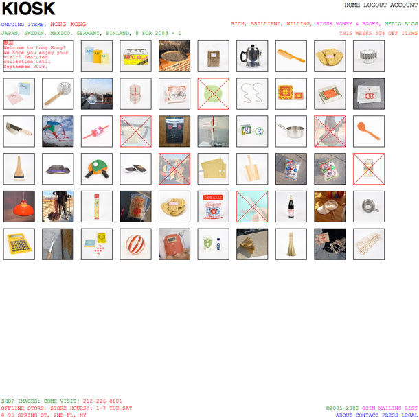
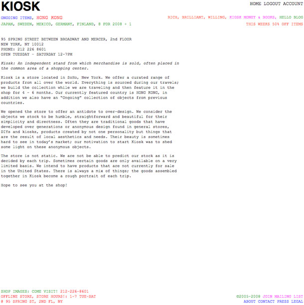
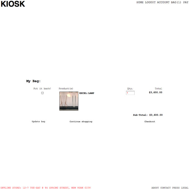
You probably know that I like minimalist design. I like it not only for its aesthetic appeal, but because of its utility in helping to bring clarity or focus to an idea. The site for the KIOSK shop utilizes a minimalist aesthetic. I can't say I love it, but I love the story, which can describe this better than I can.
"We offer a curated range of products from all over the world. Everything is sourced during our travels; we build the collection while we are traveling and then feature it in the shop for 4 - 6 months. ... We opened the store to offer an antidote to over-design. We consider the objects we stock to be humble, straightforward and beautiful for their simplicity and directness. Often they are traditional goods that have developed over generations or anonymous design found in general stores, DIYs and kiosks, products created by not one personality but things that are the result of local aesthetics and needs. Their beauty is sometimes hard to see in today’s market; our motivation to start Kiosk was to shed some light on these anonymous objects."
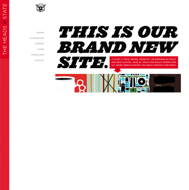
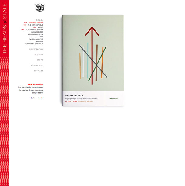
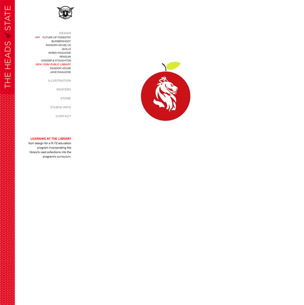
The Heads of State are a 2 person design studio in Brooklyn and Seattle. Their recently redesigned site showcases the strong portfolio of print work on projects including book covers, magazine illustrations, and corporate identity. I love the simple, powerful covers on the Rosenfeld Media books, and after diving into their site, I think I'd love even more to hire them in the future.
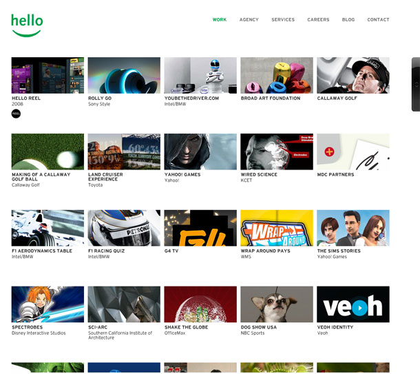
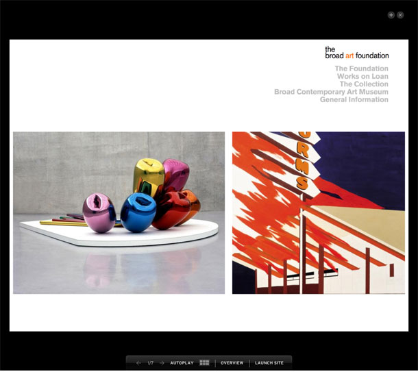

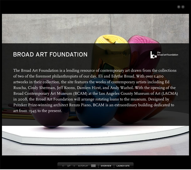
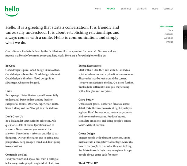
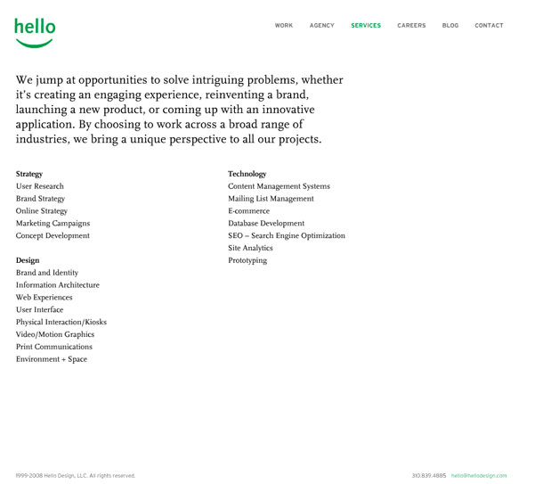
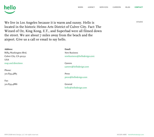
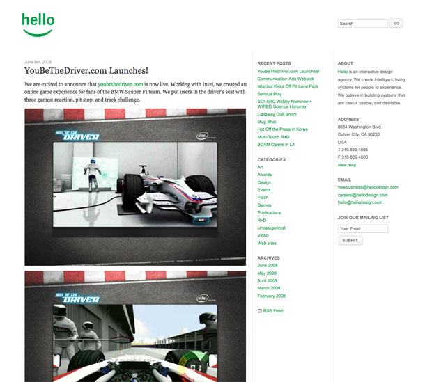
Hello is an interactive design agency in Los Angeles, California that have worked on projects ranging from immersive online experiences to kiosks. Their Flash portfolio is a clean, minimalist layout that puts the work on center stage. Rolling over a thumbnial dislays a slides and rotates through a few thumbnails for that project. Clicking on the project turns out the lights (background color) and displays either a slideshow of project screens or a video reel.
The remainder of the site provides a simple layout with SEO links and understandable navigation. The customized Flash scroll bar that they've implemented is even usable and plays nicely with a mouse scroll wheel. Couldnt' be done better.
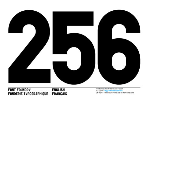
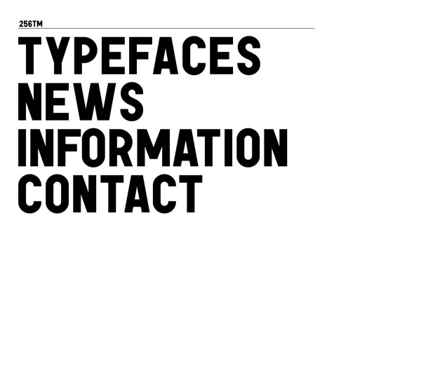
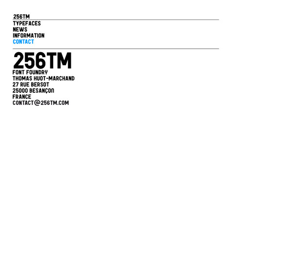
What could be more appropriate for a font foundry than to use its own large, capitalized type as the focus, form, and interface for the design. 25TM is modern, minimalist, and makes its statement firmly—type is the message, period.
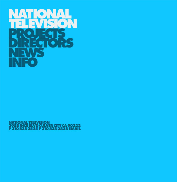
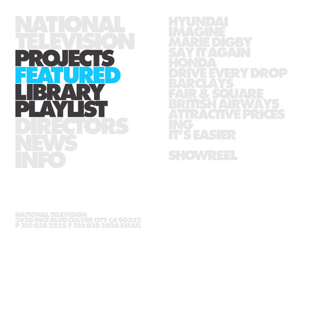
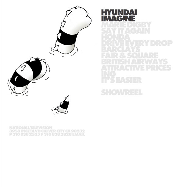
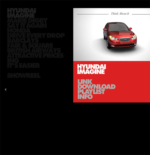
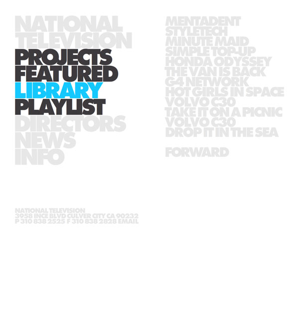
National Television is a video and film production studio in California. It's portfolio site is among the best examples of the use of bold typography as the primary element that defines both the form and interface. The look is clean and undeniably confident.
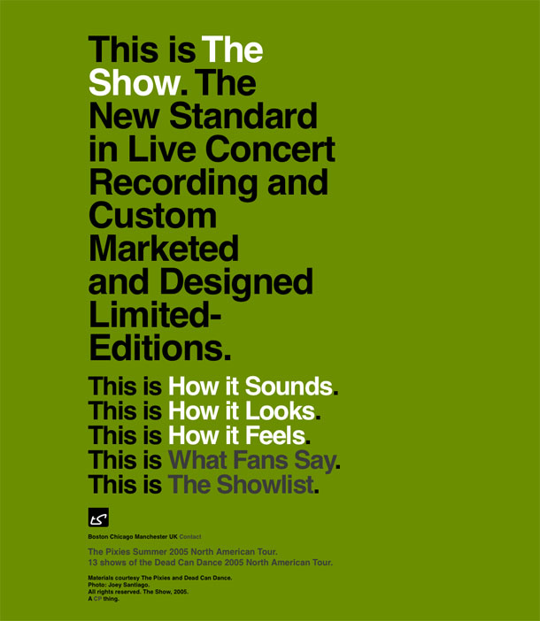
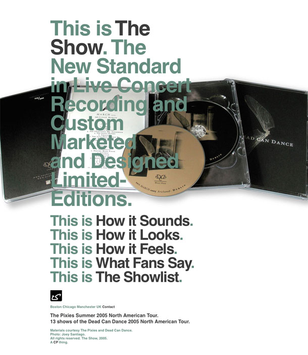
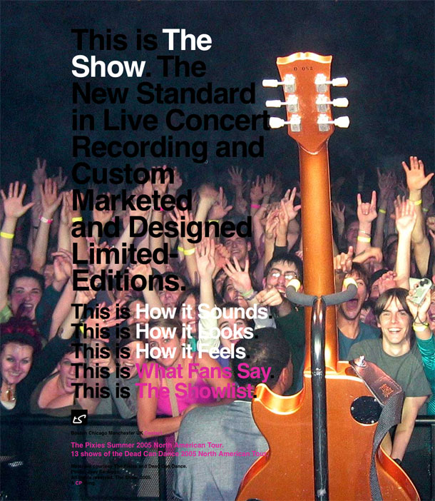
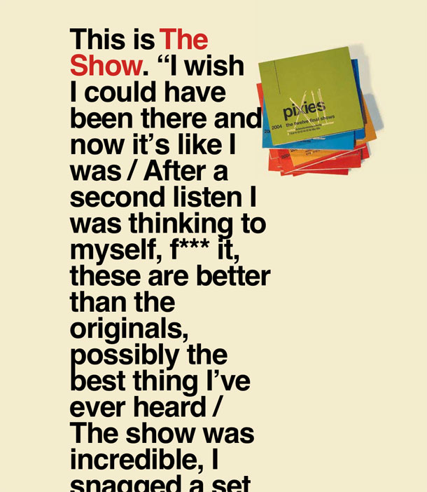
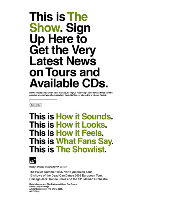
Big bold typography that functions as navigation, full screen photography that functions as backdrop, a simple message, and a lasting product that does justice to live music performances and the people who love them.
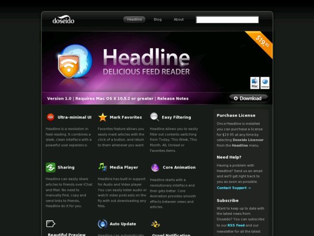
Doseido makes a simple RSS reader for the Mac. The product site sports rounded corners, a dark, glossy, beveled look, and pretty icons. Feels very much like a Mac product site.
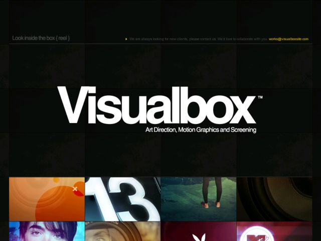
Visualbox is an agency in Buenos Aires, Argentina. Their portfolio is a single page scrolling site with project images laid out on a slate gray tile background. Love the huge heading and the gorgeous, crisp images.


The portfolio site of Erwin Bauer takes a different approach to using a pannable user interface, but implementing in JavaScript rather than in Flash. The site allows users to click and drag to pan the canvas, or to use links positioned around the content to move around. The design is clean, and mimics a design document with regisration and crop marks, and visual cues about the directions the canvas will pan to when you navigate.

TNOP's site is as minimalist as they come. A form select lets users navigate sections, and viewing content requires horizontal scrolling. I'm not a fan of horizontal scrolling, especially if I have to use the scroll bar versus an in-page control, but it's bare bones and well executed so I like it.
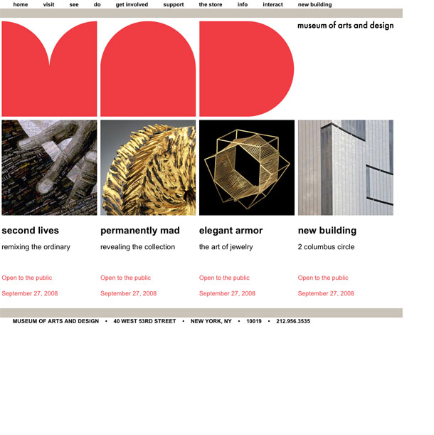
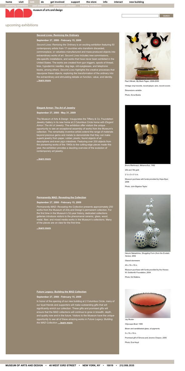
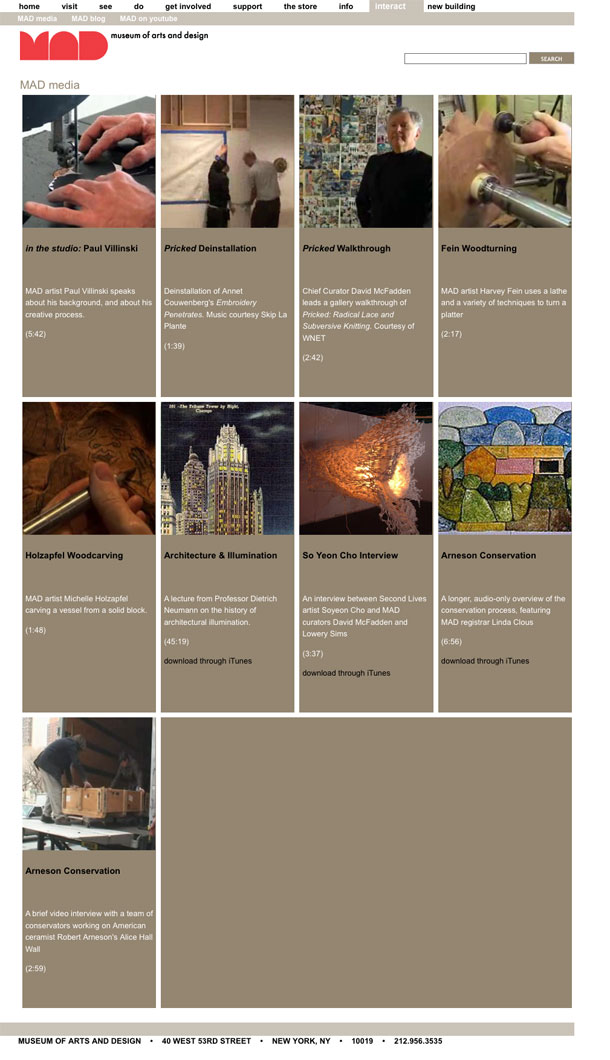
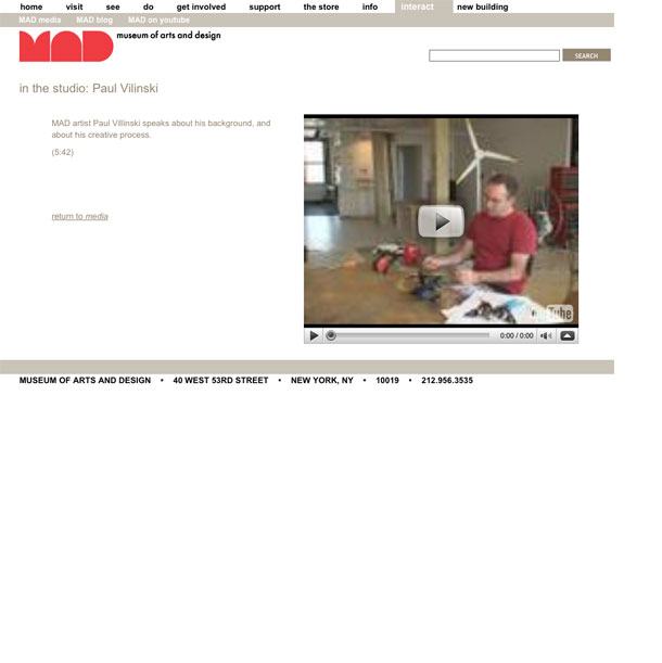
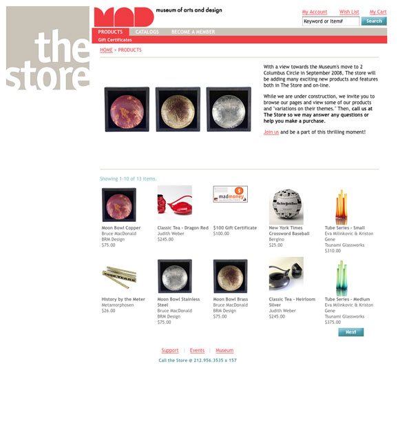
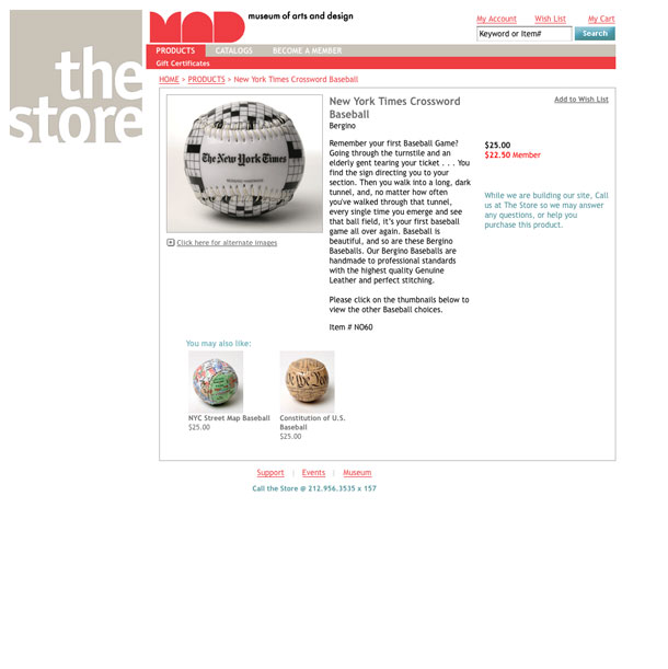
My first impression when landing on the MAD Museum site is that there is a sense dynamic tension between the huge decorative shapes that make up the bold MAD logo and the clean layout, whose grid and the solid blocks of type and photos feel very modern. There is an appropriate feeling in that tension that works well to characterize a museum like this, that houses objects of such a wide range of styles and periods.
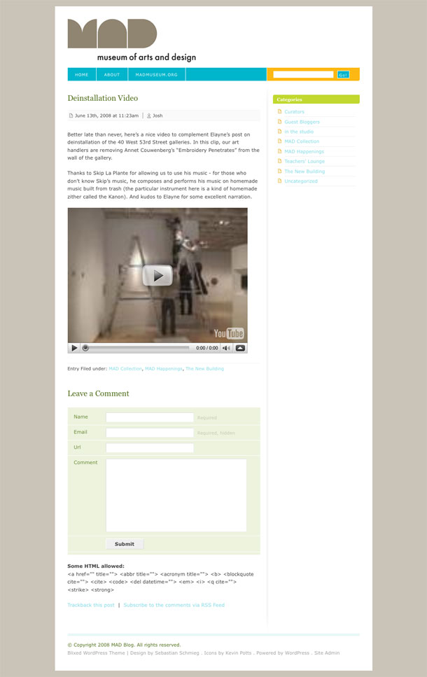
I like how the MAD style and color scheme carries over, more or less, from section to section. When leaving the site proper to the blog and store, for instance, the visual signature of the logo keeps you connected to the MAD Museum family, as do the subtle variations of the color scheme which still reflect back on the muted tones of the main site.
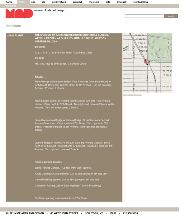
What I don't like are maybe minor details, but local navigation links on the main site occasionally jump the user out of the section they're browsing. The task-based navigation labels are nice though: visit, see, do, get involved, etc. I also dislike the shift from fixed left position to centered position when you go from main site or store to the blog. It would be nice to have a bit more consistency in the grid and layout between these sections.
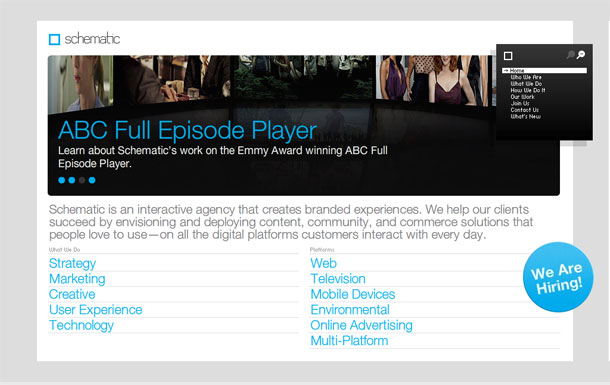
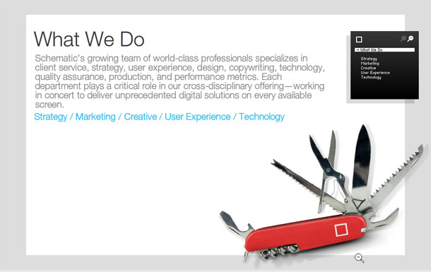
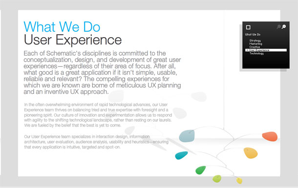
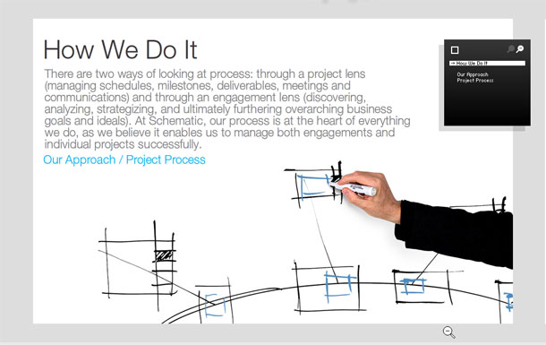
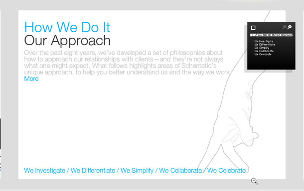
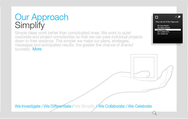
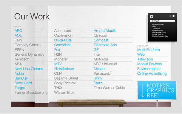
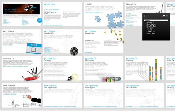
Schematic is a large agency with 6 offices in locations including Los Angeles, New York, and London. They provide a host of services including strategy, creative, marketing, user experience and technology. It's portfolio shows how a company site can be at once slick and easy to use. It's easily on my list of favorites and is one of the nicest portfolios to look at.
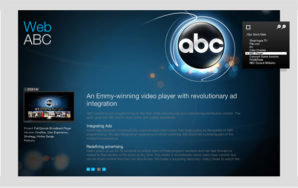
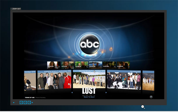
What I like about this site, besides the very clean visual design, is that it provides a very usable example of a zoomable user interface. You don't see it immediately upon entering, but each page of the flash site is laid out in a very large canvas, with each section organized into rows. Each page is essentially a rectangular miniature-canvas. They look like index cards when you zoom out to visualize the entire canvas at distance.
A persistent global navigation bar is shown in the upper right corner of the screen as a black box. As you click links in the pages or in the navigation bar, the canvas pans to that page and the global navigation box switches to show the local navigation for the section you're in. Clicking empty square in the navigation box returns to the main global navigation menu. Clicking the minus magnifying glass zooms you out to see multiple pages in the canvas. Each click provides a Flash permalink URL for linking and SEO purposes.
I'm not a fan of splash pages, but I really like the illustrations on the splash screen menu and the minimal approach to navigation. I could see repeating the illustrations in the header as well, though, rather than using the pop up menu. I also think it would be nice if they would be shown in color on the splash page. Those great illustrations shouldn't be hidden. The layout is clean and the style is very soft and elegant. For usability sake, I could deal with a slight bit more contrast in the text color towards a darker gray as well. Overall, however, I find this site very easy on the eyes.
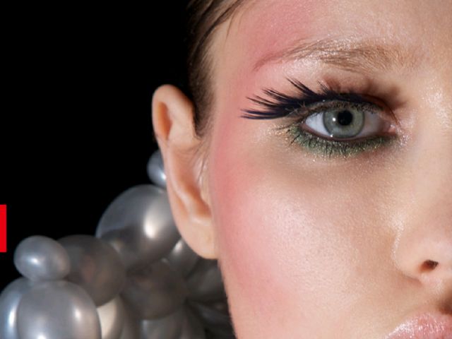
Daisy is an artist that does incredible things with balloons. The site presently shows some amazing dresses fabricated with the long balloons you'd usually only see in the form of little animals, but Daisy elevates the art to design amazing clothing that could be called haute couture. I could easily imagine these things being made out of a less ephemeral material and being worn, albeit a bit uncomfortably.
The portfolio is bold and simple, with full-screen sized, closely-framed photography. Fabulous.
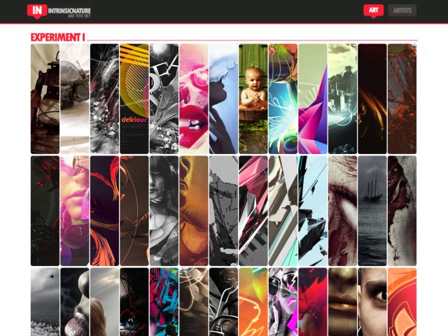
I love viewing these slices of art work this way. I like galleries that provide a glimpse of a lot of work at this scale. I used to be a big fan of a web project in the '90's called Slice The Web, which grabbed images from the web and re-arranged them into random overlayed slices.
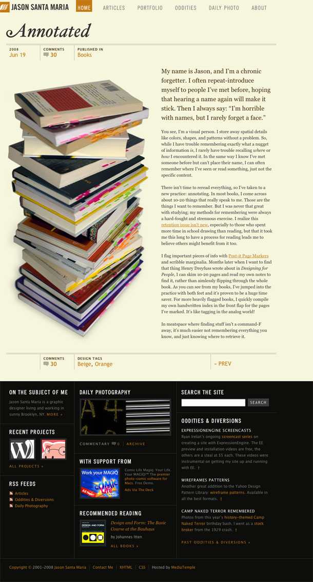
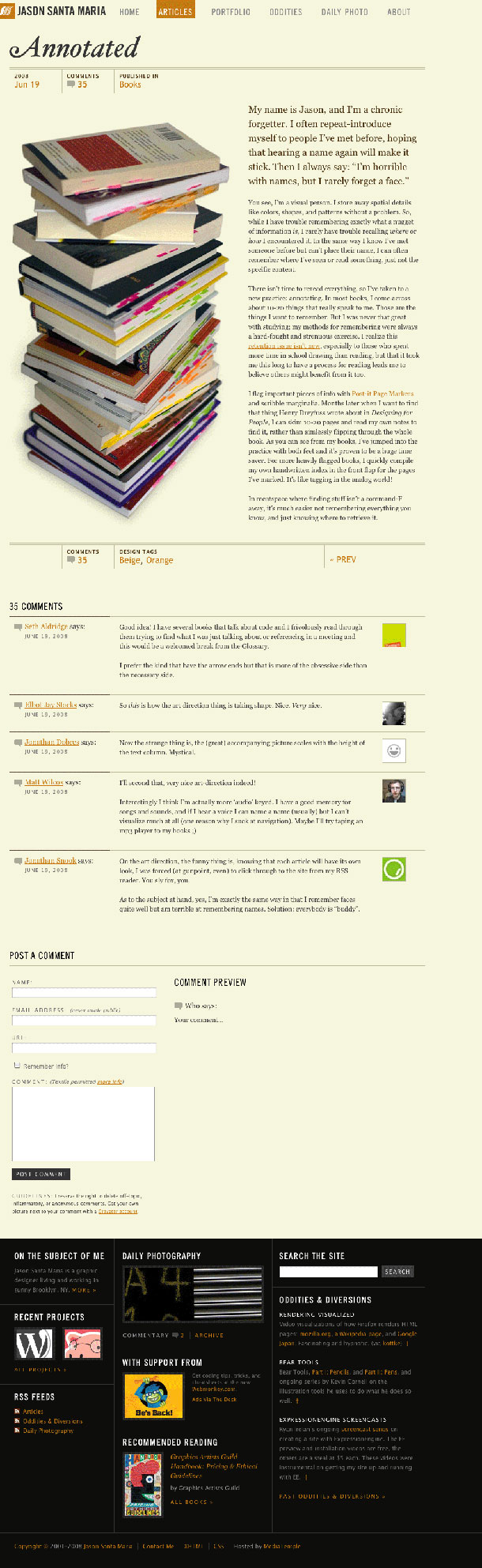
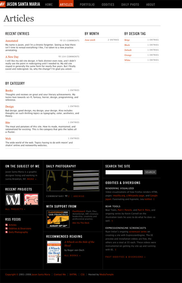
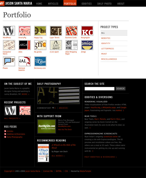
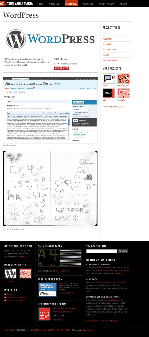
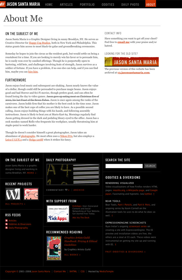
Brooklyn visual designer Jason Santa Maria redesigns his site with a more flexible system that will allow him to adapt the design of each entry to suit the content. He notes that this is a redefined focus on art direction, and a magazine approach to content publishing outside of the typical confines of a CMS templating system.
I liked previous site design, and its reference to physical print. But I find that while the new visual style might refer back to the feeling of print, this visual style is more appealing to me as a someone who tends to be drawn to modern design. The larger font sizes and greater contrast between header/footer elements and content gives it a more forward-looking feel to me than the warm colors in v2. Love it.
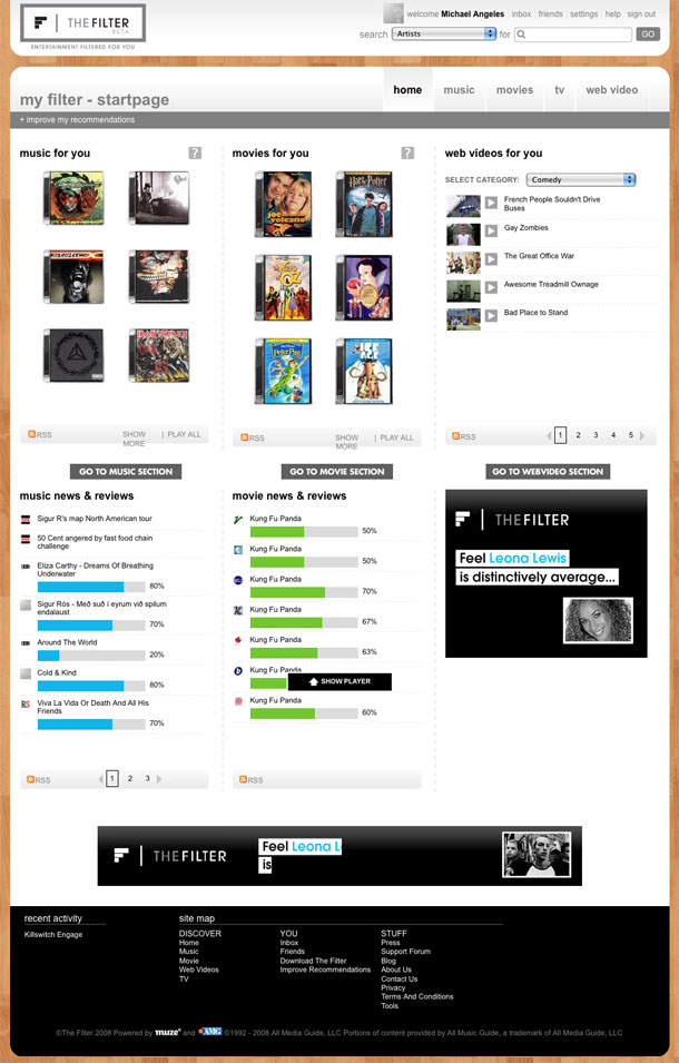
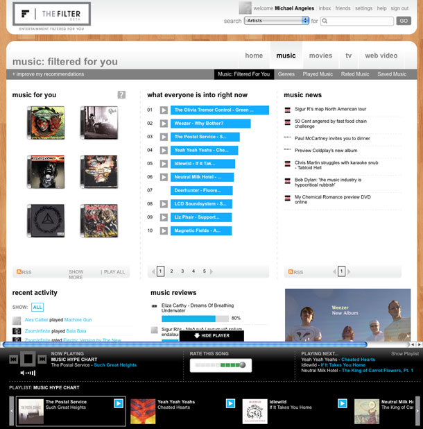
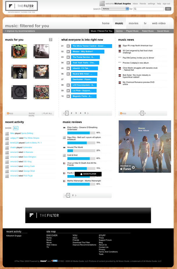
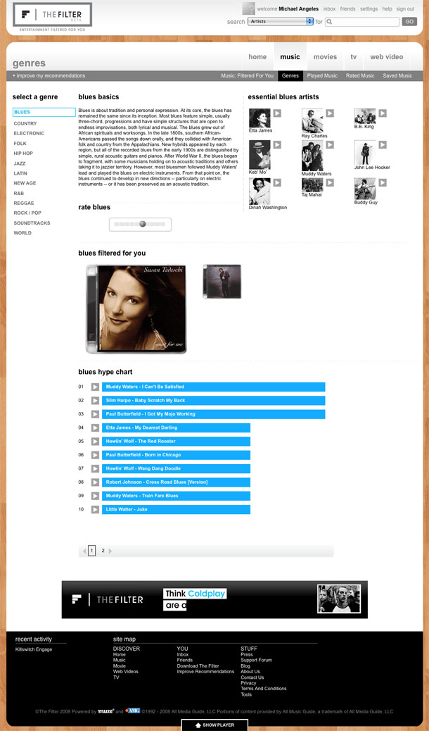
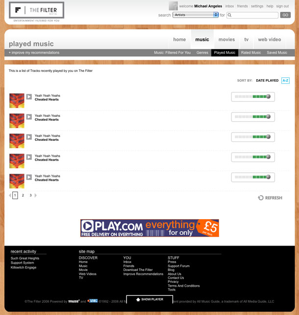
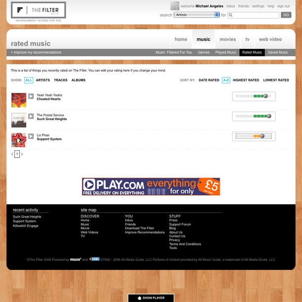
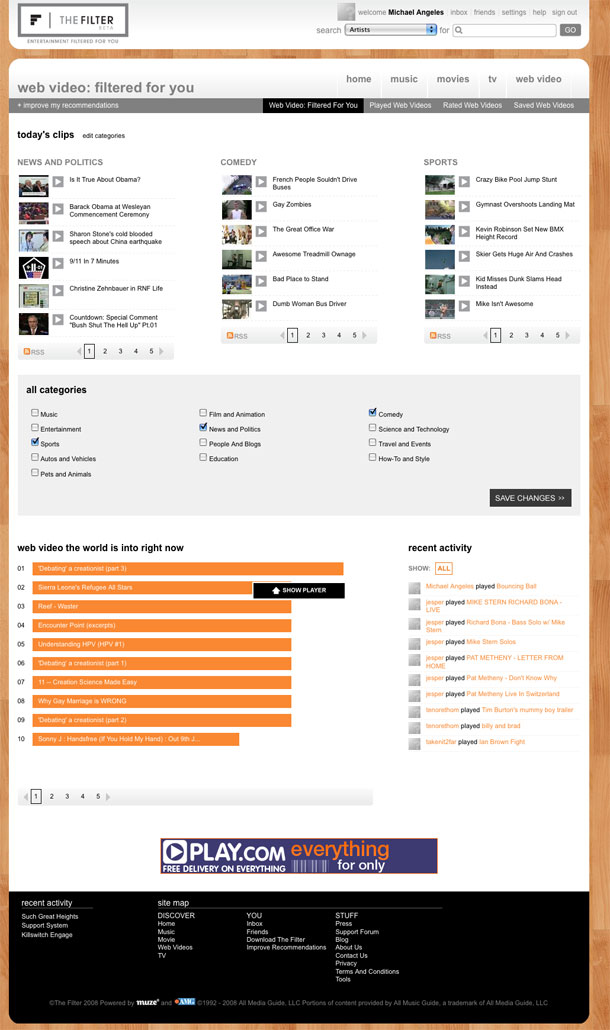
The Filter is an portal that aggregates music, TV, and video content. The project was started by Peter Gabriel and is looking to get amass a community of users who are willing to rate content so they can provide recommendations back to the community.
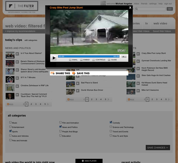
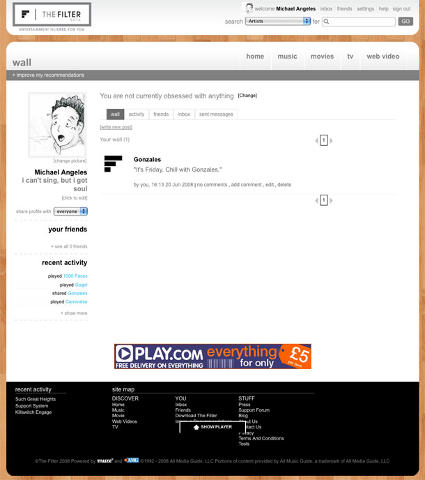
The site is looking to be a comprehensive consumer experience for all media, and essentially is pulling content from various sources and providing a single interface for adding recommendations and usage metadata to that content within the confines of this community. Some things that stood out as being interesting are the ratings control, chart views, the customized video filter modules, and media embedding in Wall messages. On my Mac/Firefox I found the docked player to be a little buggy at times.
Because The Filter is focussed on a more diverse set of content than singularly minded music sites like Last.fm and Lala.com (which recently redesigned to also focus on your own media), they don't seem to pull off the experience as well as those niche communities. A lot of the browsing and paradigms are borrowed from social networking sites like Last.fm and Facebook.
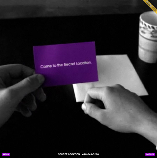
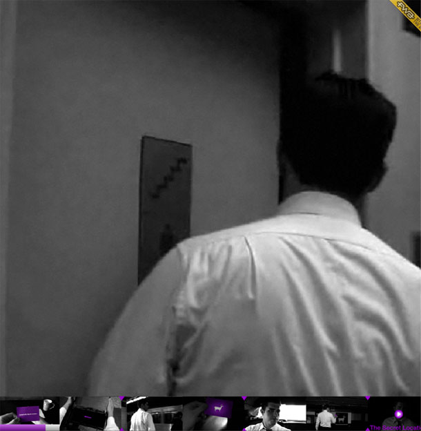
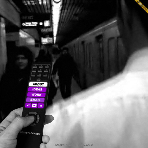
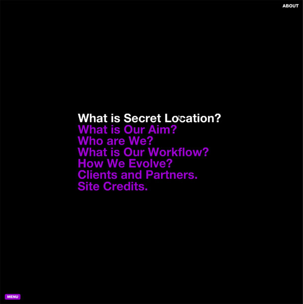
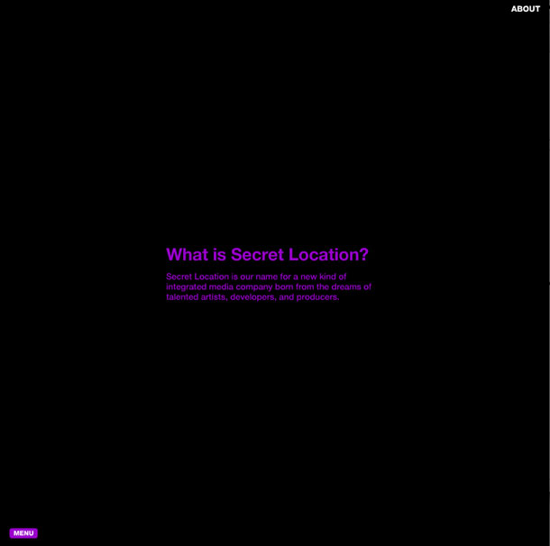
The Secret Location is an agency that works on interactive, film, animation, and motion graphics. Their portfolio exemplifies their work, by providing an immersive flash experience around a conjured up story leading a character to follow a mysterious path that leads to the secret location. Luckily the story is short and engaging, because that location leads down the path to the real goods, the company site and portfolio. Once you summon the remote control in the lower left menu, you navigate with a pretty simple hierarchical tree to drill down into the portfolio. Very nicely conceived and realized interactive art direction here that reminds me of Rec movie site.

Peter Bruce's minimalist site showcases a portfolio of fresh, and bold graphic design work, some of which bears a quality that evokes Paul Rand. The site layout is a simple, clean presentation reflective of the designer's body of work.

Graphic designer Keith Hancox's site is as spartan as it gets. He renders the monochromatic interface, including rulers, with a monospaced font, and the only graphics are the portfolio pictures. Would be easy to convert this site to use CSS rather than tables.

Single page portfolio of designer Rob Brearly. Large photos and screenshots in a simple grid make this portfolio a pleasure to scroll through.

typeish is a showcase of images, joining sites such as ffffound and weheartit. The site notes that it differentiates itself by limiting the participants to a select group that will curate the gallery. Stylistically, the yellow legal pad with scribbles and coffee stains makes this site stand out from the bunch of galleries out there, which I generally categorize at either end of the spectrum as either minimalist with few graphics or textured, 3 dimensional or glossy on the other end. This is somewhere near the latter.