UNIQLO TRY

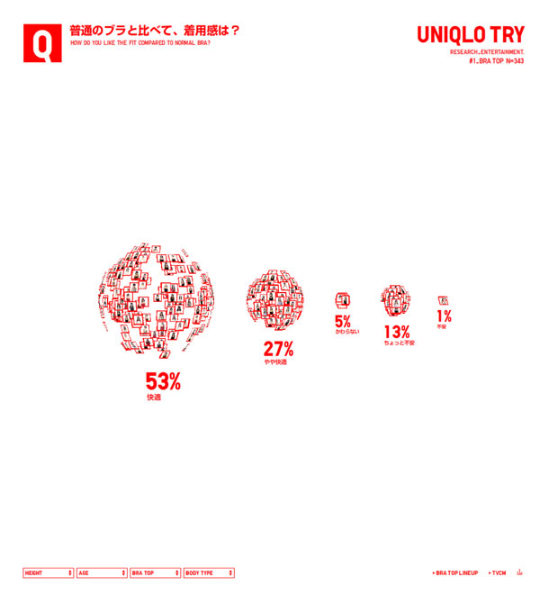
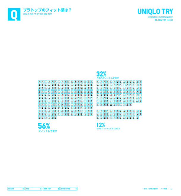
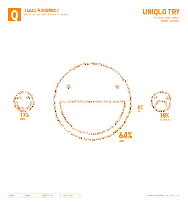
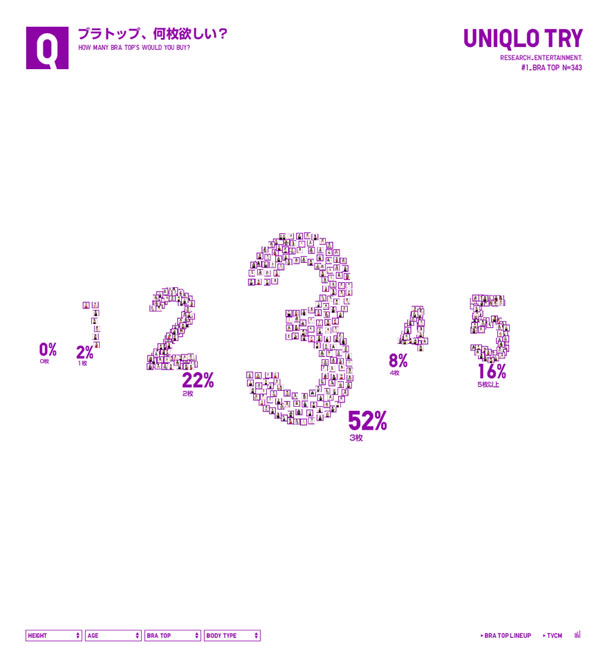
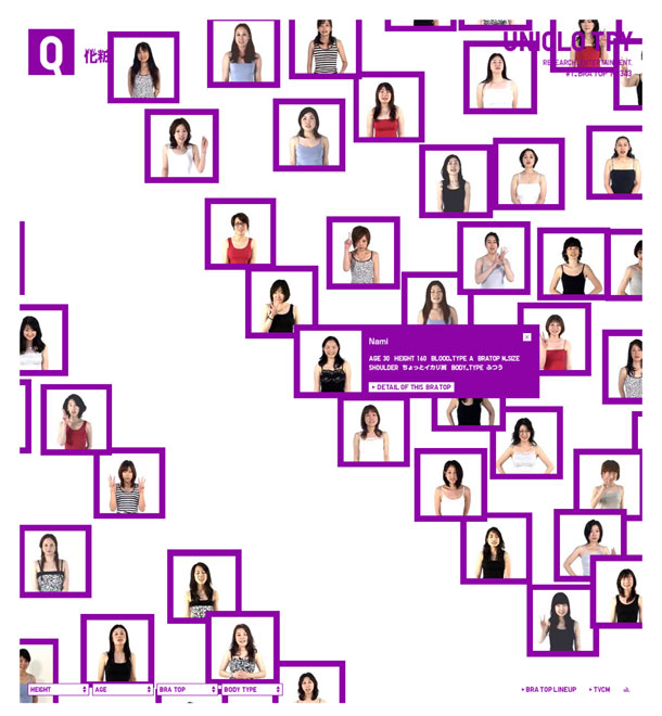
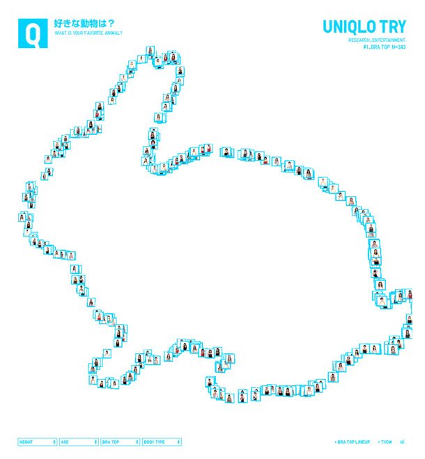
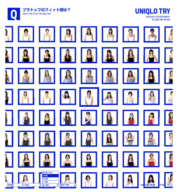
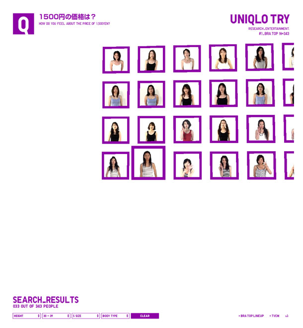
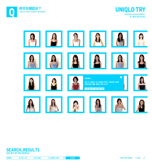
Yugo Nakamura and the Simone Inc. crew are serving up some sick Flash once again for Uniqlo. This time, the mini site is devoted to women's bras. The mood is cheerful as happy electronic strings accompany the dizzying array of women's headshots spinning and combining to create patterns in 3D space. Click on a picture to reveal the details (in Japanese) of one of the women's age, height, and bra size, or use the pop up menus to filter the set down. Visualizing underwear stats has never been so fun.

http://www.uniqlo.com/try/

Buffalo

Buffalo's site is simple on the surface, with very few pages. What I like most are the transitions when you click to view their work. AJAX is used to display work in-page, similar to the functionality of a lightbox, but doing away with transitions typically indicated by graying out the background. This version displays the portfolio panel with a close icon. They also use AJAX to toggle visibility, e.g. in their About page.

I also liked that visually the site is both ornamental and clean. The colors of the wood panel background provide warmth and the subtle ornamental flourish in the header makes everything feel stylish and quirky. The cool colors of the text contrast enough with the wood to make the page visually easy to scan. The comment bubble headlines and buttons with handwritten text provide a human feel.

http://www.builtbybuffalo.com/

Jan Quickels

This is a clean, minimalist portfolio. I like the grid of projects in the portfolio and the simple project pages and slideshows. The feeling is very clean and easy to read, even with medium contrast gray text. The brown/orange accent color works very well on buttons and highlighted text.

The only thing I thought odd was that the site name didn't accompany the logo in the upper left. I realize the name is visible title bar and footer, but it might be useful to see near the logo if you arrived from an inner page.

http://www.jan-quickels.de/

SOFAMADE

SOFAMADE are a design and development shop in Arlington, Texas.

What I liked about their site most was the bold front page colors and intro paragraph with inline links and the wide 2 and 3 column grids that varied from page to page. The layout of the text-heavy Approach page and the Portfolio pages is clean and easy to read, although I thought the Approach pages did a better job at indicating the hierarchy of page elements. The black/white style switcher is also a welcome setting for people who dislike reversed white/gray on black.

What I wasn't crazy about was the handling of link colors in the portfolio section, where they break the convention of using pink background colors, and only use pink to highlight the current project. It took me a second to see that out. In other areas, pink text is used to accent copy. I also dislike lightbox effects that require scrolling the page for long images in order to keep the correct width.

http://www.sofamade.com/

blip.tv

I have a weakness for ultra clean, modern sites, especially those that are devoted to showcasing photos, screenshots, or video. The minimalist sites that minimize graphics, let type function directly as interface, and all but vanish from your awareness really let the content come to the fore. Among the video portals, blip.tv is the one that fits this description perfectly.

http://blip.tv/

Enigmind

Engimind is a design agency in Bogota, Columbia. Their flash site has a clean, modern, and mechanical feel, and features some unique navigation tools that allow users to click links, or use their keyboard entirely to move select sections and scroll through their portfolio.

http://www.enigmind.com/#/NEWS/

krolikov

Krolikov is the illustration and animation studio of Russian designer Sedova Elena. Great illustration, and the subtle 3d effect of the boxes adds dimension and interest to the frame surrounding the content. The little touches of animation are brilliant, e.g. the plug in effect on the home link electrical cord and the little motion when mousing over the global nav. I was sort of expecting the little character on top of the books to wink at me or something.

http://www.krolikov.net/main_en.php

the playground

the playground is a design studio in Sydney, Australia. Their portfolio is elegant and has a minimalist sensibility, allowing photographs of their work to do the talking. They specialize in corporate identity, packaging, interiors, web design, signage, and international sourcing.

http://theplaygroundsydney.com/