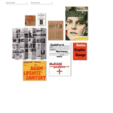
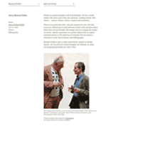
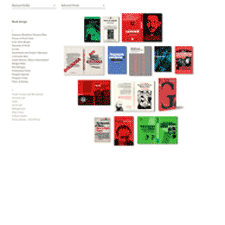
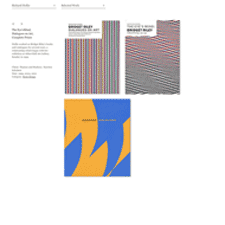
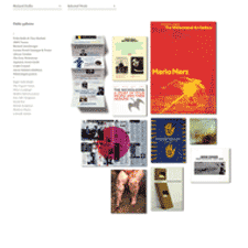
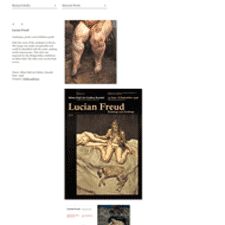
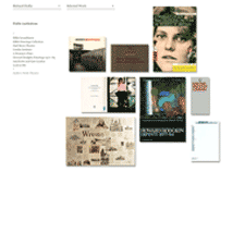
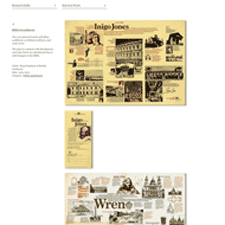
I like the simplicity of the portfolio pages on graphic and book designer Richard Hollis' site. The layout of the thumbnails of the design work as if posted on presentation board is nice. Clever shadows on the folded pieces are a nice touch as well. The enlarged images in the product details put the work front and center, with no need for explanation.
Via siteInspire
