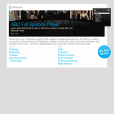
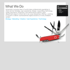
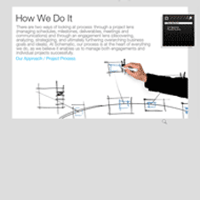
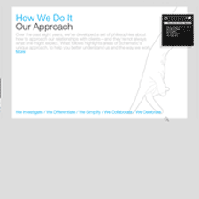
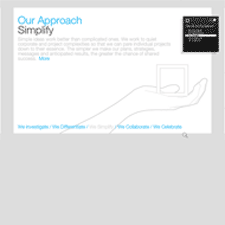
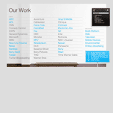
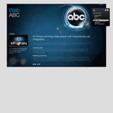
Schematic is a large agency with 6 offices in locations including Los Angeles, New York, and London. They provide a host of services including strategy, creative, marketing, user experience and technology. It's portfolio shows how a company site can be at once slick and easy to use. It's easily on my list of favorites and is one of the nicest portfolios to look at.
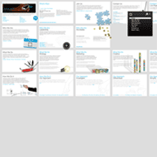
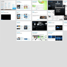
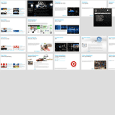
What I like about this site, besides the very clean visual design, is that it provides a very usable example of a zoomable user interface. You don't see it immediately upon entering, but each page of the flash site is laid out in a very large canvas, with each section organized into rows. Each page is essentially a rectangular miniature-canvas. They look like index cards when you zoom out to visualize the entire canvas at distance.
A persistent global navigation bar is shown in the upper right corner of the screen as a black box. As you click links in the pages or in the navigation bar, the canvas pans to that page and the global navigation box switches to show the local navigation for the section you're in. Clicking empty square in the navigation box returns to the main global navigation menu. Clicking the minus magnifying glass zooms you out to see multiple pages in the canvas. Each click provides a Flash permalink URL for linking and SEO purposes.
