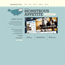
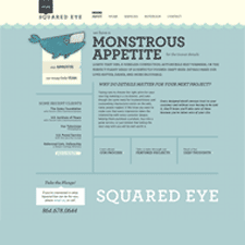
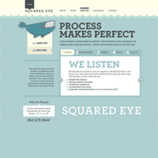
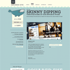
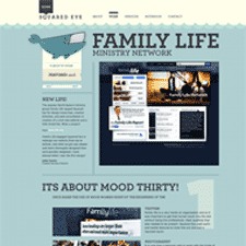
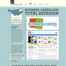
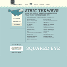
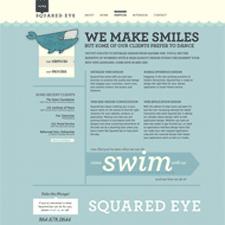
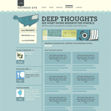
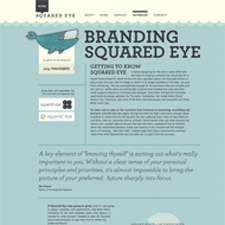
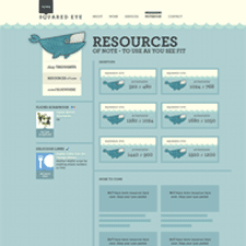
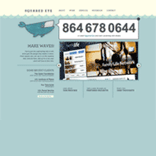
Squared Eye's newly relaunched site goes down in my short list of favorite redesigns. I love the fun art direction and editorial copy throughout the site, starting with the excellent whale logo, the crafty feel of the cutout graphpaper waves in those beiges and workingman blues that remind me of ledger paper, to the excellent copy in the headlines making reference to the water theme, and the attention to detail in every link and mouseover. Wonderful stuff.
Published on Monday, Feb 23, 2009 in designs
