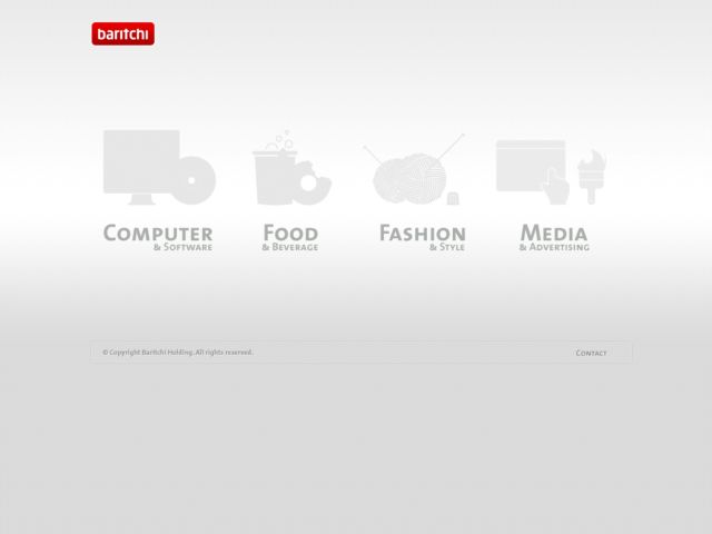
I'm not a fan of splash pages, but I really like the illustrations on the splash screen menu and the minimal approach to navigation. I could see repeating the illustrations in the header as well, though, rather than using the pop up menu. I also think it would be nice if they would be shown in color on the splash page. Those great illustrations shouldn't be hidden. The layout is clean and the style is very soft and elegant. For usability sake, I could deal with a slight bit more contrast in the text color towards a darker gray as well. Overall, however, I find this site very easy on the eyes.