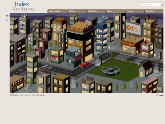
I love the isometric illustration for this little cityscape on this venture capital firm's splash page, which feels light and loaded quickly. I wish they found a way to fit a little bit more about what the company does into the design, e.g. in that scrolling ticker.
Via Andrew
