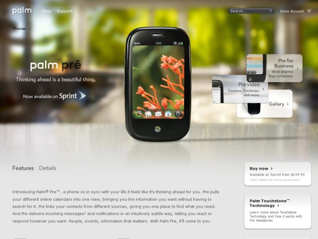
Palm's Pre product page has a serious, polished look that I assume is targeted at a "grown up," no-nonsense audience, judging by the business user scenarios in the video and the big kitchen counter backdrop. The smooth, rounded corners of the page's UI elements echo the pebble shape of the phone and the circular shapes of the Pre OS. I like the use of depth of field with the full bleed photo, the hover of the boxes on the right, the change in state when clicking the site search box, and the categorized features at the bottom.
Published on Friday, Jun 12, 2009 in designs
