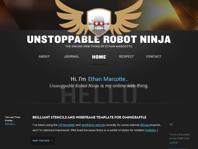
This is a bad-ass looking weblog with a very cool header. Big type and ample white space sets up a very clear visual hierarchy and makes it easy to read, and a strong center alignment of header/footer elements directs the eye. I love the big illustrated robot head in the header (kind of expecting it to wink at me) and the character photos in the footer. I also like the way the global navigation shifts so that the center link is whatever section you're viewing, which makes that centered look and directs your eyes downwards.
Published on Wednesday, Jan 28, 2009 in designs
