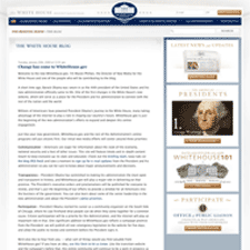
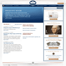
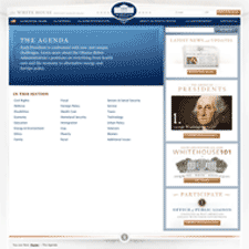
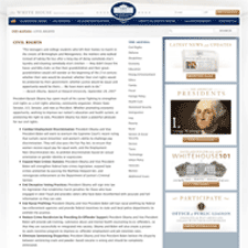
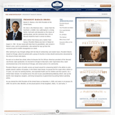
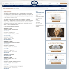
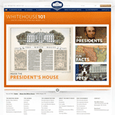
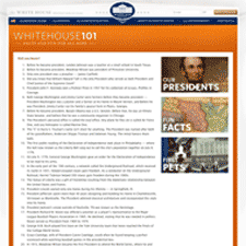
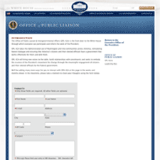
The redesigned WhiteHouse.gov site exudes a staid and elegant presence, that establishes a suitable look and feel for the new administration. Compared to the vibrant, youthful, and energentic feel of the Obama electoral campaign with it's bolder and more saturated blues and reds, and dimensional and atmospheric graphics, this site is restrained and has an appropriate seriousness that reflects the job ahead. But it is also elegant and fresh, and has the feeling of being modern, yet stately.
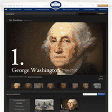
Subtle details make the design. Notice the pyramidal shape of the header, echoing the triangular pediment of the building shown in the White House seal, the faded image of the Oval Office's molding in the background, the horizontal break between the body and the footer made by the seal of the president and the strong red line, and the understated shadows complete the sense of dignity. This says, "solid" and "stable" to me, and firmly points to government's philosophical roots in things classical. Notice also the special treatment of the slideshows in the "About the White House" section, which are gorgeous. But what will make this site most successful is it's use in providing access to information from the White House, and the presence of the blog and video sections gives the sense that the site is ready for the task.

