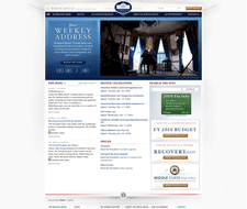
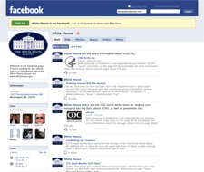
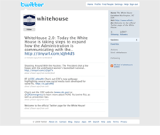
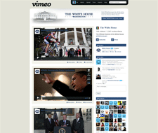
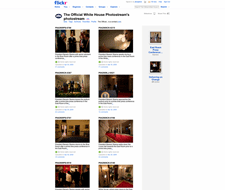
This selection of screens showcases the different social networking and video sites that the Whitehouse has set up. It's interesting to see how much continuity and consistency they're able to achieve given the design constraints imposed by the sites. Perhaps they're given the unique layout options Networks get on YouTube channels. But they couldn't do much with the Facebook page. The MySpace implementation is particularly impressive as an example of site skinning. More info about these sites can be found in the White House 2.0 article.
Published on Friday, May 1, 2009 in designs
