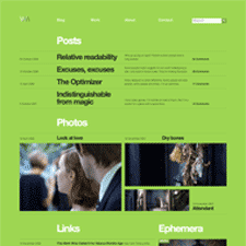
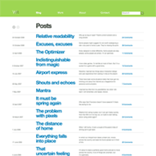
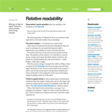
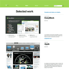
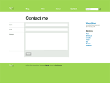
Designer/developer Wilson Miner's portfolio and weblog is ultra-clean and very easy to read. The large type and great use of white space presents a clear hierarchy of page elements, and attention to details like the simple use of prev/next arrows for carousels and pagination make perusing this site a pleasure.
Published on Tuesday, Nov 11, 2008 in designs
