User Interface Design Gallery

A gallery of user interfaces that I've collected over the years.

Mention Call To Action

Mention.com's Success Stories section uses this great phrase to introduce the Proof in the drip pan at the bottom of the page.

"They also started with a free trial." Short and persuasive copy that makes an otherwise common CTA more compelling.

1. Intro text, subdued company logos for the proof (so as not to compete with the CTA), and bold red call to action button to create your first alert and start a free trial.

https://en.mention.com/success-stories

Cotton Bureau Off-Canvas Checkout

Cotton Bureau uses the off-canvas pattern to slide steps of the checkout flow into the screen from the right, as the product page and previous steps slide off screen to the left.

I like how this implies the forward movement through the checkout process a bit better than the cart workflows that use vertically arranged collapsing panels.

1. Product page.
2. After adding product to cart, the cart panel slides in from right, and product panel slides off canvas to left.
3. Shipping information slides in, pushing content off-canvas left.
4. Review/Billing slides in, pushing content off-canvas left.
5. Steps removed and Confirmation panel appears (with a darker background color).

https://cottonbureau.com

Beatport Pro Music Store

Beatport's Pro app for the Mac offers a shopping experience that's tailored for the way DJs shop for music. The app lets users analyze their music (tracks, sounds, and playlists) to prepare sets and add music to their playlists. Here are some of the elements of the version 2 interface related to shopping in the app.

Beatport comes close to the experience of shopping in a record store, breaking down music into genres and sub-genres. Beyond that, they provide filters to offer some of the experience you would expect in a boutique shop of having someone select tracks by mood and type of venue/set. Hand picked charts round out the experience of having the in-the-know shop owner as curator to recommend tracks.

The interface for needle-dropping on the track waveforms gives you a decent way to judge a track over the selected preview. They provide a nice small representation of this in the track details inspector and the player at the bottom of the app. The track details show all the metadata I could imagine wanting—BPM, key, duration as well as those genre/mood/venue categorizations—along with purchase buttons. It would be useful if they made the metadata in the details inspector linkable as well.

1. Filtering by mood. Includes an option for exclusions when clicking twice on a button.
2. Adding a BPM range filter.
3. A pre-defined filter based on previously followed artists or labels is provided as a link. This is further filterable by other categories.
4. Search results for an artist, showing track details inspector in the right sidebar, and player at the bottom. Clicking in the highlighted waveform in the player lets you needle-drop to that part of the track.

http://pro.beatport.com/

Basecamp Form Focus

This is a cute interaction for the input focus and data validation on Basecamp's registration form. The smiling character illustration on the left points out which steps are in focus. When an invalid value is entered, the character makes a concerned face and the pointing hand stays fixed on the highlighted input.

The illustrations on the site do a great job of making you feel like this isn't "business as usual," which is the reason for switching to Basecamp. Simple things that make the customer smile probably go a long way in this case.

1. Smiling, pointing dude.
2. Dude is concerned about your invalid form value and stays pointed at that error to remind you to come back.

https://basecamp.com/start

YouTube Delete Timer

YouTube puts up 2 speed bumps when you try to delete a video from the video manager. This technique slows down the user about to peform a destructive action, and protects them from inadvertently deleting content.

1. Selecting Delete action shows dialog confirming action.
2. A second confirmation dialog requires confirmation, but the Delete button is disabled until the countdown timer runs out.

https://www.youtube.com/

La Wine Agency Date Picker

I like the design of the La Wine Agency site. The beautiful large type on the off-white paper reminds me of letterpress cards.

One thing I loved immediately was the age gate, which asks you when you were born so you can get through to shop for wine.

Not only is the big text for the month/day/year picker friendly, but that goofy headlines and "When were you last born?" copy is hilarious, if you catch the joke.

1. La Wine asks for a birth date before allowing you to enter the site.
2. The big text pickers highlight your value, and change the month or number to black when you've clicked a value.

http://lawineagency.com/

Zerply Email Notifications Settings

Simple things appeal to me. I like the simplicity of being able to usubscribe immediately. Zerply goes the extra mile and not only gives me options to never get email notifications via links in the notification itself, but also to change the frequency of updates. Nice.

1. Email notification from Zerply.
2. Update frequency settings in the bottom. Click and you're done.

http://zerply.com/

Slavery Footprint Form: Drag to Select

The Slavery Footprint website allows consumers to visualize how their consumption habits are connected to modern-day slavery.

They use a set of forms in a wizard-like survey to come up with an estimate of the number of slaves that are impacted by your behavior.

This section of the survey asks the user to drag the icons for items that describe the kind of house and car they own or rent into a drop area in the home above.

1. Select your home ownership type.
2. Drag in the items that characterize your home and car ownership.
3. As rooms and autos are added, the house grows to indicate your status.
4. While filling out the survey, you can fine tune your answers by adding more granular information for each category.

http://slaveryfootprint.org/

Slavery Footprint Form: Sliders

The Slavery Footprint website allows consumers to visualize how their consumption habits are connected to modern-day slavery.

They use a set of forms in a wizard-like survey to come up with an estimate of the number of slaves that are impacted by your behavior.

The forms use large controls and clear visual feedback using illustrations. Each step of the form is a full screen shown in linear progression.

1. Select male or female child to add.
2. Enter the child's age using the slider. Image shrinks/grows with age.
3. Click Done to add.
4. Child added to show how many in your family. Click an image to remove and start over.

http://slaveryfootprint.org/

Panic Shopping Cart

Panic, the Mac software company that makes Coda and Transmit, has an apparel store with fun shopping cart behaviors that mimic the Mac's dock. The apparel store shows t-shirt listings, and a little cart dock at the bottom of the page that invites visitors to drag t-shirts down into it to add to cart. Clicking and dragging shows the ghosted t-shirt moving with the cursor until it snaps into the dock. Adding a bunch of t-shirts enables the carousel. When you drag t-shirts out of the dock, they disappear with a puff of smoke, just as items in the Mac dock do. Those who don't like to drag can use the plus sign icon.

The cart page shows a clean and simple form with all of your items to purchase, your information (shipping/billing info), and payment info. Short and without any fuss. I wish open source carts were easy enough to configure to be this simple.

1. Product page with shopping cart docked to bottom of viewport, doubling as a drop area for adding to cart.
2. Drag behavior to add to cart.
3. A simpler add icon is also provided.
4. Cart shown with carousel controls when reaching max number to display. Users can drag items out and they're removed with a puff of smoke.
5. Checkout page.

http://www.panic.com/goods/index.php

iTunes First Time User Welcome Messages

First time users of iTunes are presented with instruction screens for adding media to their library. The simple instruction panels provide links to buy media or to watch video tutorials showing how to purchase, import, and use the software.

1. First time user panel for Music with links to download or import media, and watch tutorials.
2. First time user panel for TV Shows.
3. Tutorial video from Help app that appears when user clicks the "Watch the tutorial" links in first time user panels.

chrome://speeddial/content/speeddial.xul

JS-Kit ECHO Commenting

JS-Kit's ECHO is a service that can be embedded in CMS as a replacement for commenting, and provides a real-time stream of diggs, tweets, comments. The interface, at first blush, looks a bit like an email composition form, with From, To, and Body Fields. Selecting the From drop down menu shows options for logging in your identity via JS-Kit or a third party social networking API. The To: field adds "This Page" by default, meaning you're adding a comment to this page. It also allows you to enter other destinations, e.g. Twitter, FaceBook, FriendFeed, to alert your contacts in those social networks of your comment.

1. Default view of form, not logged in.
2. Identifying yourself by selecting a social network or other participating community via the From pop up menu.
3. Identity selected (Google Profile), and From: now showing name and avatar. Options to select other identities still visible, as is log out link.
4. Selecting destinations for your comment in the To: input via the pop up menu. Page is default, and other social networks shown selected and added to the input. Clicking X icon removes.
5. Adding images. Caption option is available.
6. Follow options allow you to get email notification or RSS.
7. Comment added.

http://js-kit.com/

iStockphoto Search

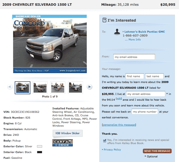
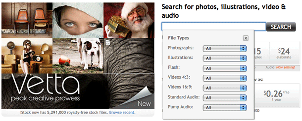
iStockphoto takes a rather approach to search that offers plenty of options. When the user is logged out, they're presented with a search form on the front page with options that appear when the input is in focus. The user may then select typical options, e.g. size under photos, number of credits under illustration, format for video.

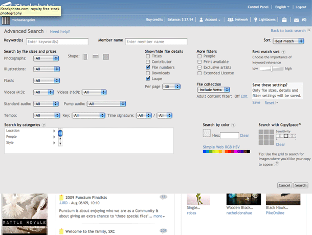
On the results page, a simpler search form is displayed at the top of the page. If the user is logged in, they don't see the search options drop down on the home page, but see a personalized home page with this simpler search form with checkboxes. The advanced search, however, provides all of the options seen on the anonymous user home page, plus additional options, e.g. search by color, shape, category, location of art on grid.

1. Anonymous users see a search form on the home page.
2. When the input is in focus, search options are displayed.
3. Logged in users see a simple search form in the header.
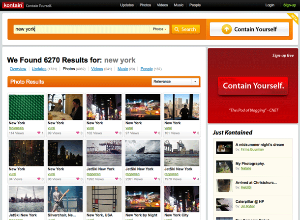
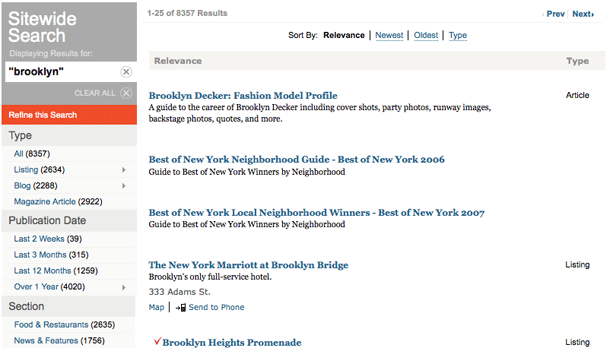
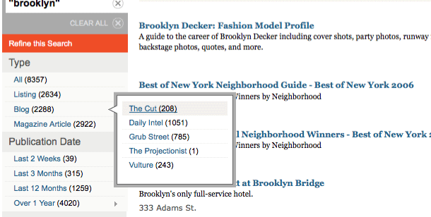
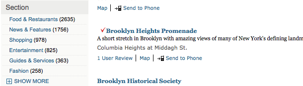
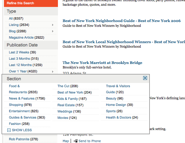
4. Search results allow the user to narrow by image type.
5. Advanced search provides numerous image search options.

http://www.istockphoto.com/index.php

Kontain Search

Kontain is a social media site for sharing photos, video, and music. The site provides a large, simple search form at the top of most aggregate pages, and a pared down version of the search form in the upper right corner of single asset pages. A pull down menu to the right of the search input displays options for searching everything, or restricting to media types, users, or just updates.

The options are displayed as circles, and should function as radios. Unfortunately for me, on Firefox and Safari, the circles were sticking like check boxes, so I was a bit confused by this detail initially. The last selected option was always replaced in the form, but the other options could be toggled to have multiples selected. This may just be a bug, because the results are always scoped to the last selected option.

1. Site search at top of aggregate pages.
2. Pull down to scope search. Circles should function as radios, not checkboxes.
3. Search results shown, scoped to selected media type, with menu to change scope.
4. Compact site search in top right displays search scope pull down, but removes the submit button.

http://www.kontain.com/

New York Magazine Search

New York Magazine provides a site search form in the header with options to limit the scope of search, and features advanced filtering options on results page. The results page is simple on the surface, but provides powerful filtering options in the sidebar. The search strategy is shown with actions for removing terms from the search or clear all.

I found some of the behaviors on filtering options to be inconsistent with others. The Type and Publication Date facets provide tree-type fly out menus. But the Section and Author facets, provide bigger multi-column flyouts, triggered by "Show More" links. I haven't figured out my the trigger icon and style needed to be different.

1. Header showing search form in upper left.
2. When the input is in focus, search options are displayed.
3. Search options shown with radio selected.
4. Search results showing search strategy in top of sidebar, and filters for refining search below. Sort options shown in inline list.
5. Showing the search strategy box after removing the term "Blog."
6. Single column flyout menu under Type facet > Blog.
7. Show More link for flyout menu under Section facet.
8. Multi-column flyout menu after clicking Show More link in Section facet.

http://nymag.com/

Fever Progressive Disclosure

The Fever RSS news reader provides some useful progressive disclosure/enhancement behaviors that hide features until they are needed. Many of the primary features are also provided as keyboard shortcuts. The resulting experience provides a subtle and minimalist aesthetic without compromising features.

1. The initial view of the app shows groups of items and the pages linking to them. The main navigator is shown in left sidebar.
2. Selecting a category ("UX" in this example) displays a second column for browsing feeds in that category.
3. When the user hovers over the feed column, an A-Z jump list appears to the left as well as an overflow scroll bar in the right. Above the A-Z list is an X icon to hide the feed list. Hovering over a single feed displays an options menu and a refresh button.
4. Clicking a feed's options menu displays a drop down of options for the feed.

http://feedafever.com/

Virgin.com Header

The Virgin.com redesign sports a header that provides a boatload of functionality using mega fly out menus: locale selection, micro-site navigation, registration, login, and newsletter signup. I like that they make these options readily available wherever you are on the site. The longer drop downs like the registration form, for example, seem a little long for users on smaller screens, e.g. netbooks.

1. The global navigation bar provides mega drop downs with sub-nodes and links to their subsidiary companies that provide products and services under each category.
2. The login form is a simple drop down, with a link to register on a separate page.
3. The Sign Up drop down provides the full registration form in a big drop down.
4. Clicking Worldwide provides options to view the site for your geographic region. This option is also provided in the Flash hero below the navigation.
5. The Virgin Companies link provides navigation to micro-sites, and remains consistent as you navigate from site to site.

http://www.virgin.com/