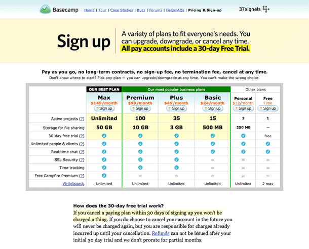
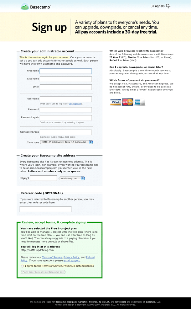
Starting off from Basecamp's sign up page, you pick your plan option, then fill out their form.
The form is clean and simple. Inputs and labels are aligned well and there is a logical chunking of sections of the form. I like the simple hairlines between chunks in the top area.
One of the nicest things about this entire experience is the starting point where you select your plan. The user may return to this page at any point to upgrade, downgrade or cancel their plan. Their options are always available and clearly defined without any difficult obstacles to making changes.

