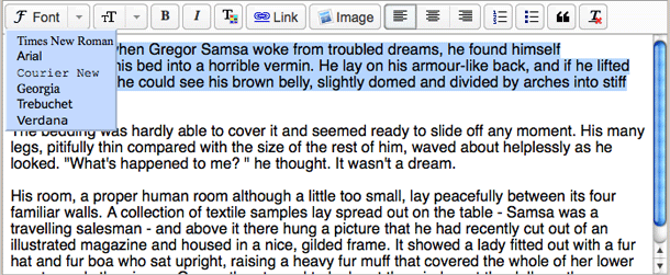
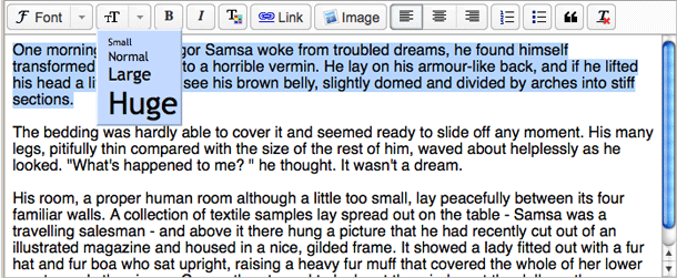
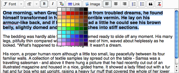
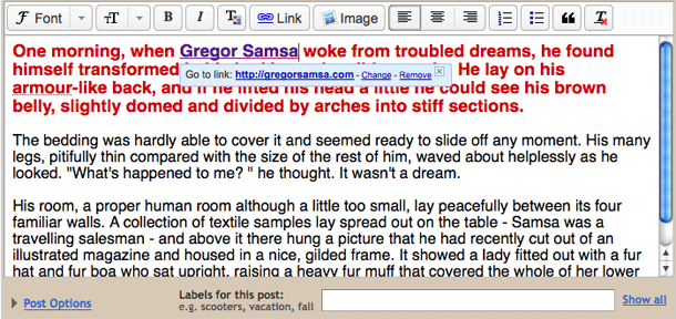
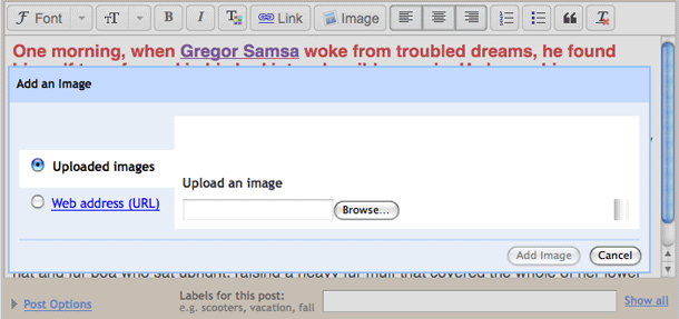
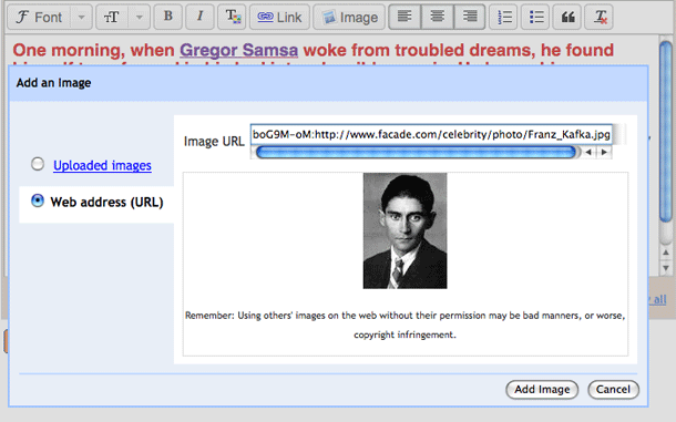
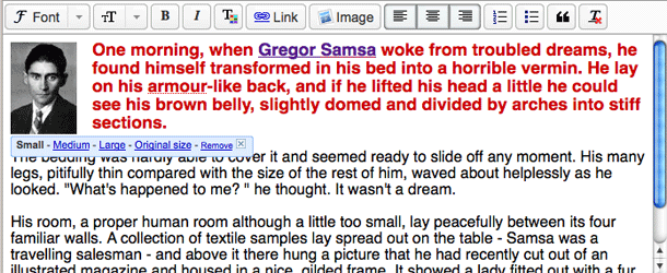
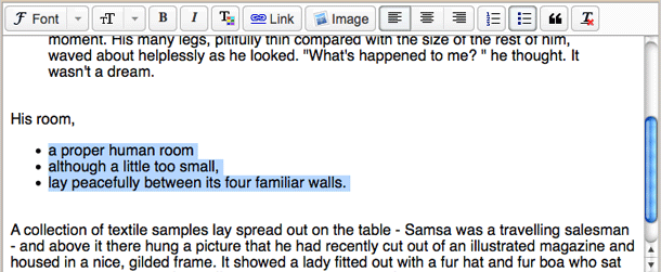
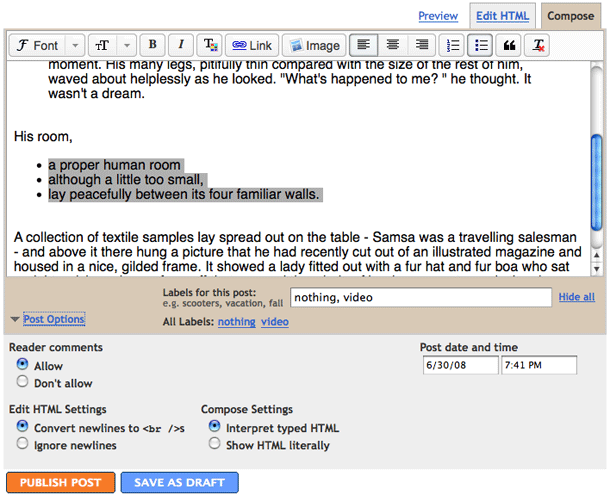
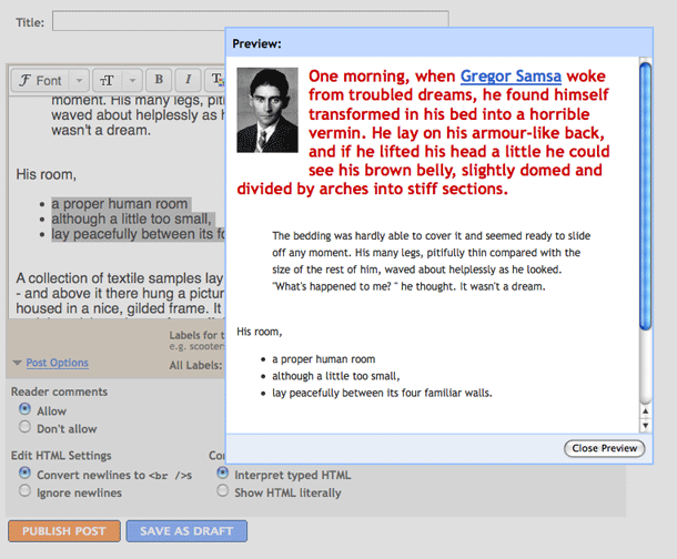
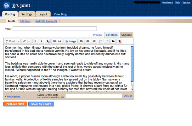
The new Blogger Draft text editor shares some of the behaviors of the rich text editor in Gmail, and as commenter points out, uses the same icons used in Google Pages. Blogger and Pages use beveled buttons rather than using the more minimalist style of the borderless icons in Gmail. One might argue that these controls are actually more usable because the states of toggles and the affordances supplied by buttons and dropped down menus should be obvious. The interface controls are simple and easy to use.
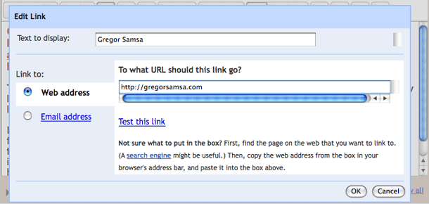
5. Selected text shown as link. When links are selected controls are displayed in the editor to modify the link.
