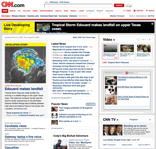
The CNN News portal provides a very dense global navigation header that's got quite a bit going on, but succeeds in drawing out the main entry points for news, featured or promoted points of interest, language/edition preference setting, search, and even a sticky alert area for late breaking news. It even borrows the idea of hot topics navigation per section from Newsvine, which allows for a more variable set of local navigation based on what's happening now, rather than on a rigid top-down IA.
While the density of the navigation might overwhelm some site designs, the clean, modern, and minimalist treatment of the page layout, and the the clear hierarchy of type and content elements make for a cohesive header and body, even given the density of content on the page.


