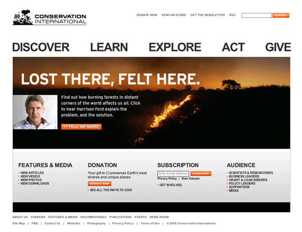
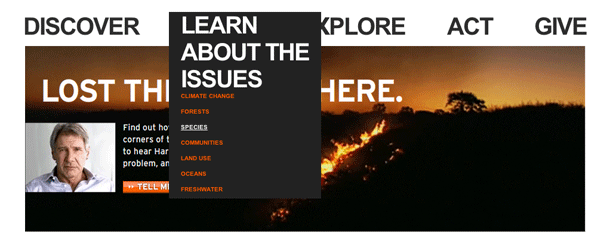
The Conservation International site provides an interesting take on the flyout or drop down global navigation bar. The site uses single, short action words set in very large type to indicate what you can do and name the sections of the site: Discover, Learn, Explore, Act, Give. These are nice pathfinder-type labels. When the user hovers over a links, the label expands to provide a phrase. For example, Learn becomes "Learn about the issues," and Explore becomes "Explore critical places." This is a nice implementation that keeps the design simple and bold, yet usable. It provides better scent to the links when the user decides to dig deeper into the site.
Published on Thursday, May 29, 2008 in interfaces

