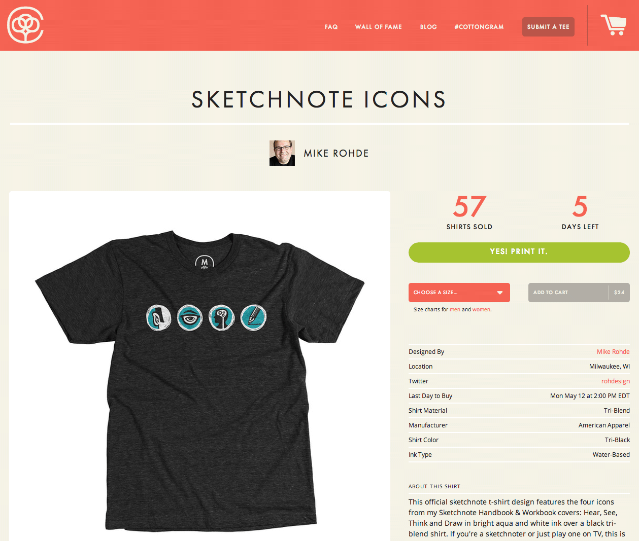
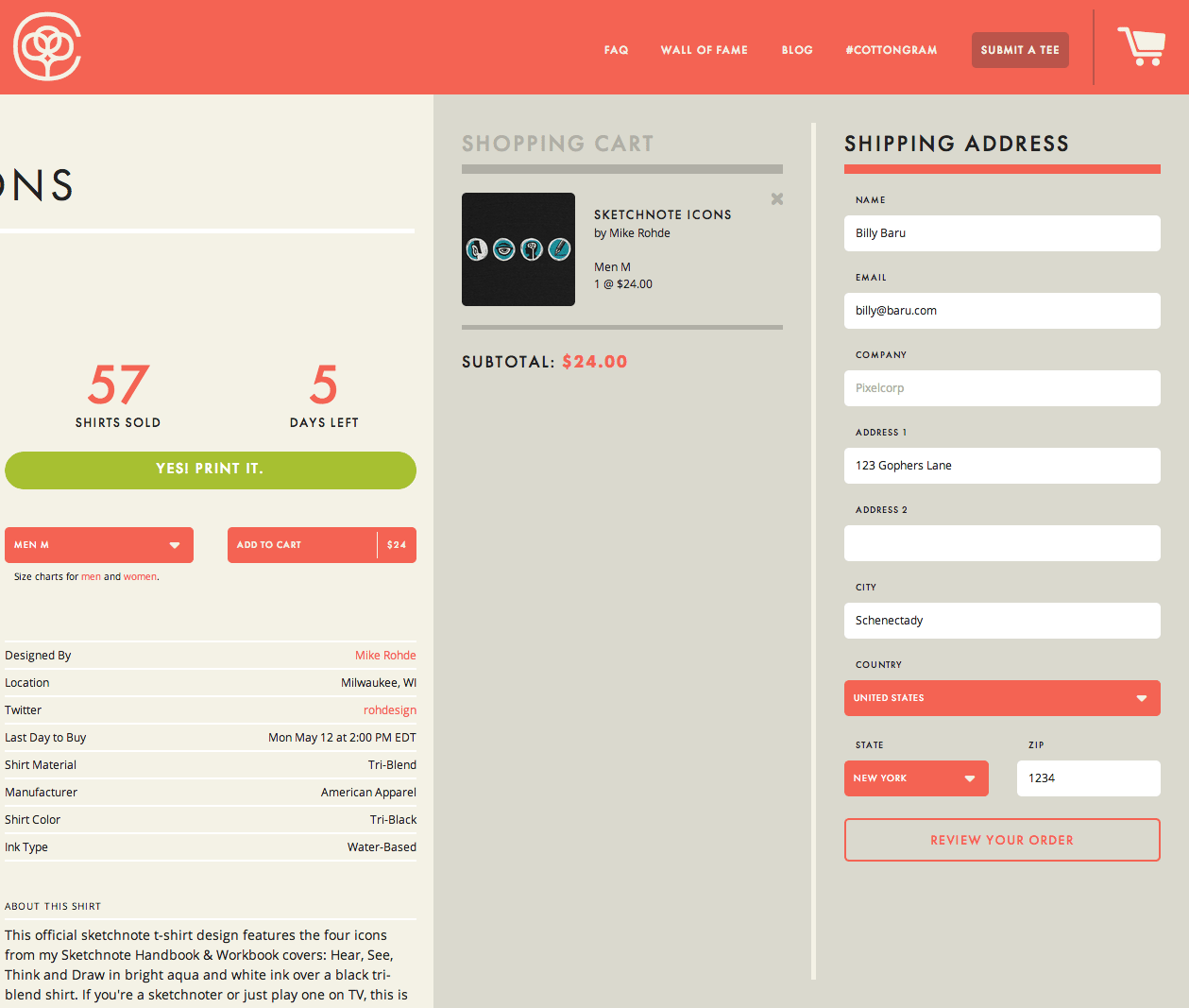
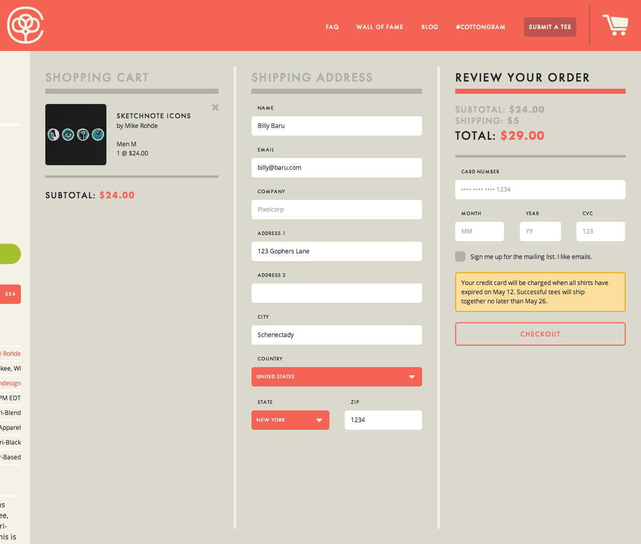
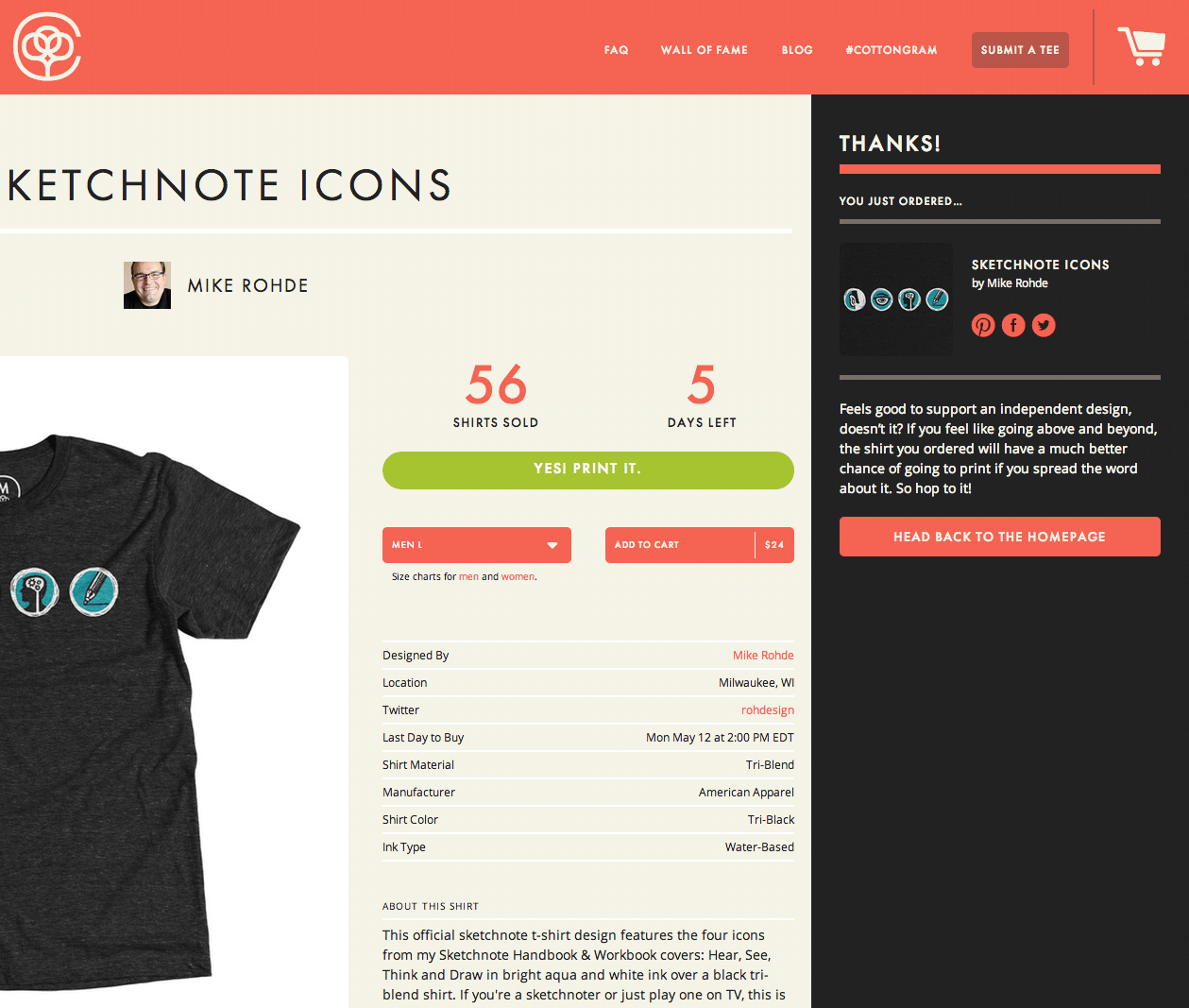
Cotton Bureau uses the off-canvas pattern to slide steps of the checkout flow into the screen from the right, as the product page and previous steps slide off screen to the left.
I like how this implies the forward movement through the checkout process a bit better than the cart workflows that use vertically arranged collapsing panels.
2. After adding product to cart, the cart panel slides in from right, and product panel slides off canvas to left.


