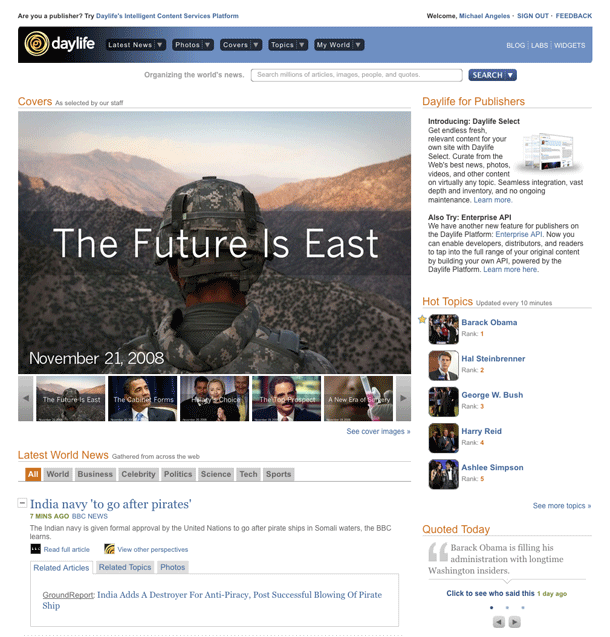
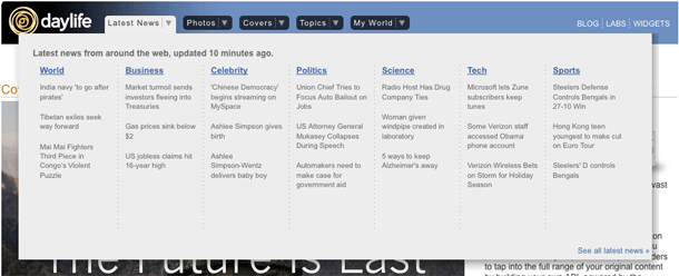
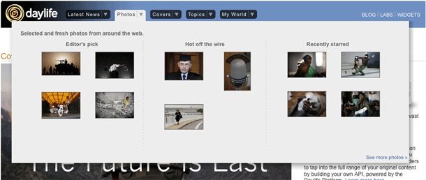
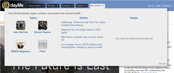
Daylife's drop down menu in global navigation that provides a wide ribbon to show both navigation to secondary levels and to show teaser content, e.g. the Latest News menu shows top level news categories as well as recent articles in each category.
News sites like Daylife and NewsVine have been coming up with interesting ways of changing user's expectations of what can exist in global navigation. In some cases, the labels and categories for what appear in global navigation suggest a shifting information architecture that is based on what's interesting now or what people have been reading.
The notion of either letting editorial selectivity or bottom-up data analysis determine navigation is what's interesting to me here when combined with a ribbon menu. It extends the idea of what can be done with a top tags navigation bar, to show more context within each category, which may be more useful with large sets of categories or freetags than displaying every top level in a hierarhical list. I imagine it would even be useful for promoting information or advertising. Ack! I'm sure someone already does it.


