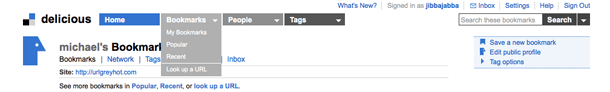
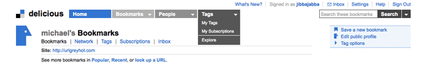
The redesigned del.icio.us site provides drop down navigation to signed in users. Clicking the navigation label jumps to that section, or click the arrow to drill down in that section. They provide separators in the drop-down to chunk up the navigation options.
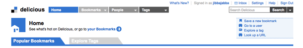
There's some inconsistency in the treatment of selected sections. The blue background of the nav link on Home implies selected color. But if you click the links in the global nav, the blue background on Home remains on Home. But on the home page, for instance, when you click the tabs for Popular Bookmarks and Explore Tags, the background shifts to the tab you click. This behavior could carry over to the global nav to be more useful. The different shades of gray for the other global navigation links are just a stylistic treatment I think, but they provide no feedback.