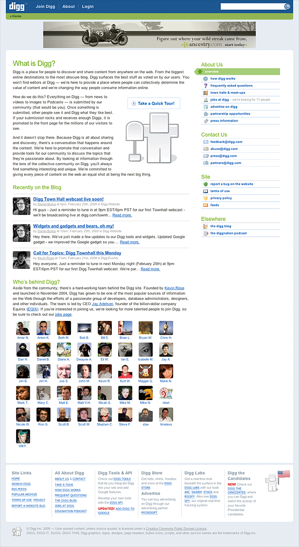
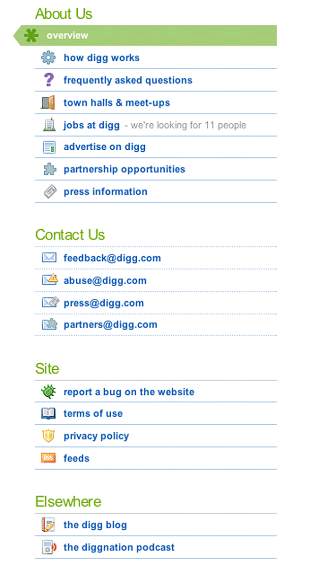
This is perhaps more about information architecture than interface or interaction design. One thing I like about Digg's About section is the transparency of the company that's suggested here. They only provide email addresses for contacting the company, rather than providing a form. They provide 4 types of contact: feedback, abuse, press, and partners, each type of gets sent to an email address. This exposes you, the sender, as it doesn't allow the sending of anonymous email, and gives them a way to respond to you. It also gives a sense that someone will respond, which is not the perception I have when I fill out a form and get an autoresponder. That may provide a false sense of openness, however. With the volume of traffic Digg gets, I wonder if they are able to respond to each piece of communication they receive in a timely fashion. To further emphasize this transparency, Digg exposes who the staff are by providing a list of avatars linking to each person's Digg profile.
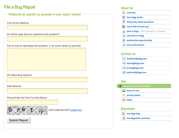
Digg provides a form for contacting them regarding bugs, which makes sense because in this case they want more information about the page you're looking at, the browser/OS you're using, etc. That doesn't appear to be done very well, however. Clicking the Report Bug link from the footer could auto-fill the referring URL, and grab the Browser and OS using environmental variables.


