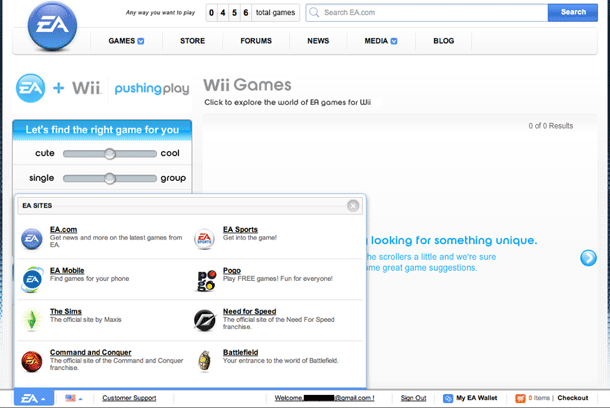
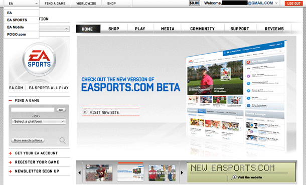
Game maker EA provides access to their network of microsites from EA.com and offers cross-site navigation via a toolbar that is positioned at the bottom or top of each site. I like the design of the navigation on the main site and the Sports sites. But the navigation is inconsistent in position, visual design, and behavior from site to site. The Pogo site doesn't have a micro-site navigator at all, so ironically, you have to "pogo" up to the main EA site via the logo in the footer to cross-navigate. This may not be an issue, however, if EA doesn't want or need users to cross-navigate, or more importantly if Pogo users don't want to navigate to other EA sites.
Published on Thursday, Jul 9, 2009 in interfaces


