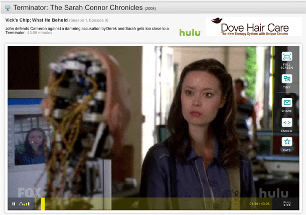
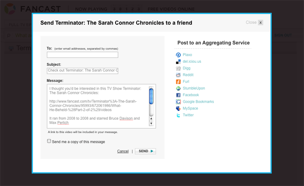
The Fancast has a simple video player interface with typical features. No advanced features like clipping (although it does allow sharing scenes) and the features it does have are not available in full screen mode. Additionally, accessing any of those features, e.g. sharing and embedding, pauses playback. I like the simplicity of the design, but the video player could reach some parity in terms of functionality with what video users are becoming accustomed to.
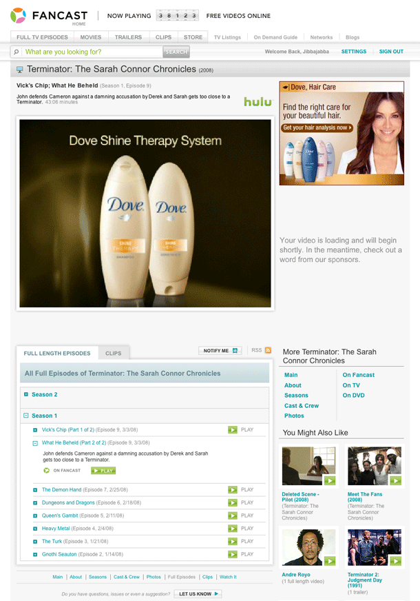
1. The video page (truncated here) showing player in the stage area, other episodes and clips as well as related videos below the fold.
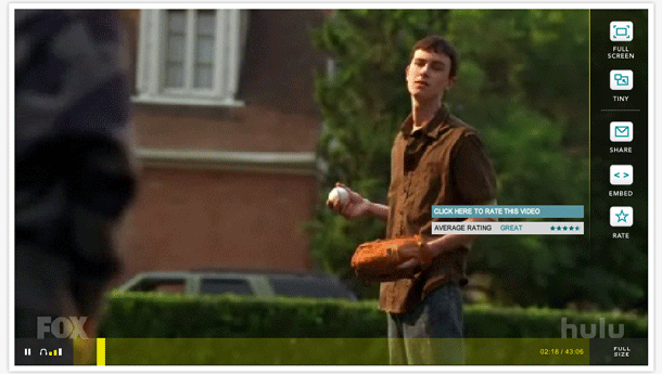
3. Showing rating controls. Clicking video controls in the right sidebar creates a modal shift, and video playback pauses.
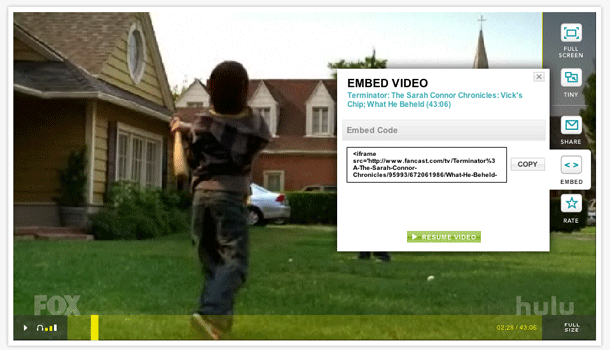
5. Share controls displayed in a lightbox. Not sure why this is such a drastic modal dialog compared with the others.
