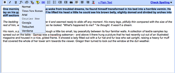
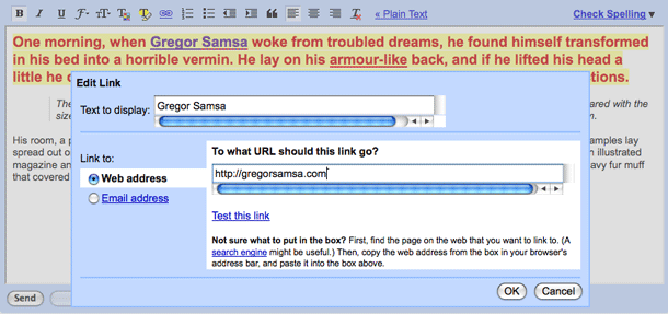
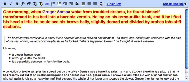
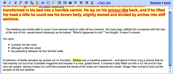
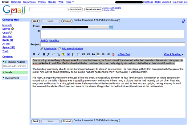
Google have been doing some work getting some of their interfaces to be consistent with each other. GMail and Blogger now provide similar interface behaviors and controls, with slight differences. Other applications like Google Sites and Docs continue to have different controls.
Gmail and Blogger are among the simplest of these text editor interfaces, for good reason. In blogs and email, rich text formatting should be bare bones and out of the way as much as possible. Google is successful in understanding the differentiation in these use cases from text editing in wiki/site and word processing. The controls are intuitive and usable.
