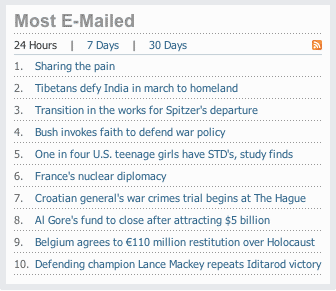
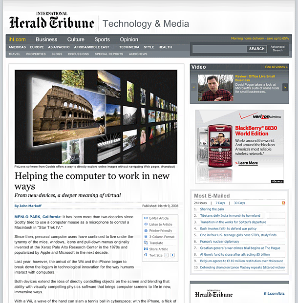
The International Herald Tribune site has, in my opinion, been the site that set the bar for clean, minimalist newspaper web sites since John Weir worked on the design circa 2000/2001. The evolution of the site has continued to stick to Weir's minimalist visual style, although his innovative DHTML column and clipping behaviors are gone.
The top stories content module is an interface element that is a common feature in news sites. IHT implemented their module in as minimally as possible, providing 3 time slices beneath the header and a link to the RSS feed. Contrast this with the top stories module provided by Newsweek. I'm including this in the gallery because I think it demonstrates the type of simple presentation where the interface chrome gets out of the way so that users can get to what they need with no fuss.

