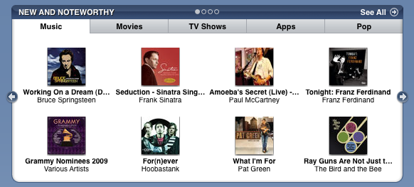
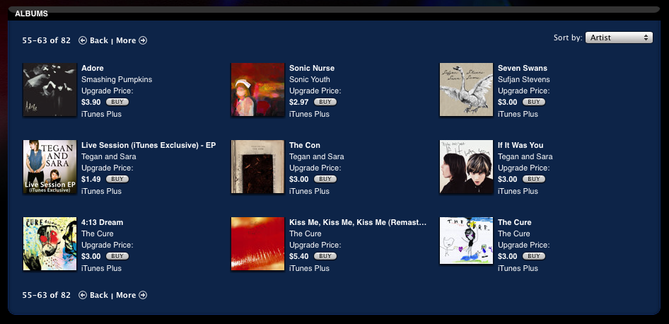
The iTunes Store has 3 different pagination controls it uses in different places. The most common method for paging through a series of items is to show a carousel on the main pages, with prev/next arrow icons to shuffle through sets of 3-4. On special featured modules with larger poster image thumbnails they use coverflow with their hybrid scrollbar which has arrows that increment one item at a time, or allow you to scroll to move through larger increments. Lastly, they have a simple back/more link control that they use on some of the generated views. I noticed this is in the Upgrade to iTunes Plus area.
Published on Friday, Jan 30, 2009 in interfaces


