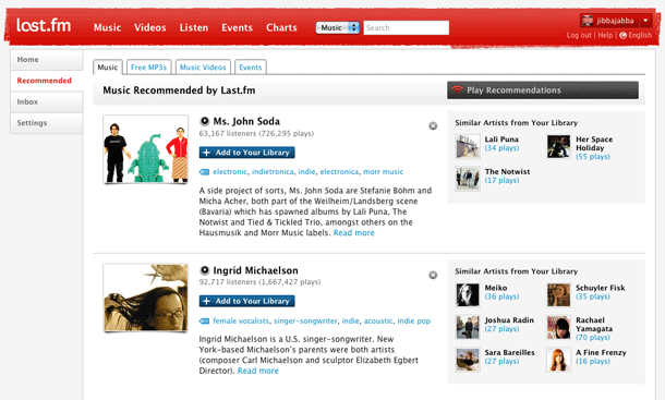
In Last.fm's redesign, the site started combining vertical tabs along the left hand side of the content area, and horizontal tabs in the main content area for sub-navigation.
This is not something I would recommend. There is something rather unnatural feeling to me when vertical tabs along a Y axis are laid out with text in the West-East orientation. I think for the metaphor to make sense, the South-North orientation has to be respected, as though you were stacking real manila folders. The combination of the vertical and horizontal makes this navigation choice even weaker in my opinion. Stacked horizontals would have been a clearer choice, or just getting rid of the tab metaphor in the left sidebar entirely would clear things up.
