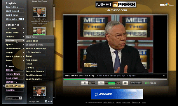
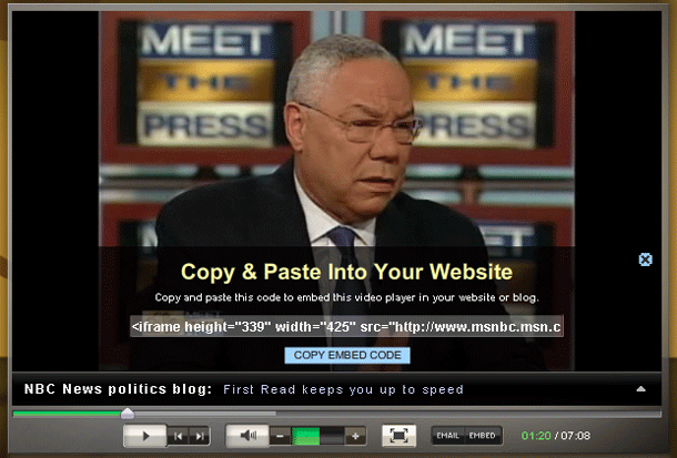
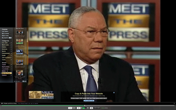
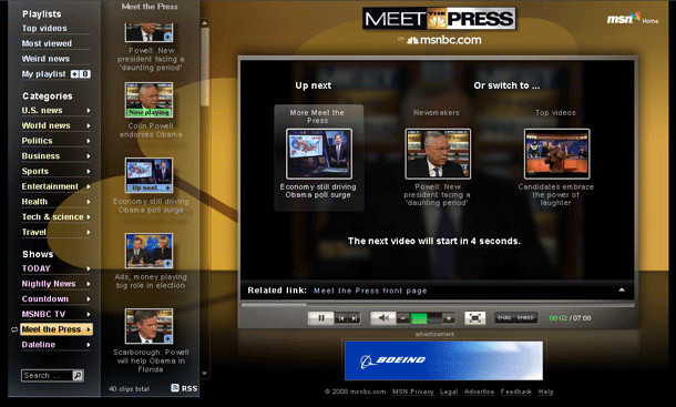
MSNBC's video player loads in a pop up window with the video player on the right, and a left sidebar showing navigation options to browse by playlist, category, or show. The video player itself provide a barebones set of controls for pause/play, previous/next, volume, mailto link, and embed code. A square ad unit hides the left sidebar pre-roll and is replaced by a small persistent ad unit sitting below the player. Post-roll the next 3 video thumbnails are shown and autoplays the next in line.
Nothing surprising in this interface, although the background graphics are nice. I presume that the pop up window ensured that the lighting effects can fill the screen cleanly, but I'd much rather see that interface in page rather than in a pop up window.


