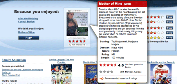
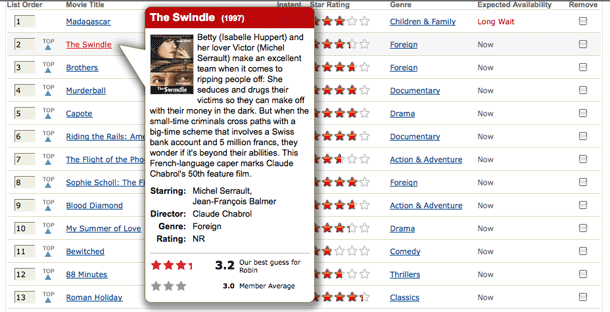
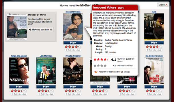
The video details shown on mouseover in Netflix is one of those behaviors I just take for granted now. They've used their quick-loading, shadowed mouseover call outs for years now and they've always felt very useful to me and effortless to deal with. They're always available, and even work in areas you might not expect to see them, like in a recommendation list within a lightbox dialog.
The mouseovers even make up for some things that I feel are design shortcomings, like the lack of a feature to show a gallery of poster images or sort by genre in the instant play queue. I have 225 videos in my instant queue and that list is not the same to me as my DVD queue in terms of how I use it, because I don't always want the top thing in the list, and since I can choose without thinking about order, I want to filter and view more info here. Oh well. The mouseover suffice to some degree. While the Netflix mouseover is really excellent, they could take a lesson from the Apple TV in designing some of their listings/views. Don't even get me started on the painful experience that is the Roku UI.