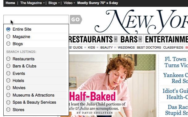
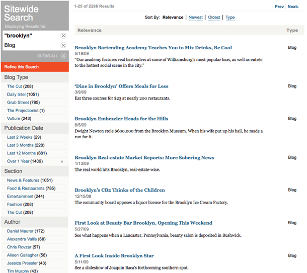
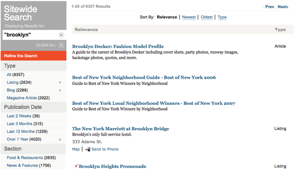
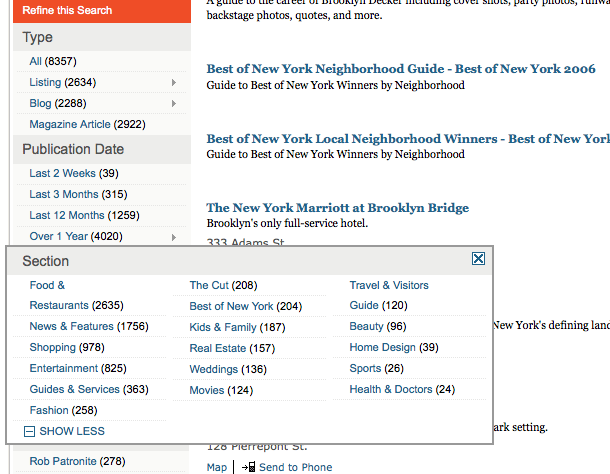
New York Magazine provides a site search form in the header with options to limit the scope of search, and features advanced filtering options on results page. The results page is simple on the surface, but provides powerful filtering options in the sidebar. The search strategy is shown with actions for removing terms from the search or clear all.
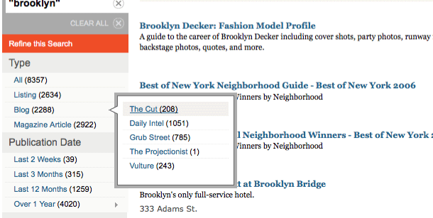
I found some of the behaviors on filtering options to be inconsistent with others. The Type and Publication Date facets provide tree-type fly out menus. But the Section and Author facets, provide bigger multi-column flyouts, triggered by "Show More" links. I haven't figured out my the trigger icon and style needed to be different.

