User Interface Design Gallery

A gallery of user interfaces that I've collected over the years.

Holland Festival Program Browser

The Holland Festival provides a program browser/calendar that provides an AJAX interface for viewing over 3 weeks of events in a grid. Drop down menus are provided to narrow or expand by genre, locale and route. A single toggle highlights featured events. And a sliding selector, which can be dragged to move the range left and right and with handles to narrow or expand the window, allows you to filter the days to be shown in the grid. Hovering over the individual events in the grid provides a link to show the details in a dialog layer.

1. The initial grid with all genres and locations shown.
2. Unchecking all genres allows the selection of individual values. Matches are highlighted in the grid and others are dimmed.
3. Selecting the Locations drop down and unchecking the "All" value allows the selection of individual values.
4. Velow the date range is narrowed using the handles, and the grid updates to show 1 column per day. The "Highlights" button is also checked and matches are shown with a yellow badge.

http://www.hollandfestival.nl/page.ocl?pageid=13

EA Microsite Navigation

Game maker EA provides access to their network of microsites from EA.com and offers cross-site navigation via a toolbar that is positioned at the bottom or top of each site. I like the design of the navigation on the main site and the Sports sites. But the navigation is inconsistent in position, visual design, and behavior from site to site. The Pogo site doesn't have a micro-site navigator at all, so ironically, you have to "pogo" up to the main EA site via the logo in the footer to cross-navigate. This may not be an issue, however, if EA doesn't want or need users to cross-navigate, or more importantly if Pogo users don't want to navigate to other EA sites.

1. Micro-site navigation accessed via the EA logo in the footer.
2. Micro-site navigateion acessed via a drop-down menu in the header.
3. Another micro-site navigator design in the header.

http://www.ea.com/

Nike Microsite Navigation

Nike.com's main site provides entry to a host of micro-sites for each sport or product family, but a consistent navigation model is provided across all microsites. A primary navigation widget is provided in the Nike Swoosh button, which reveals a list of a few of the most popular microsite destinations. A "More" link epxands the list to show all of the microsites.

1. Users click the Nike Swoosh logo to navigate across the Nike space to other microsites. A drop down reveals the most popular destinations.
2. A More link in the drop down reveals the entire list of microsites.

http://www.nike.com/nikeos/p/nike/en_US/?

Nike Video Hero

Nike has been using a video player as hero graphic in the main Nike.com site. The player features large buttons for play controls and link to microsite (the button with the right angle quotes), star rating, playhead, low/high resolution and bandwidth switcher, a time elapse countdown, volume bars, and save/share options.

http://www.nike.com/nikeos/p/nike/en_US/?

Layar: Mobile Augmented Reality browser

Layar is an augmented reality application for Android phones which uses location information and the phones camera to show what is around the user by displaying real time digital information on top of reality. The video shows the browser being used to scan buildings and overlay real estate information to find out which houses are for sale.

http://layar.eu/

MoMA Exhibition/Collection Browser

MoMA's exhibition and collection browser provides faceted drill-down of the museum collection's image library using a mega drop-down menu. Each facet provides the ability to select multiple terms, so the user may select multiple authors, departments or decades, for instance. Executing the search displays the narrowed set of results in an image gallery that can be toggled thumbnail, slideshow, list, and single artist views. Sorting options and image matte colors may also be selected by the user.

1. The main collections page provides invites the user to browse using large images as links for selecting a first point of entry.
2. The collection browser includes a filtering toolbar. Clicking anywhere in the toolbar displays filtering options.
3. The filter drop down displays facets in columns. Multiple terms may be selected in each facet. User clicks Search to find matches.
4. This is the page of narrowed search results using the filters shown in the toolbar. Unfortunately, you can't see what the terms are if you selected multiples in a facet.
5. This is the single entry view.

http://www.moma.org/explore/collection/

Formula 1 Video Bandwidth Profiler

Formula 1's Video site provides a bandwidth profiler before display their video player. After checking your bandwidth availability, the app suggests a resolution and quality that will give you the best experience.

1. User selects the video they wish to view.
2. App assesses available bandwidth.
3. App provides report of bandwidth and resolution, and suggests the option that will provide the best experience.
4. Grade 2 video player.

http://www.formula1.com/video/

Profoto Breadcrumbs

Profoto's take on the breadcrumb combines expanded menus for each branch to provide a drill-down method for navigating siblings, aunts, great-aunts, etc. It basically exposes the hierarchy of siblings at each level, and it's really most useful when you've navigated deep into a hierarchy.

It can get a little weird when you use these, because you have to remember that you're viewing siblings in the branch you're exposing. If you look at the last screenshot for the "Products" siblings, you see that Products is listed there along with the other top-level categories and miscellaneous stuff. But in the second screenshot under the "Profoto" product, I see what I think are children of Profoto, rather than it's siblings. Possibly because Profoto is the only product? I don't know.

I like the implementation of this hybrid breadcrumb/navigation menu, but I think I got lost because of the information architecture. Things need to be exceedingly simple for me to make sense of a site's content and what threw me off was my own IA perspective. If you're going to feature IA as part of a hierarchical navigation control, the IA should really be well organized to reflect hierarchy. Otherwise, forgo hierarchy and find a better way to point users through contextual links in the body, or perhaps treat the final node differently and break it out of the breadcrumb. Or maybe I'm just confusing myself because of my purist ideas about these kinds of things.

1. Breadcrumbs shown below title. Hovering over a crumb displays a clickable button style behind it.
2. Clicking the disclosure icon next to a crumb expands a multi-column list of what should be siblings to the current node or leaf. I think this one shows children though.
3. Children of Cables. When navigating down this deeply, the options are very helpful.
4. Siblings of "Products" seem miscellaneous.

http://www.profoto.com/products/profoto

Adobe Product Comparison Table

Adobe's Creative Suite packages the company's graphics and motion products into families that can be purchased as a set. Because it can be difficult to determine which suite is right for the work you do, Adobe provides both a product comparison table with products and features listed in a chart, or a wizard questionnaire.

1. The standard product comparison table, showing suites along the top and included products prices in rows.
2. Checking off the applications you're interested in displays the suites that include the checked product(s).
3. An activity-focussed wizard asks what types of activities the customer is interested in, and highlights the matching suites.
4. The product focussed wizard is identical in function to clicking the checkboxes in the screen 2 above, but displays in this simpler list.

http://www.adobe.com/products/creativesuite/compare/

Basecamp Product Comparison Table

37 Signals' product comparison for Basecamp provides a simple, side-by-side comparison of the features of each product category. They also try to help guide the customer to the plan that meets typical needs by featuring the Plus Plan in a larger box. Details for each feature are provided in a mouseover when hovering over the feature in the featured plan box. The mouseover is not provided on hover in the other boxes, but the feature description is the same, regardless of plan.

http://www.basecamphq.com/signup

Best Life Magazine Drop Down Menus

Best Life Magazine's global navigation uses drop-down menus to provide both sub-section navigation where applicable, and teasers of content in sections, using a multi-column lists and showing a featured article with a thumbnail.

Thanks to Fritz for the pointer.

1. Subscribe drop down shows print and online subscription options.
2. Teasers of latest and featured content within a section.

http://bestlifeonline.com/

Quicken Product Comparison Table and Wizard

When a software company's product family grows, it can be quite difficult for customers to figure out which product is right for their needs. Quicken is one of those examples where the number of products is overwhelming. They try to help customers with a product comparison table provides a basic checkbox chart of all product feature categories, with product names and prices along the top of the table, and rows of feature categories, with checkboxes to indicate which products match which features. Each feature category can be expanded to show more detail about features within corresponding categories. For prospective customers who don't want to make sense of the text heavy table, a simple wizard provides a questionnaire that asks what the customer's needs are, and displays the product that best meets their needs.

1. Comparison table showing all Quicken products and the feature categories offered.
2. Users may expand feature categories to get more detailed information about what feature coverage is offered. Users may also expand or collapse all features.
3. A wizard questionnaire aims to make product selection simpler by asking what the customer's needs are.
4. A solution is displayed after checking all of the customer's requirements.

http://quicken.intuit.com/compare_products.jsp

Target Drop Down Menus

Target's global navigation features wide, multi-column drop-down menus that stretch to the full width of the page layout. The columns in the drop down show hierarchical lists of product/section contents using font weight and indentation, and additionally allow the company to promote special events.

1. Drop down for the "Women" section shows a multi-column hierarchical list of all product sub-categories.
2. The "See All" menu item allows the site to show other product categories that aren't being featured.

http://www.target.com/ref=nav_2_t_logo

Twitter Confirmations

Twitter provides a subtle, unobtrusive notification messages, e.g. when a direct message is sent. The confirmation appears as a layer with a white background over the top of the page, covering the page header, and unfortunately, not providing a more obvious "Close" link to dismiss the message. The message can be easily dismissed by clicking anywhere in the div, but that's not readily apparent.

1. Direct message interface.
2. Confirmation that direct message has been sent appears as layer over the top of the page.

http://twitter.com/home

Apple Support Email Button

The Apple Support site features a very simple "email this page" button in the upper right of the screen along with other tools like print and call support. The email widget starts out as an envelope icon. When clicked, the icon slides to the left and an input appears with a "To" label and a "Send" button. The user simply enters the recipients address and presses send. An AJAX progress spinner appears briefly, then a confirmation message, and the form collapses back to the icon. Can't get much simpler than that.

1. Page tools showing mail icon in the right.
2. Clicking the icon reveals simple email form.
3. Clicking send displays AJAX progress spinner, then confirmation. A few seconds afterward, the form collapses.
4. Email received.

http://www.apple.com/support/

iTunes Ratings

The iTunes Store allows customers to rate items and displays the average rating and total ratings below the product image. They use a disclosure arrow to allow customers to view a breakdown of ratings by number of stars.

1. Customers' average rating, and form select to add your own rating.
2. Expanded ratings break down after clicking the disclosure triangle.

http://www.apple.com/itunes/

Shelfari Hybrid Buttons, Revised

We covered Shelfari's hybrid button in their list views of bookshelf items. That example showed a single push button with an attached icon for drop down menu. The single button allowed for the use of a default behavior, while the drop down arrow allowed for the display of other options for the item. The drop down menu allowed users to make multiple selections, i.e. using checkbox behaviors, rather than just select one value in the drop down list.

Timothy Gray reported that they did some usability testing on the feature and made some improvements to try to help users with what was perceived to be "overloaded." To this end, they've separated the default button, which now shows an "Add" or "Edit" state, depending on whether the item is in your shelf. Clicking Add toggles the button to Edit. Clicking Edit now displays options in a dialog with pagination and tabs to step through the options.

The old drop down feature of the hybrid button is now placed in a separate drop down button. I'm still not sure why there's a need for checkboxes here. Radios for single selection might be even simpler. Am guessing they're trying to address an edge case where someone has read and is now re-reading? I wonder if they can simplify that. I do like the little chicklet button bar at the bottom.

1. List of items with Edit/Add buttons shown for each item.
2. Clicking Edit displays a dialog with user's options for editing that item in their "shelf."
3. Some items, like date in this screen, display more options. The options in this area were a little confusing to me, and I seem to have broken the add/delete behavior there.
4. Tabbed panels break up and step the user through the editing options.
5. The Add/Edit and Drop Down buttons shown here within a tab of the dialog.
6. The drop down menu with "quick edit" options. Still checkboxes rather than radios.

http://www.shelfari.com/

Aardvark Registration

The registration process on Aardvark provides a modal dialog that uses some nice content previews, content filtering, and progressive disclosure to guide the new user through the form.

1. Clicking sign up button from an invitation opens modal dialog with basic information form. A preview area updates your info as you fill out the form.
2. The birthday input filters and corrects date format. City/State shows suggestions. (The one in yellow is a browser auto-completion.)
3. A conditional select is shown for neighborhoods matching my city.
4. Following entry of email/password, additional fields are disclosed in the dialog.
5. Confirmation dialog is displayed.

http://vark.com/

Netflix Undo

Netflix offers an undo function in their Queue that allows users to undo a remove action. Users click an X icon to remove a movie from their queue, and the row is grayed out, showing an undo text link replacing the remove icon. The row persists until the user moves to a different page, so several removed rows may be visible if the user does repeated removes in one session. Upon return visits to the queue, the removed movies will be gone.

Prior to adding this function, clicking the remove control would simply remove the list from your queue, so if the user made a mistake, they would have to navigate back to the removed movie to add it back. The undo allows users to recover from mis-clicks or if they change their mind about watching that movie they just axed.

1. Section of a movie Queue.
2. Hovering over a movie row.
3. If the user clicks the X icon, the movie is removed, but the user may undo their action.

http://www.netflix.com/MemberHome

thesixtyone alerts

Music community site thesixtyone uses unobtrusive growl-like panels in the bottom right corner of the page for system alerts and messaging. Like growl or iminlikewithyou, these messages appear briefly and fade out. The effect is subtle and might be easily missed, but the addition of an ambient "pop" earcon (alert sound) tells you to look for the message. Nicely done.

1. System alerts appear in the bottom right corner, with accompanying alert sounds.

http://www.thesixtyone.com/

Washington Post/Evri Related Content Module

The Washington Post uses a related content widget created by Evri that indexes content using person, place, and thing (subject) facets and allows the Post to display a list of related content beneath news. The widget, which is actually a bit of SVG/VML and JavaScript, provides a small visualization of topics in the article, and allows the user to do some filtering of the related content. Navigating to topic pages provides a complete filtering view for exploring and narrowing related content.

1. This widget appearing at the bottom of an article in the Washington Post allows users to find related content. A diagram lists all indexed people, places, things (subjects) found in the current article.
2. Selecting "Obama" shows the other concepts that have content associated with Obama. The list of Obama content is shown below the diagram.
3. Selecting "Obama" and "General Motors." The topics update in the link list above the radial diagram and the related content list below is also updated.
4. Clicking the "Obama" text link shows an Obama topic page with allows the user to further explore related topics, and filter news on the topic.

http://www.washingtonpost.com/wp-dyn/content/article/2009/02/23/AR2009022302176.html?hpid=topnews

Zappos Search Results Filtering

The Zappos' search engine provides a nice results filtering interfaces that presents the user with facets for refining their search. The user can click on the terms at the top of the search results page to narrow the set, and a breadcrumb trail shows the selections they've made. Each term in the breadcrumb provides a checkbox to remove any one of those selections and broaden their search.

1. Users run a search using the site's global search box. In this scenario, I used the term "Running" and we're viewing the search results page that provides facets for narrowing your search. Options for sorting are displayed above the results.
2. I've clicked a few terms in the following facets: Product Type - Shoes, Gender - Men's, Size - 8.5. A breadcrumb list is shown above showing the refinements I've made to my search and the results have been updated.
3. I've added a few more refinements, and the result set has been reduced from 908 to 19.
4. The breadcrumb trail showing what I've searched for provides checkboxes to remove terms from my search, and this screen shows that I've removed the color Black from my search.

http://www.zappos.com/

Huffduffer Registration

Huffduffer, a hybrid bookmarking/podcast service features a whimsical inline registration form that's formatted in sentences with blank areas that the user fills out with their name, password, etc. Kind of a fun, unexpected way to format the form. Reminds me of the kinds of forms you'd fill out by hand in days of old, which goes with the retro style of the site.

Via SwissMiss.

http://huffduffer.com/signup/

Gmail Move and Label Menus

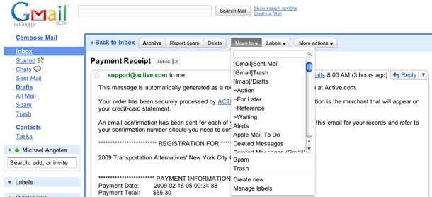
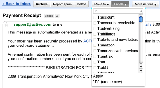
Google modified the labeling (tagging) menus in Gmail to add a Move option to co-exist with the prior Label drop down menu. The Move menu allows the user to move an email to a single label and then archives it, removing it from the Inbox. The Label menu allows the user to add multiple labels to the email, but does not archive it. Both menus offer a label search input with auto-completion, as well as options to create new or manage existing labels.

This is one of those times when I feel comfortable enough wearing my own hat as a power user to say that while these efficiencies were added, they don't go far enough. Gmail has always seemed like an leader/innovator in pushing tags rather than folders for organizing email. So I think they can push for implementing advanced features that aren't the most simple to use at first. These menus really do make it easy to do more with labels without hitting the label menu over and over again for repeat actions.

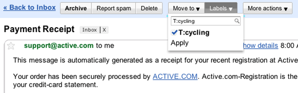
What seems incomplete to me is the auto-completion behavior on the search input. I'm one of those ridiculous Gmail power users that organizes labels into facets by using prefixes, e.g. L: for lists, T: for tags, P: for projects, ~ for GTD labels, e.g. ~action, ~waiting, etc. So in my examples you'll see that I would be able to tag something L:cycling or T:cycling. But if I enter "cycling" in either of these search boxes, nothing gets found because Gmail only matches from the beginning of the labels. The right way to do it is to match against any text in the string, and luckily MailPlane, the desktop application for Gmail gets this right.

1. The Move menu offers options to move and archive the current message, as well as create new labels or mark as spam.
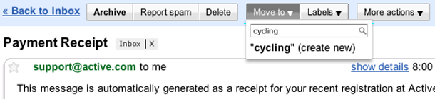
2. Typing text into the search input allows you to find an existing label, and offers the user an option to create the label if it doesn't exist.
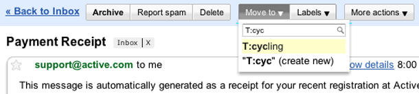
3. This shows a match against my string "T:cyc."
4. Gmail only matches from the beginning of the string in their search capability. MailPlane's labelling panel (CMD-L) allows you to search for labels and matches anywhere in the string. So in my scenario above, I can find "cycling" without entering my prefixes.
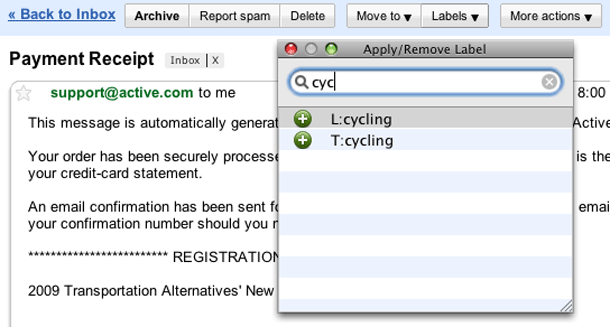
5. The Label menu allows you to find labels and click checkboxes to apply more than one label to the message. Prior to this, Gmail users had to click the Label drop down menu repeatedly when adding more than one label.
6. Users click the apply button in the drop down menu to add the labels that were checked off.

http://gmail.com

NIKEFOOTBALL Search Box

The Nike Football site uses a deceptively simple trick to draw attention to its unobtrusive search box. The narrow sidebar navigation menu features what looks like a search box that is a bit too small to be usable. Clicking what you think is the search box expands a real search input adjacent to the sidebar in the body.

It's a clever method, but as you can see from the comments, it's not without problems. A good example of how simple solutions aren't always easy to come by.

1. A small search box appears in the top of the navigation menu sidebar.
2. Clicking search box shows the real search form in the body.

http://inside.nike.com/blogs/nikefootball-en__EMEA/

Shelfari Hybrid Buttons

Shelfari has a clever hybrid button/drop down menu to display actions on books. The button label shows the current status of the item, e.g. on my shelf, add to my shelf. When the user hovers over a button of a book that's not in your shelf, the label changes to "Add to I've Read". Clicking the drop down arrow shows other options for the book with shelf actions in the top half (I plan to read, I'm reading now, I've read), and the bottom half shows other attributes of your book (Favorite, I own, Wish list). All of these options are checkboxes, so you can select multiple values in the expanded actions.

See also Shelfari's updated button design.

1. Buttons for books appear to right, showing shelf status (Add to my self/On my shelf).
2. Label changes when hovering over button to show more specific default action, "Add to I've Read."
3. Drop down behavior shows other options for the book.
4. Multiple options allowed, and button label updates depending on selection.

http://www.shelfari.com/

Autoblog Pagination

Autoblog's photo galleries feature beautiful, large automobile photos. Each gallery shows large beveled previous/next buttons above and below the photo, with a [current photo]/[total photos] indicator above. Below, a strip of thumbnails shows the full list of images in the gallery. An indicator of the current photo in that strip, e.g. with a special border treatment would ice the cake.

http://www.autoblog.com/gallery

EffectiveUI Accordion Stacks

Effective UI has an interesting Flash UI for presenting menus on their home page using a stacked accordion. Upon landing on the home page, a series of stacked boxes are displayed with both a large descriptive heading of that section and shows the first mini-slide in that deck/stack to help you see what that section is about. Mousing over the first slide in the stack expands the stack to show the headings for the other nodes of content within it, and the user may now hover over the other items to view their descriptions. Clicking a card displays its content in an floated layer.

1. The front page showing series of stacks. The headings for each stack are shown below.
2. Mousing over a stack to expose all of the headings.
3. Clicking on a card to display its content.

http://www.effectiveui.com/