User Interface Design Gallery

A gallery of user interfaces that I've collected over the years.

iTunes Pagination

The iTunes Store has 3 different pagination controls it uses in different places. The most common method for paging through a series of items is to show a carousel on the main pages, with prev/next arrow icons to shuffle through sets of 3-4. On special featured modules with larger poster image thumbnails they use coverflow with their hybrid scrollbar which has arrows that increment one item at a time, or allow you to scroll to move through larger increments. Lastly, they have a simple back/more link control that they use on some of the generated views. I noticed this is in the Upgrade to iTunes Plus area.

1. Carousel showing prev/next arrows and position indicator circles.
2. Coverflow with hybrid prev/next scrollbar. Typical carousel shown below.
3. Generic Back/More links with text showing [current range] of [total number].

MSNBC Spectra Visual Newsreader Carousel

MSNBC.com's Spectra Visual Newsreader provides an interesting way of visually presenting channels of content from the massive news site. Adding channels drops media cards into the screen and rotates them in a 3D carousel.

Below the vortext of cards, a hybrid pagination scrollbar, which bests Apple's concept, allows the user to select cards to view one at a time. Previous/Next arrows allow linear progression. A helpful [current card]/[total cards] indicator is shown on the scroll bar. The currently selected card is shown below the carousel with media details and thumbnail. What really makes this control nail the experience is that after each card in the order is displayed, every prior card is tucked away into the stack. This hiding behavior is based on the linear order cards rather than hiding the ones the user has actually viewed. If they were eventually able to use the latter, the "read/viewed" status, as the criteria would make this that more interesting.

1. Full view of the Spectra Visual Newsreader.
2. Clicking on a card in the carousel displays details and the pagination controls update to show the number of the card in the stack.
3. Carousel showing prev/next, first/last, and scroll bar.
4. Selecting cards hide all prior items behind the current card deck/stack and show the remaining items in the carousel.

http://msnbcmedia.msn.com/i/msnbc/components/spectra/spectra.html

Wikipedia Roll Clusters and Wheel Menus

Wikipedia Roll, a Flash-based Wikipedia browsing application attempts to help provide better exploration of Wikipedia entries by doing some content/link analysis and clustering topics and sub-topics related to the retrieved entry.

The screen above shows the entry for "interaction design." You can see that the links occurring in the article, and presumably, other related topics are grouped into clusters that can be further explored. Each cluster provides a wheel tool for spinning through the group's available terms. Scrolling to the left/right on the page shows more clusters for the group.

http://api-exploration.net/mashups/wikipedia-roll/index_en.php#/Interaction%20desig

Wowhead Breadcrumbs

Wowhead is a database of World of Warcraft information. The database provides a hierarchical subject taxonomy to describe items, and presents that hierarchy in the breadcrumbs for the item. When the user hovers ofer a branch in the breadcrumb trail, a drop down menu is displayed to show the node siblings and drill down to children.

1. Single entry view (database record).
2. Hovering over the current entry's parent category (Daggers) to view siblings.
3. Hovering over the grandparent category (Weapons) to view its siblings (other grandparent categories).

http://www.wowhead.com/

Flickr Pagination

Pagination is often overlooked as a minor detail. Good pagination gives the user a sense of how many pages of content, e.g. search results or gallery pages, are available to view and makes it obvious how to navigate those pages. It indicates the current page, provides link targets to advance or go backward, provides a shortcuts to jump to the start of the list, and indicates how many pages are left in the list, and possibly how many items are found in the pages. Flickr is one of the sites that meets all of these requirements and displays these controls very clearly and without any fuss.

http://flickr.com/

QuickSnapper Vertical Carousel

The vertical carousel on Quicksnapper shows a preview of recently snapped screenshots. Unlike most carousels, however, this one auto-scrolls vertically, and provides controls at the top and bottom rather than at the sides. It displays 4 items at a time.

1. Carousel of recent websnaps with scroll buttons at top and bottom.
2. Carousel shown in page.

http://www.quicksnapper.com/

Evernote Text Editor Task Creation

Evernote, the unique note keeping desktop, mobile, and web-based application allows users to upload notes from images or PDFs or create them right in the software as one would any publishing system. The note creation editor features a simple rich text editor with one feature that is uncommon for web-based editors--a task checkbox. All this does is insert a checkbox wherever the insertion mark (cursor) is located, and while in edit mode, allows you the user to toggle between checked (done) and unchecked (to do). The toggle does not work in view mode, unfortunately. You can then filter notes to show those that contain that contain unfinished, completed, or all tasks.

I really like where Evernote is heading with some of the functionalities they're putting into the editor. They could go a bit further and actually allow link creation between notes and achieving something like a base set of wiki functionality for single users without necessitating forward linking, which is often the biggest cognitive barrier to entry for those new to wikis. The use of tags and notebooks should be enough organizing power for most users.

1. Creating tasks in notes editor by simply clicking the checkbox icon in the editor controls adds checkbox at insertion point. Tasks may be checked to show done/todo state in edit mode.
2. In view mode, the checkboxes appear, but may not be checked.
3. Tasks may be filtered in the notes browser. Interestingly, Evernote even found checkboxes in the PDF of Luke Wroblewski's Forms ebook as well, and though they were to do items.

http://www.evernote.com/

Issuu Pagination

Issuu is an online self-publishing service that allows users to create e-magazines and books that are displayed in their slick Flash reader. The service also provides social features around the content.

One of the nicest things about the reader is the usable pagination. The reader features the typical next/previous and jump to page features you'd find in an ebook or PDF reader. They also provide some features that are similar to the browsing experience with Preview, the Dock, and QuickLook in the Mac, utilizing miniature thumbnails of pages to scroll through pages.

This is perhaps the best ebook-type reader I've seen on the web. I don't know if they every utilized that behavior where a hovered page would show a turned down corner to indicate that you could "pull" the page corner to turn it. I remember seeing that behavior here and there on some flash sites that had multi-page magazines. This pagination is much easier and flexible than most, and every possible browsing and reading use case seems to have been thought of that I can imagine.

1. Default view is magazine mode, which allows you to view 2-page spreads.
2. Hovering over a page's outside edge shows the next page arrow, and last page arrow.
3. The top center of the UI shows the prev/next arrows, flanking a thumbnail gallery view icon. The input to the right shows [current page / total page] field so you can jump to a specific page. The thumbnails at the bottom use a fish eye lens effect like the Mac OS X dock, to allow you to jump to different pages.
4. The thumbnail gallery view of pages opens in a lightbox.
5. Paper View mode showing the page navigator in the left. Paper view mode allows you to scroll vertically through the whole document.

http://issuu.com/

Engadget Comment Voting

Engadget's comment rating and karma system uses +1/-1 voting, so users can vote comments up or down. Votes below a certain threshold get dimmed out rather than hidden. When a vote is applied, the user's vote is registered, a message appears, and the voting controls are hidden. To the right, there's an exclamation mark to flag inappropriate comments, which are then immediately collapsed from view.

http://www.engadget.com/

Sling Welcome Message

Sling.com's welcome message position's a 3 column intro to the site for first time users, which it positions between the main promo marquee and the body of the page. Dismiss the message as a logged in user and it shouldn't come back again.

http://beta.sling.com/

WordPress Layout Customization

WordPress added some excellent layout customization options on administration screens in version 2.7. The most obvious change comes in the form of the Screen Options tab, which expands a settings panel that let's the admin hide or show parts of the UI being viewed, and saves those settings for the user immediately.

The UI also provides a drag and drop behavior to re-arrange modules. When hovering over a module heading, the icon turns into a full hand and lets the user move modules up or down in the column, or between columns. A down arrow appears on hover over the headings and allows the user to collapse the body of the module.

This seems like an excellent idea for an administrative interface, and the behaviors were very intuitive. I noticed the options, and my changes without even knowing that this was a new feature. At some point I wondered if it would be desirable to reset all your customizations to move the modules to their default positions. Other than that, everything I could to customize the layout seemed easy, and it seemed particularly nice to be able to modify the post forms. Good stuff.

1. Default admin dashboard.
2. Clicking the screen options tab to expose settings below nav bar.
3. Changes are reflected immediately in the body of the page.
4. Doing a module layout change using drag and drop.
5. Collapsing a module using down arrow in the module heading.

http://wordpress.com

Gifting Feature at Nintendo

Nintendo provides excellent illustrations to describe the gifting process on the Wii, using storyboards. The gifting page shows a table of contents at the top, for each use case: sending, receiving, confirmation, and faq. Clicking one of the use cases jumps the user down to the storyboard illustrating steps to complete each case. It's a simple, very clear, and visual. I wish every support site worked that way.

Thanks to Boon Sheridan for the tip.

1. Table of contents (use cases) at the top of the page.
2. Sending a gift.
3. Receiving a gift.
4. Gift confirmation.

http://www.nintendo.com/wii/channels/gifting

Pano Logic Expanding Call to Action

Pano Logic sells a simple network PC. Their product site features a large graphic of the product, and 3 simple informational modules at the bottom to find out more about the product, read reviews and press, and watch a demo webinar. The modules expand when the user hovers over each box. There isn't much information added, except for a call to action that tells the user a little more about what they'll see if they click the link.

Very simple expand/collapse transition that can be used to highlight a call to action and display more below the surface.

1. Calls to action below the marquee, showing plus icons to expand.
2. First box expanded, now shows minus icon, and call to action text with arrow.
3. Second box expanded.

http://www.panologic.com/

Daylife Drop Down Menus

Daylife's drop down menu in global navigation that provides a wide ribbon to show both navigation to secondary levels and to show teaser content, e.g. the Latest News menu shows top level news categories as well as recent articles in each category.

News sites like Daylife and NewsVine have been coming up with interesting ways of changing user's expectations of what can exist in global navigation. In some cases, the labels and categories for what appear in global navigation suggest a shifting information architecture that is based on what's interesting now or what people have been reading.

The notion of either letting editorial selectivity or bottom-up data analysis determine navigation is what's interesting to me here when combined with a ribbon menu. It extends the idea of what can be done with a top tags navigation bar, to show more context within each category, which may be more useful with large sets of categories or freetags than displaying every top level in a hierarhical list. I imagine it would even be useful for promoting information or advertising. Ack! I'm sure someone already does it.

1. Global navigation at the top of the page shows down arrows to indicate expansion of the control.
2. Top news categories with 3 news items for each.
3. Photos drop down shows editor's picks, recent photos, and photos recently starred by users.
4. Content selected by editorial staff.
5. Your favorite topics, articles, and photos.

http://www.daylife.com/home

Google Analytics Date Selector

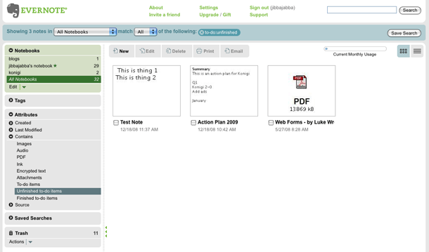
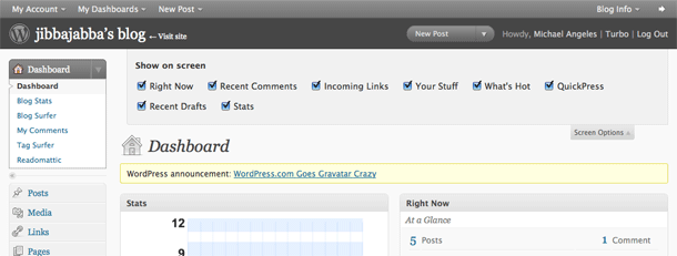
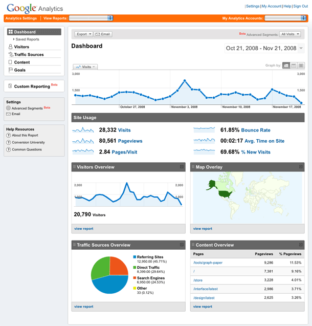
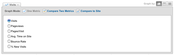
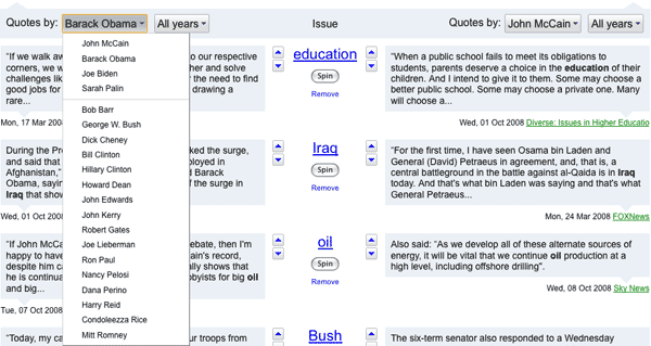
Google Analytics offers one of the most sophisticated date selectors for data filtering that I've seen. The interface allows you to filter reports to a single day by clicking one square in a 3 month range. To select a date range, you click the start input, click a day, and do the same for the end date range. Or you can enter dates in the text inputs.

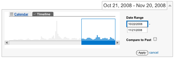
The timeline control allows you to visualize the volume of visitor activity as vertical bars, and adjust the date range by pulling slider handles. They don't include tick marks for date milestones, e.g. month/week ticks would be useful, so you have to watch the dates change in the inputs as you drag. The "Compare to past" functionality works well here too, because you really need to compare ranges of equal length. Clicking compare to past opens up a second range in green, and you can drag the ranges back and forth in time.

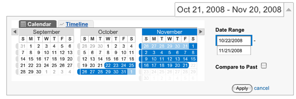
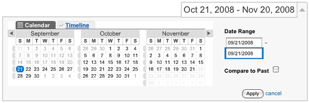
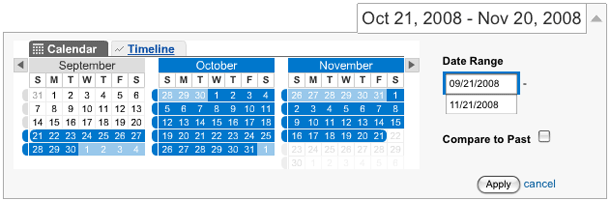
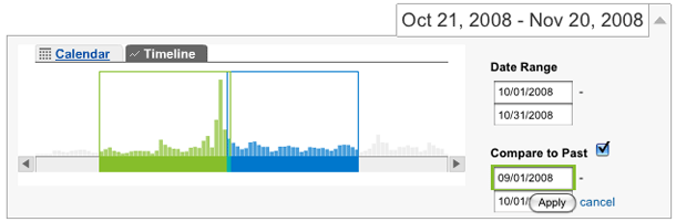
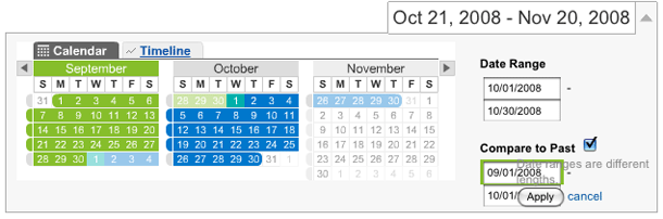
Comparing to past is a little less intuitive in the calendar view if you rely on clicking to make your selections. I just found it hard to click the input first before clicking the calendar to indicate whether I'm enter a start or end date. The best bet is to use the input controls there because it's easy to mistakenly create ranges of different length and overlap ranges. They do provide visual cues when there's an overlap by showing those dates as mixed green/blue squares.

1. Default date range.
2. Filtering to a single day.
3. Clicking to expand the date range.
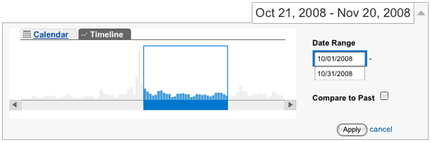
4. Viewing the range in timeline display.
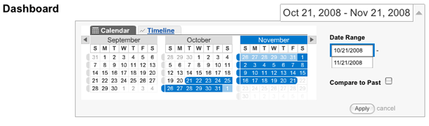
5. Push the blue bar to move the date range, and pull handles on range to fine-tune start/end dates. Dates update in text inputs at right.
6. Compare to past shows second date range. When there is overlap, the colors are mixed.
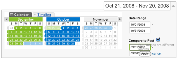
7. Compare to past in calendar view.
8. Overlapping date shown in teal.

http://www.google.com/analytics/

Google Analytics Drop Down Menus

I'm a fan of the drop down menus that span a wide area, e.g. the main body or full page, in order to show a wider range of options rather showing fewer in a vertical drop down and forcing navigation through a fly-out tree. This convention is showing up mostly in global navigation, and with the introduction of Microsoft's Ribbon, we can expect to see more of it.

Google shows buttons with down arrows to indicate that clicking one of those controls will show expanded options in-screen, a la the drop down menu. However, rather than floating a div above the flow of the page, their control expands a div in place below the button, and the expanded div is attached to the button which now looks like a tab. The page flow is respected and content is pushed down, and as each control is opened, any expanded controls are collapsed.

1. Analytics Dashboard. Controls with down arrows indicate that options are available.
2. Clicking the date range selector displays calendar or timeline controls.
3. The segment control expands to show granular selection options for filtering your report.
4. Simple inline list of export options.
5. Visit filtering options.

http://www.google.com/analytics/

Netflix Mouseover Info

The video details shown on mouseover in Netflix is one of those behaviors I just take for granted now. They've used their quick-loading, shadowed mouseover call outs for years now and they've always felt very useful to me and effortless to deal with. They're always available, and even work in areas you might not expect to see them, like in a recommendation list within a lightbox dialog.

The mouseovers even make up for some things that I feel are design shortcomings, like the lack of a feature to show a gallery of poster images or sort by genre in the instant play queue. I have 225 videos in my instant queue and that list is not the same to me as my DVD queue in terms of how I use it, because I don't always want the top thing in the list, and since I can choose without thinking about order, I want to filter and view more info here. Oh well. The mouseover suffice to some degree. While the Netflix mouseover is really excellent, they could take a lesson from the Apple TV in designing some of their listings/views. Don't even get me started on the painful experience that is the Roku UI.

1. A mouseover showing video details in a module.
2. A mouseover showing video details in the queue.
3. Mouseovers even show up on lightbox layers.

http://www.netflix.com/MemberHome

Netflix Quick Add

The video queue on Netflix offers a "Quick Add" functionality at the bottom of the queue that lets users search for a particular title and add it to their queue without having to view the video page. It's a single input with an auto-completion behavior to suggest videos based on what you type. Clicking a title from the suggestion list or hitting return on an exact match adds the video and shows a confirmation.

This is a really efficient utility. The only slight change I would make is in the heading "Looking for a specific title?" which doesn't really hint at the purpose of that input--quickly adding videos to your. Something like "Add a specific title to your queue" might be better. I happened to capture an earlier version of this above in screen 3.

1. Looking up specific titles to quickly add to the queue.
2. Confirmation when video added.
3. An earlier version of this interface.

http://www.netflix.com/Queue

Netflix Rate for Recommendations

Netflix shows a module to signed in users at the top of their home page asking the user to rate recent returns. The module promises to give 2 recommendations immediately after they've rated. On sites like Flickr, the recommendation engine is perhaps one of the single best incentives for adding ratings. On a lot of sites, ratings give you nothing back. This is a good example to illustrate quickly why you'd want to add a rating, and would be particularly useful to demonstrate the value to new users.

1. Module on home page shows movies you recently returned.
2. After rating the return, you get 2 recommendations back immediately.

http://www.netflix.com/MemberHome

Yahoo! Buzz Index Charts

Yahoo! Buzz Index presents the day's top 20 searches overall, and in a number of categories, e.g. actors. A subject's buzz score is the percentage of Yahoo! users searching for that subject on a given day, multiplied by a constant to make the number easier to read. Weekly leaders are the subjects with the greatest average buzz score for a given week.

The chart shows current rank, icons for the change in rank over previous day, previous rank position, number of days on chart, score, and score change. A score is the percentage of users searching for that subject on a given day.

1. Chart of overall search leaders.
2. Detail.

http://buzzlog.buzz.yahoo.com/overall/

CSS Ninjas Cost Estimate Slider

CSS Ninjas provide a service for converting designs into XHTML/CSS. Their site features a nice cost estimate tool that allows prospective clients to see how much it will cost by specifying the number of pages that need to be converted. A slider allows you to estimate the cost of 1 to 20 pages. Clicking the "proceed to checkout" link opens the request for quote, and you can enter a number above 20 if required.

1. The cost estimate slider.
2. Moving the slider right.
3. Viewing the request for quote and modifying the estimator form manually.

http://www.cssninjas.com/

Yahoo! Breadcrumb Tab

Yahoo's hybrid tab/breadcrumb navigation is one of my favorite approaches to global and local navigation. This navigation interface answers a few nagging questions that an interface designer might ask. "How do I present the user with an interface that provides focus on the area they've navigated to, while providing a path back or to other main areas of interest?"

What's interesting here is that they provide a row of primary navigation tabs at the top level, and replace that with a hybrid tab/breadcrumb once the user makes the decision to drill down. The first problem you encounter with that behavior is that you lose the links back to primary sections of content. To deal with that problem, they provide a drop down menu for the first link in the breadcrumb to show siblings at the top level. Below, they show links for local navigation (children) for the current section in focus.

This seems like a unique approach, and I've already been influenced enough by this to design a breadcrumb UI that goes even further by providing sibling navigation at lower levels. On my first encounter with this UI earlier this year, however, I didn't know quite what to make of it because I came in at a lower level rather than at the top. It took me a few minutes to understand the navigation model because of that. I would be interested in hearing opinions of this. For my approach, based on this model, I'm using the breadcrumb in a less prominent location while continuing to use traditional navigation, to slowly introduce this model within a CMS skin.

1. The home page primary navigation tabs. Below are Newsvine style top topics.
2. Selecting "Everyday" tab changes the primary nav to a breadcrumb. Local nav shown below.
3. Cotinuing to drill down.
4. Lowest level with children displayed.
5. The drop down arrow next to "Food Home" provides links to top level, primary nav siblings.

http://food.yahoo.com/

In Quotes

The "In Quotes" project in Google Labs is an interesting attempt to leverage information from Google News to try to help people understand where public figures stand on topics and issues by extracting quotes. Google says "Much of the published reporting about people is based on the interpretation of a journalist. Direct quotes, on the other hand, are concrete units of information that describe how newsmakers represent themselves."

The interface is pretty simple to use. Enter keywords or click the provided words to compare quotes from the 2 public figures who have been vocal on the given topic area. Then you can click through what each person was reported to have said on the topic, or use the fun Spin button, which is a like a pulling a slot machine to change the quotes shown.

1. Default screen for the presidential candidates.
2. Enter or search for a topic. It will be added to the list of quote comparison rows.
3. Select the people to compare.
4. Read and change the quotes.

http://labs.google.com/inquotes/

MSNBC Video Player

MSNBC's video player loads in a pop up window with the video player on the right, and a left sidebar showing navigation options to browse by playlist, category, or show. The video player itself provide a barebones set of controls for pause/play, previous/next, volume, mailto link, and embed code. A square ad unit hides the left sidebar pre-roll and is replaced by a small persistent ad unit sitting below the player. Post-roll the next 3 video thumbnails are shown and autoplays the next in line.

Nothing surprising in this interface, although the background graphics are nice. I presume that the pop up window ensured that the lighting effects can fill the screen cleanly, but I'd much rather see that interface in page rather than in a pop up window.

1. Video player, navigating by category in the left sidebar.
2. Embed code panel. Pauses playback and slides into view.
3. Full screen.
4. Post-roll.

http://www.msnbc.msn.com/id/8004316

FanSnap Search Results Filtering

FanSnap is an event ticket search site that provides faceted results filtering. Users simply enter an upcoming event, and FanSnap returns a list of available tickets from vendors like StubHub, provides filtering by price, seating area, and ticket vendor. If a venue diagram is available seats are overlaid over the venue's seating chart. Users can sort and star/favorite available tickets in their "short list", and then click a link to purchase the tickets at the ticket vendor's site.

1. Search screen.
2. Results screen with filtering options on the left, map of venue in center with markers color coded to ticket prices. Hovering over a marker shows ticket info. Results list shown on the right.
3. Filtering options modified in the left sidebar. Shows areas narrowed and collapsed to only the options selected. Number of results is narrowed and updated in the right.
4. "Short list" in the upper right sidebar shows tickets that have been favorited. Hovering over a result displays a mouseover in the map.
5. Clicking a result shows ticket info and option to purchase.

http://www.fansnap.com/

Apple Accordions

Apple's accordion module provides a method for displaying a good deal of informational and promotional content without overwhelming the interface. The types of things that are displayed in these are accordions are usually supporting content, so the desire to use a design pattern that hides and shows these panels of content is useful. Only one panel is visible at a time, and hovering over or clicking a panel heading brings its content into view with a smooth slide transition.

1. Supporting information, news, and store locations is displayed in an accordion of panels at the right.
2. Hovering over one of the blue panel headings displays that panel and hides all others.
3. On the "Downloads" page, download categories and top 10 lists of downloads are displayed.
4. The "Top Apple Downloads" panel in view.

http://www.apple.com/mac/

Apple Carousels

Apple's Coverflow-like carousels are used on interior pages of Apple.com to provide visual navigation of products using product images. A set of images is displayed in a wide panel with a horizontal scrollbar. Carousels are used primarily for promotion when most sites place a set of images in this upper area of the screen below the navigation. Apple utilizes this space to provide better findability of products within each section of the site.

1. The coverflow area opened up to Macs on the Mac page. The labels in the scrollbar are used to jump to product category in the horizontal scrolling list.
2. Clicking "Servers" jumps to the end of the list.

http://www.apple.com/mac/