User Interface Design Gallery

A gallery of user interfaces that I've collected over the years.

Hulu 3 Up Carousel

Hulu's new 3-up carousel is being utilized in the site's channels sections to offer a promotional space that takes up less screen height than their 1 up carousel, allowing the display of 3 promo items. This is very similar to the horizontal scrolling Cover Flow module in use on Apple.com interior pages.

1. First set of channels. Scroll bar below allows the user to view more.
2. Second set of channels. Hovering over a channel reveals it's name and an "explore" button to jump to it.

http://www.hulu.com/

Hulu Channel Drop Down Menu

Hulu's drop down menu for channels stretches to the width of the design and provides a multi-column grid of channels. This method of running a drop down or flyout menu left-to-right rather than top-to-bottom allows interface designers to present longer lists of options without worrying about what appears in relation to the fold, and forcing scroll on longer lists.

http://www.hulu.com/

OnSugar Site Publishing

Sugar Inc. releases the OnSugar Blogging platform to let Sugar community members start their own sites. Based on the Drupal platform, OnSugar provides some very nice modifications to clean up and simplify the posting and content management interfaces provided by the popular open source CMS.

What I like most about what they've done with Drupal is the clean tabbed UI for content creation, the media embedding options for inserting images from Getty, ShopStyle, and Fashion week photos, and the excellent spread editor. Sugar have really thought about what users in their demo want from a CMS, since they're designing for themselves in a sense. One can only hope that what they've achieved here will be rolled back or inspire the content entry interfaces in future Drupal versions.

1. Registration
2. Site creation.
3. Site page with no content. User menu in a fixed position at the top.
4. New post entry form.
5. New "Spread" entry form. Spreads give users the ability to design a content spread.
6. Image selection from featured external partner sources.
7. The spread editor. Dragging and dropping media to lay out the spread.
8. Content published in user's site.
9. User's OnSugar dashboard.

http://www.onsugar.com/

Umbrella Today Weather Forecasts

Umbrella Today is a dead simple single serving site that delivers your weather forecast with a twist. Enter your zip code and it tells you if you need an umbrella#38212;if it's raining of course. Give the service your phone number, and they'll SMS you whenever the forecast calls for rain.

1. Enter your zip code.
2. The confirmation screen tells you if you need an umbrella today. Enter your phone number to get SMS notifications.
3. Enter the confirmation code sent to your phone via SMS.
4. Confirmation tells you're ready to accept the alerts, and gives you options to unsubscribe.

http://umbrellatoday.com/

Everymoment Now News Visualization

everymomentnow is a beautiful news visualization site designed and developed by Craig Mod. The idea is to provide a sense of volume and correlation between keywords within a given subject area. The current incarnation focuses on Obama/McCain in the news.

The clean, minimalist interface allows the user to visualize spikes in news article occurrences for each keyword a the highest level. You choose a single focal point using a keyword (e.g. Obama or McCain) or a date restriction, and the site displays the news articles indexed for that entry point. A much richer interface is also displayed for exploring the set of news articles by other keywords associated with the current keyword/date focus. So you could look at Obama + 9/16/08, or Wall Street + 9/16/08. Presently the interface doesn't allow for a combination of multiple keywords, e.g. Obama + Wall Street + 9/16/08.

1. Main page for Obama/McCain news articles.
2. Detail page for "Obama + 9/16/08." More link at bottom of articles displays more articles in page via AJAX.
3. Date Control shows range of dates to filter the current set.
4. Volume control in upper right: titles only, titles and truncated teaser, titles and long teaser.
5. Keyword selection. Allows user to change the keyword criteria for current day.
6. The "Quick Context" bar at the top allows the user to select one of the candidates or running mates as the focus.

http://everymomentnow.com/

Fancast Video Player

The Fancast has a simple video player interface with typical features. No advanced features like clipping (although it does allow sharing scenes) and the features it does have are not available in full screen mode. Additionally, accessing any of those features, e.g. sharing and embedding, pauses playback. I like the simplicity of the design, but the video player could reach some parity in terms of functionality with what video users are becoming accustomed to.

1. The video page (truncated here) showing player in the stage area, other episodes and clips as well as related videos below the fold.
2. Video controls display upon hover over the player.
3. Showing rating controls. Clicking video controls in the right sidebar creates a modal shift, and video playback pauses.
4. Embed controls.
5. Share controls displayed in a lightbox. Not sure why this is such a drastic modal dialog compared with the others.

http://www.fancast.com/

Yammer Microblogging

Yammer is a Twitter clone for companies. The service works for users under a single company domain, and provides a combination of microblogging and presence/status information following in the footsteps of ervices like Twitter, Facebook, and LinkedIn.

1. Sign Up.
2. Home page and content entry screen.
3. Updates are shown immediately in the page.
4. Clicking a hashtag displays only entries with that tag applied.
5. Member listing.
6. Tag listing.

https://www.yammer.com/home

YouTube Localization

YouTube's localization options limit content to submissions from a particular country, and the language selection options allow users to change the interface language. This is one of those interfaces that becomes clear when you've clicked the links, because the option are hidden until you click the "Worldwide" link. Qualifying labels like "Content: World | Lang: En (US)" might make these very obvious. It's nice that YouTube gives you that content selector. I'm just not sure how this plays in other countries when there is a dual content/language choice like this. Simplest manifestation of this in most sites is just to switch languages, in which case flags are usually pretty clear.

1. Default state for content/language options when viewing in U.S.
2. Clicking "Worldwide" makes it clear that this is a content selection option and shows countries to limit the content scope.
3. Selecting "English" shows the language options for the interface.
4. The resulting changed state after switching to France/Francais.

https://www.youtube.com/

CBS Navigation

The CBS site features a drop down menu that spans the entire width of the layout when the user hovers over shows. Wide drop downs are not unusual, and for a time appeared on the Amazon.com site when they experiencing the growth of their departments. On CBS, this type of interface is used to display as many of the network's shows as it can, segmenting them by airing time and format.

Below the navigation the site shows featured shows in a promotional module with a carousel UI. Lower down in the page, the featured and algorithmic lists of videos are presented in carousels as well.

1. Home page.
2. Hovering over the "Shows" link in the global navigation displays wide drop down menu.

http://www.cbs.com/

IKEA Navigation

IKEA's navigation menus feature a simple navigation bar on the top of the layout. The most important entry points are shown as is a button for new items. A drop down menu at right for the rest of the top level entry points. Within each section, tree navigation interfaces are provided for browsing more deeply within the section.

1. Home page.
2. "Living Room" selected in the global navigation. Local navigation appears in the left sidebar.
3. Selecting a local nav link in the left sidebar expand that branch of the local tree.
4. Selected links in the tree are highlighted.
5. The "All Departments" link in the global navigation displays the expanded top level of the tree.
6. Selecting a branch in "All Departments" doesn't display a selected link in the global nav.

http://www.ikea.com/us/en/

Rofo Search Filtering

Rofo provides a faceted search engine for commercial real estate properties. The beta provides a search interface at the top of the home and results pages to set parameters including location, size, type of space, and budget. Slider controls are used to narrow size and budget. At present, changes in these settings require a manual page submission to update results. The top location shows some limitations on the number of visible values that can be displayed.

1. Submitting a search from the home page. Cities with properties are matched against the database and suggested via auto-completion.
2. Search results page.
3. Slider controls adjusted for size and budget. Search clicked to resubmit.
4. Selecting more values that are not visible in checkboxes for type of space or sliders in size.

http://www.rofo.com/

CNET TV Video Player

CNET TV provides a video player that showcases their large library of content including product reviews, news coverage, and special reports. The main page of CNET TV features the video player in the center stage, with a short list of featured (hot) content flanking the left side, and a playlist on the right showing the currently playing video. The player controls are simple and easy to use, but at full screen, the controls a little soft and blurry. They offer options for downloading the clips and sharing on bookmarking services and embedding. Email button is a mailto: link.

The page is clean and offers good navigation options without overwhelming the user with too much information. A carousel at the bottom of the page shows thumbs of popular and new content as well as videos from their Loaded and News sections.

1. CNET TV page.
2. Video Player in center, featured videos on left, and playlist on right.
3. Showing Closed Captioning.
4. Showing Share options.

http://cnettv.cnet.com/?tag=hdr%3bsnav

TheWB.com Video Player

The WB brings its video site to the masses of OC and Friends fans and adds another network portal into the mix with Hulu. In terms of visual appearances and the high level navigation (IA), TheWB.com feels like the polar opposite in sensibility to Hulu's pared down appearances and very usable directory structure and show pages. On Hulu, once you arrive at a show page, everything you can watch whether it be a full episode or clip, is neatly organized and presented on the page. TheWB, while lusciously designed gives you a harder navigation experience.

The video player, on the other hand, is quite nice and easy to use. The sharing and commenting tools slide out a right-side drawer and push the player to the right of the stage area. The transition is slick. They also offer video clipping like Hulu. Unlike Hulu, TheWB's clipping controls move the screen with the playhead. We expect that Hulu will fix that one day. No one seems to have perfected this interface yet, but it's a nice option for users who like to embed and share.

1. The show page with video player stage on top.
2. The sharing and embedding drawer. Clipping sliders (the orange triangles) appear in the time line to share only a portion of the video.
3. Sharing the clip on Facebook.
4. Commenting.

http://www.thewb.com/

MobileMe Calendar Date Selector

The date selection controls in MobileMe Calendar mimic the date selection segmented control in iCal. However, the control bar adds an additional drop-down menu for actions like creating events, and jumping to a specific date. The interface is simple. The addition of the action menu makes the functions from the iCal menu bar accessible without having to add to the web-based calendar interface.

1. The full calendar interface.
2. The action menu expanded.
3. Dialog for "Go to date" menu item.
4. Clicking into the input opens the calendar date picker.

http://www.me.com/calendar/

VideoEgg Tabs

The VideoEgg Advertising Network site uses vertical tabs along the right of the page with labels properly oriented in the north-south direction. While doing tabs this way requires that they be handled as images or Flash, the metaphor is recognizable and its use makes sense immediately. Local navigation is handled inside the banner area.

1. Vertical tabs along right side of page.
2. Navigation detail. Local navigation seen in the large banner area to the left of the tabs.

http://www.videoegg.com/

Yahoo! Buzz Voting

Yahoo! Buzz pulls actively viewed and shared pages from its portal and puts them in a Digg-like interface with vote-to-promote buttons so users may actively push stories up and down the Buzz list. The digg/bury interface is simple. Stories are categorized by several main topic areas, and users may view the stories with the highest vote count, over several time slices, or sorted by recency.

1. When the user visits the site the first time, a guided tour jumps the user around the page to introduce them to the site's features. First they point out the buzz button.
2. The guide points out the first user who buzzed an entry to provide incentive to participate.
3. The guide points out the submission form.
4. On hover, the entry shows number of votes and the buzz down button.
5. Button changes to indicate that vote was submitted.

http://buzz.yahoo.com/

Ed Lives Here Glossary

Paper manufacturer NewPage provides the Ed Lives Here site, a useful resource with information about paper, printing, and design. One of the features of this site is a glossary of printing terms. The glossary provides categorized sub-glossaries, as well as the typical a-z index of terms, and a search input. Browsing through the glossary is facilitated by the A-Z links, which use a fish eye lens to bring focus to a section of the list.

Thanks to Matthew at PatternTap for the tip.

1. The glossary starting with "A" terms in view.
2. Jumping down to the "H" terms using the A-Z links. The H is focussed using the fish eye lens. Letters are enlarged on hover.
3. Viewing a sub-section of the glossary, which is categorized by issue.


http://edliveshere.com/glossary/

Flickr Edit In Place Fields

Flickr's edit in place behaviors make it easy to change data on records without requiring the round trip to a full page editor form. They provided one of the earliest examples of this behavior, using AJAX to quickly update fields in place, and has remained the model to emulate for some time.

1. Flickr entry in user's photos page.
2. Hovering over the title field highlights it with background color to provide a subtl alert the user that it can be edited.
3. Clicking the title switches it from system text to an input form.

http://flickr.com/

Panic Tabs and Carousel Panel

Panic's product page for Coda provides a hybrid interface utilizing both tabs along the top of the information panel, and arrows on the sides to slide through all of the pages in a carousel.

1. The product information panel in the full page.
2. Clicking the next arrow slides to the next panel in the carousel.
3. Clicking a tab further to the right, slides all panels off to the left until the target page is reached.

http://www.panic.com/coda/

Yahoo! Autos Carousel and Accordion Panel

Yahoo! Autos has uses a nice hybrid design pattern for promoting the different categories of top cars selected by users. Situated in the right hand column, the arrows at the upper right allow the user to slide through the different lists. The details for the top car are shown in an exposed panel of the accordion, and the titles of the remaining 4 are displayed as well with large number to indicate order. Moving the cursor over one of the other titles slides that panel open and collapses the others out of view.

1. The User Picks panel is promoted on the right side of the page.
2. Hovering over the title of one of the cars expands the accordion to reveal that car's detail.
3. Clicking the arrows in the upper right slide to the previous or next list, and the dot indicator above the arrows show what page you're viewing in the set.

http://autos.yahoo.com/

CNN.com Global Navigation

The CNN News portal provides a very dense global navigation header that's got quite a bit going on, but succeeds in drawing out the main entry points for news, featured or promoted points of interest, language/edition preference setting, search, and even a sticky alert area for late breaking news. It even borrows the idea of hot topics navigation per section from Newsvine, which allows for a more variable set of local navigation based on what's happening now, rather than on a rigid top-down IA.

While the density of the navigation might overwhelm some site designs, the clean, modern, and minimalist treatment of the page layout, and the the clear hierarchy of type and content elements make for a cohesive header and body, even given the density of content on the page.

1. Global navigation on home page.
2. Crime selected in primary navigation bar and hot topics updated to reflect section.
3. Navigation for featured sections--video, user centered news, and charitable action--are highlighted in the area adjacent to the primary navigation.
4. Hot topics navigation below the primary navigation bar and are re-scoped depending on section being viewed.
5. Setting edition preferences expands a big, clear form with radios for choices.
6. The Arabic edition selected.
7. The global navigation displayed with the page design.

http://www.cnn.com/

Delicious Global Navigation

The redesigned del.icio.us site provides drop down navigation to signed in users. Clicking the navigation label jumps to that section, or click the arrow to drill down in that section. They provide separators in the drop-down to chunk up the navigation options.

There's some inconsistency in the treatment of selected sections. The blue background of the nav link on Home implies selected color. But if you click the links in the global nav, the blue background on Home remains on Home. But on the home page, for instance, when you click the tabs for Popular Bookmarks and Explore Tags, the background shifts to the tab you click. This behavior could carry over to the global nav to be more useful. The different shades of gray for the other global navigation links are just a stylistic treatment I think, but they provide no feedback.

1. Site header for user that's not signed in.
2. Global nav on home page for signed in user.
3. Global nav on Bookmarks page showing drop down menu. Notice that Bookmarks link is not indicated with blue background.
4. Drop down for People.
5. Drop down for Tags.

http://delicious.com/

Delicious Tag Filtering

del.icio.us' tag filtering provides an excellent interface design for filtering tags without having to scan your tag list or tag bundles, which can turn out quite long over time. In a control area that looks and behaves like a hybrid breadcrumb trail, you enter a tag into an input. Tag suggestions are provided as you type. Build up that filter by adding tags, and each tag in your crumb path can be removed independent of the path you took by clicking the tag's adjacent X icon.

1. The tag filtering UI.
2. Adding a tag and viewing auto-complete or type ahead suggestions.
3. First tag, "iphone," added and you can see the tags that may be combined in the right sidebar under "Related Tags."
4. Second tag, "hacks," added and Related Tags is narrowed further.
5. Original "iphone" tag removed, and now viewing only "hacks."

http://delicious.com/

Enterprise 2.0 Conference Inline Login Form

The Enterprise 2.0 Conference site, which is run on Jive Clearspace, provides an inline form for logging into the site. Clicking the Login link in the header replaces the header content with a form where inputs and labels are displayed in a single row.

1. Header global navigation with login link.
2. Clicking login link replaces the navigation bar with the inline login form.

http://community.e2conf.com/index.jspa

Konigi Inline Login Form

Seems strange to feature this site here, but I'm building up a set of this inline form design convention. Konigi provides an unobtrusive control for logging in via the user's site login/password or Open ID login in a utility navigation area. Clicking one of these log in links allows the user to enter their credentials without navigating to a form on a separate page.

1. Header with login options in utility nav on the right.
2. Utility nav close up.
3. Clicking Log In hides the utility nav and displays inline login form.
4. Clicking Open ID hides the utility nav and displays inline Open ID login form.

//konigi.com/

Amazon Unbox Video Player

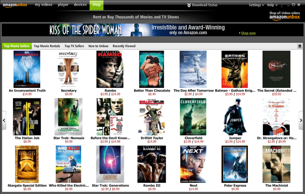
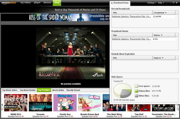
Unbox is Amazon.com's Movie and TV Show store, which offers downloadable videos that may be played on a user's PC, TiVo, or portable media player. The Unbox video player provides a "Shop" browser, a carousel of poster images for viewing top selling and renting movies and TV shows. Sadly, you have to make your purchase via the Amazon.com web site, and can't purchase directly from the player. You also cannot browse videos by genre in the player's Shop.

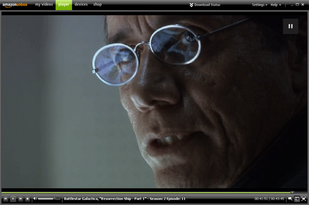
The player itself is simple to use. The tabs along the top allow the user to switch between their purchased video, video player, their devices, and the shop. A drop down panel shows download status and storage space available, which is a nice touch that I appreciated. The player itself provides play/pause, reverse/forward, stop, volume, running/total time, scrubber, and view modes.

This feels very much like a first release. I only used the Windows Video Player, so I cannot comment on the TiVo experience (DirectTV Tivo customers cannot participate). There are some shortcomings in the browsing process, a problem that the Roku also suffers form in its first release. Neither Unbox or Roku compares with the browsing offered by the Apple TV.

What I liked is mainly that there was a different catalog of titles—some of which aren't available on iTunes or Netflix's Watch Immediately Inventory. The prices are competitive and the standard video quality was fine.

1. Full screen player.
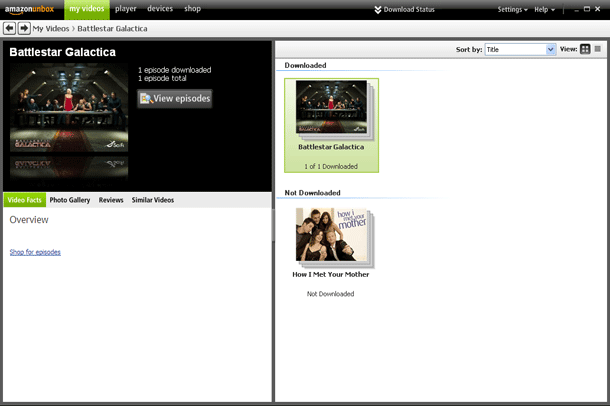
2. Browsing library of my purchases in My Videos.
3. Browsing titles via the shop.
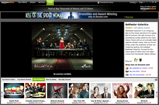
4. Viewing single TV Show page.
5. Download Status panel.

http://www.amazon.com/Unbox-Video-Downloads/b?ie=UTF8&node=16261631

bit.ly url shortener

Bitly is a simple url shortening service aimed at web professionals. The service provides a simply shortened URL and friendly urls based on keywords you specify. This is an example of a single-serving site that provides a simplified interface, but offers much more functionality following that initial interaction with the service. Attention is paid to making default behaviors easy, but gives expert users much more below the surface. bit.ly also offer referring tracking, an API for web apps, mirrored URL on Amazon Web Services, and thumbnail images.

1. User enters long URL. Can click shorten at this point and be done.
2. Optionally, user may enter words to make a friendly url.
3. When user submits the form, the shortened URL is displayed along with options to view details, and a history of last 15 shortened URLs.
4. The info page provides all of the details about the URL, including hit count, referrers, and thumbnail images.

http://bit.ly/go

New York Times Article Clipping

The New York Times' Times File Service allows users to save news items for reading later. Users click an Folder icon in the article tools adjacent to the article. When they navigate to their Times File, they see their list of shaved articles, with options for tagging, describing, and sharing the article via email. A nice feature of the Tiles File can be found under the Most Popular tab, where the most saved articles can be copied into your own library.

As a side note, there was a similar feature for news clipping in the innovative version of the IHT designed and developed by John Weir, but sadly all of the JavaScript from Weir's version was stripped out a recent IHT redesign.

1. Article page showing article tools to the right including the "Save" folder icon.
2. Clicking Save icon opens up a window with information about where the article was saved, and other articles saved by people who favorited the same item.
3. User's Times File.
4. Editing the article information, including description and tags. Didn't like the use of semi-colons. Commas seem an easier convention.
5. Most popular saved pages.

http://timesfile.nytimes.com/view.jsp